Shadcn UI
shadcn/ui is a set of components for React, built on Radix UI and styled with Tailwind CSS. Shadcn redefines how developers use UI component libraries by shifting from traditional npm packages to a copy-paste model. This approach gives developers full control over their components while eliminating dependency bloat and update issues. Additionally, shadcn/ui introduces a component registry, allowing users to browse, pull, and customize high-quality components effortlessly.

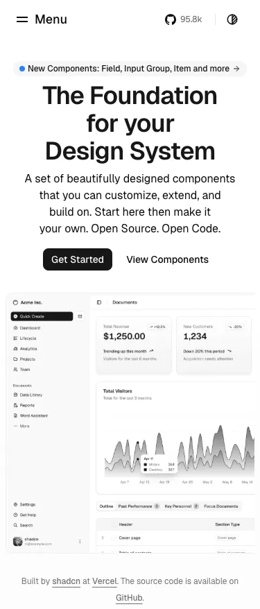
Screenshots
(3)
About Shadcn UI
shadcn/ui is a React component library built on Radix UI and Tailwind CSS, designed for a copy-paste workflow. It ships as self-contained components you can browse in a central registry, paste into your project, and customize with no external dependencies. A CLI manages components across apps, delivering fast, accessible UIs out of the box.
shadcn/ui is a set of components for React, built on Radix UI and styled with Tailwind CSS. Shadcn redefines how developers use UI component libraries by shifting from traditional npm packages to a copy-paste model. This approach gives developers full control over their components while eliminating dependency bloat and update issues. Additionally, shadcn/ui introduces a component registry, allowing users to browse, pull, and customize high-quality components effortlessly.
Features
- Copy-Paste Model – Components are added directly to projects, ensuring full ownership and flexibility.
- Component Registry – Developers can browse and pull pre-built components while maintaining full customization.
- No External Dependencies – Unlike traditional UI libraries, shadcn/ui components are self-contained, reducing update conflicts.
- Tailwind and Radix UI-Based – Components are styled with Tailwind CSS and built on Radix UI for accessibility and consistency.
- Fully Customizable – Since components are part of the project code, they can be modified without restrictions.
- Lightweight and Fast – No extra dependencies mean a leaner, more efficient codebase.
Use Cases
Target Audience
Discover More Tools
Explore our comprehensive directory to find complementary tools and innovative solutions that enhance your development workflow alongside Shadcn UI.