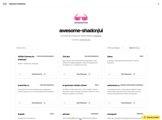
Premium blocks, templates & marketing.
4 products found
A curated Shadcn UI kit for React apps that accelerates UI development with ready-to-use, composable blocks. It includes camera-enabled components (capture-photo), AI chat elements, autocomplete, automatic form creation, and other reusable patterns to help teams prototype faster while preserving a cohesive, accessible design system.
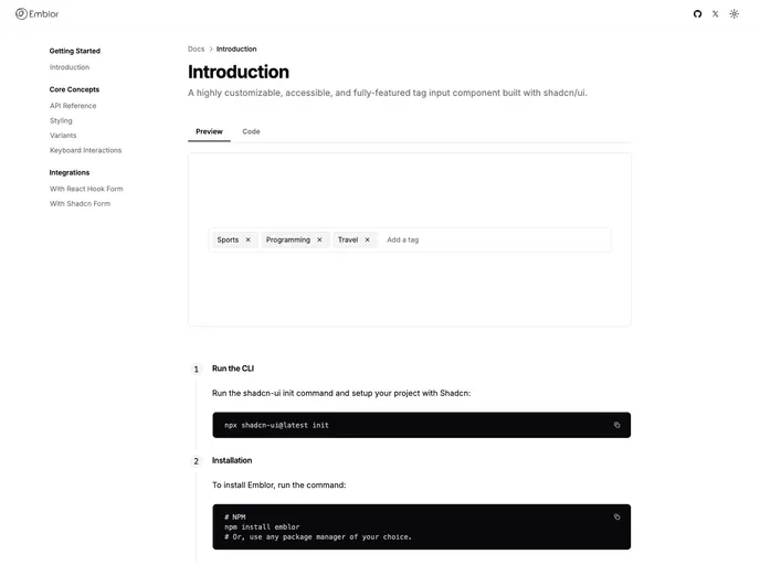
Emblor is a highly customizable, accessible tag-input component built with Shadcn UI. It delivers autocomplete, robust validation, drag-and-drop management, read-only mode, and flexible delimiters, all designed for seamless theming and precise control via Input, Popover, Command, and Dialog primitives. Open-source and free to use.
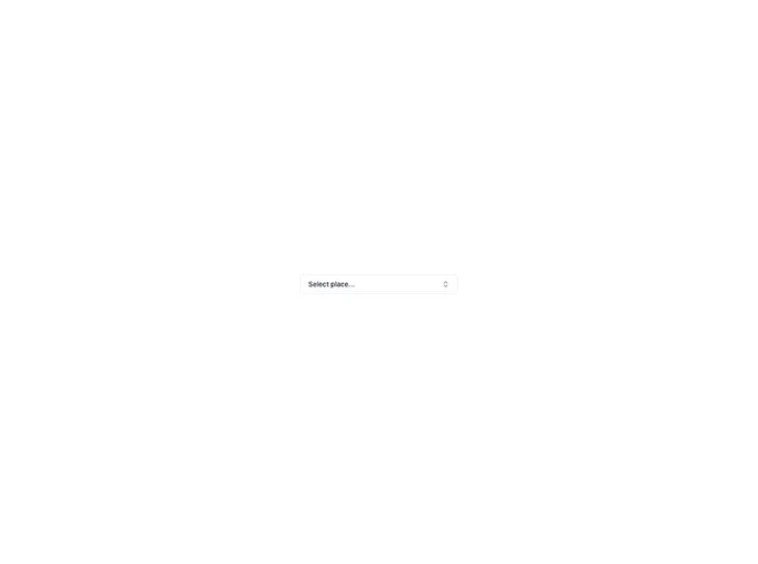
Search Address is a React component that uses OpenStreetMap's Nominatim to deliver fast, autocomplete-driven address lookup with grouped, interactive results. It plugs into shadcn-ui and lucide-react, supports multiple providers, debounced input, and dynamic imports for performance—open source for community collaboration.
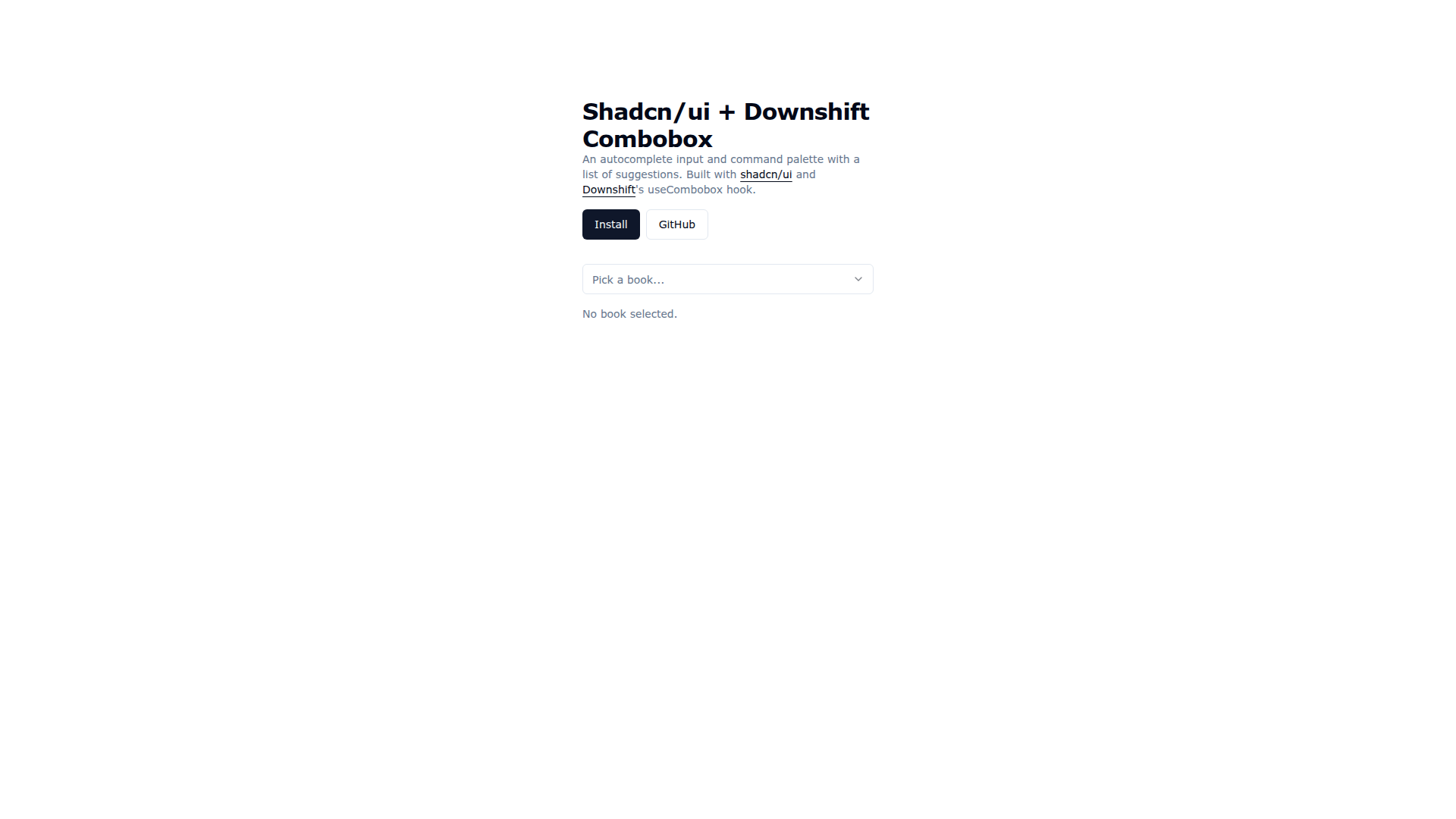
Downshift Shadcn Combobox merges Shadcn UI visuals with Downshift's useCombobox to deliver an accessible autocomplete input and command palette. It enables keyboard-friendly suggestions, cohesive theming, and rapid prototyping, with easy installation via the shadcn CLI and practical demo code for real-world usage.