Premium blocks, templates & marketing.
5 products found
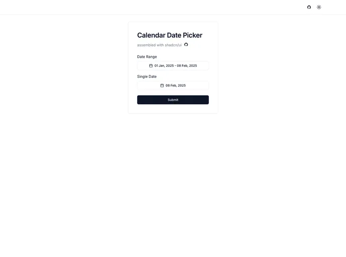
An accessible, drop-in calendar date picker for Next.js apps that blends Shadcn UI styling with Radix primitives. It delivers a keyboard-friendly interface for quick date selection, supports localization and flexible formatting, and plugs into your Next.js project with minimal configuration for a polished, consistent user experience.
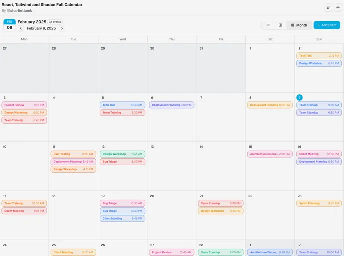
React/ShadCN Calendar: a Tailwind-first, dashboard-focused calendar component. Built with ShadCN patterns and Radix UI accessibility, it supports dark mode, responsive layouts, multiple views, and robust event management. Fully customizable and ready for seamless integration into React apps.
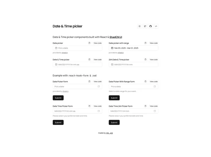
Shadcn Date Time Picker delivers cohesive, adaptable date and time inputs built with ShadCN patterns for rapid integration into React/Next.js apps. Accessible, Tailwind-friendly components enable precise scheduling and streamlined form UX with consistent theming.
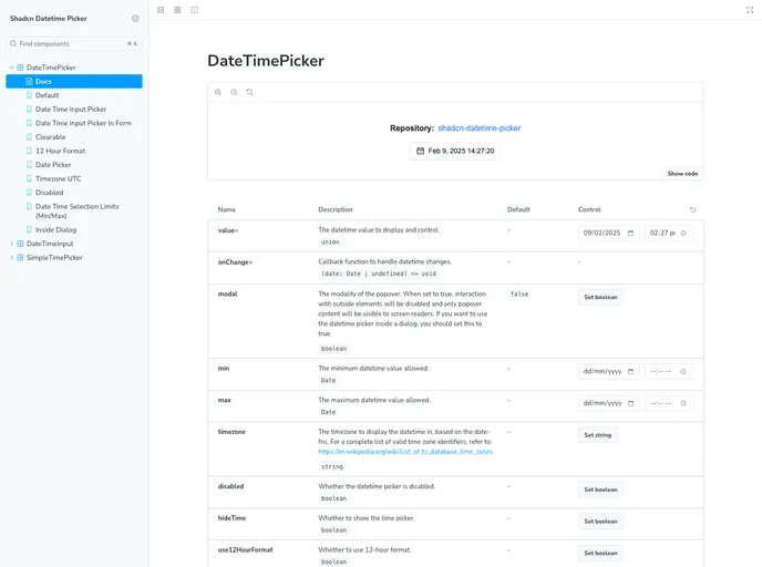
Shadcn Datetime Picker is a robust React component that blends seamlessly with the Shadcn UI framework to deliver polished, timezone-aware date and time selection. It provides date and time pickers, calendar navigation, and ready-to-use TSX files for quick, reliable integration in Next.js and Tailwind-powered apps.
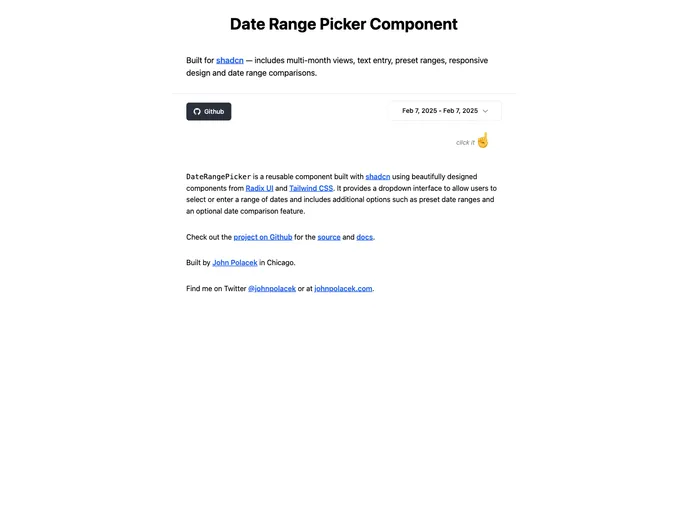
Date Range Picker For Shadcn is a reusable UI component built for Shadcn projects using Radix UI primitives and Tailwind CSS. It delivers a clean dropdown to select or type a date range, supports preset ranges, and offers an optional date comparison view for quick analytics.