Premium blocks, templates & marketing.
6 products found
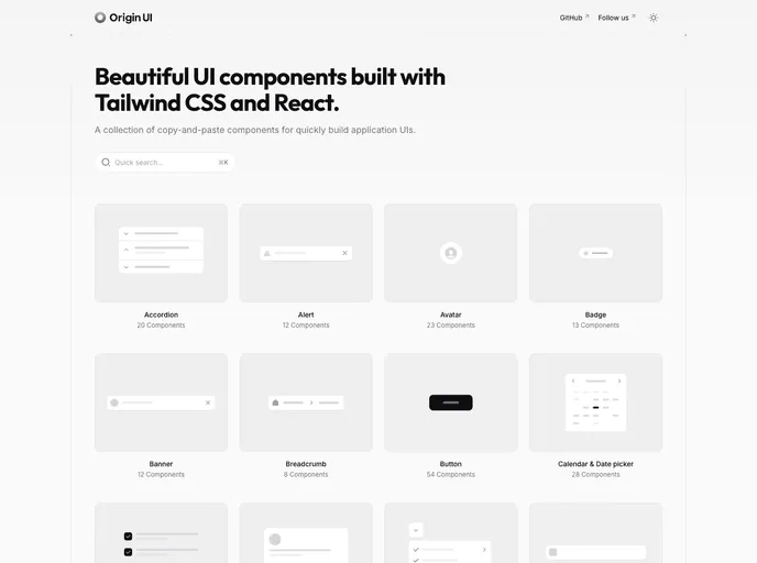
Origin UI is a copy-paste component library for React and Next.js projects, designed to accelerate UI development with a consistent styling system, dark mode, and shadcn-friendly conventions. It streamlines setup by guiding you to copy registry files into your project, wire CSS variables, and adjust Tailwind config for fast, reliable UI integration.
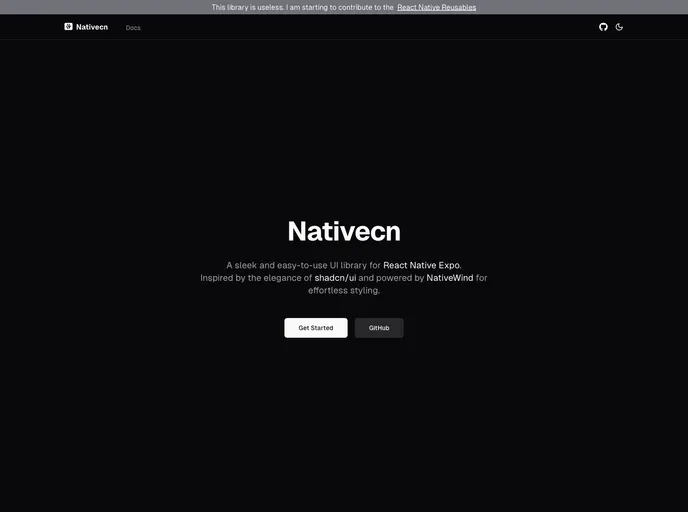
Nativecn is a React Native UI component library inspired by shadcn-ui, crafted for fast, themeable mobile apps. It delivers highly customizable, accessible components with built-in dark mode, CSS variables, and NativeWind compatibility, enabling teams to ship cohesive UIs with minimal setup.
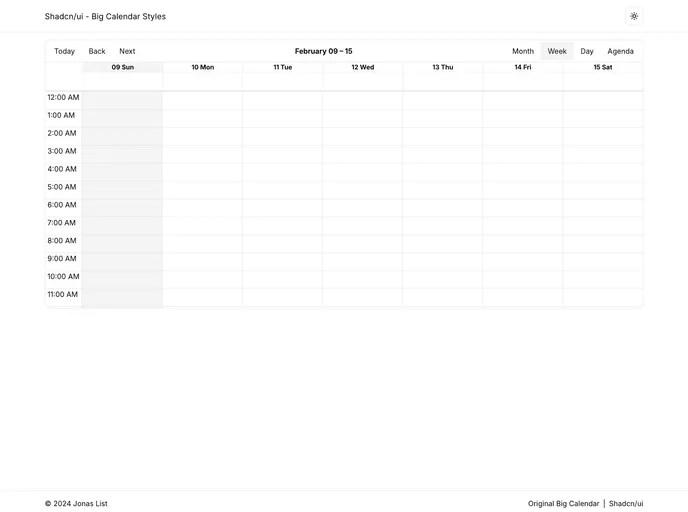
Shadcn UI Big Calendar is a Next.js open-source boilerplate that demonstrates dynamic, theme-aware styling by wiring Shadcn CSS variables into React Big Calendar. The calendar adapts instantly to the active theme, enabling rapid prototyping of themed scheduling dashboards.
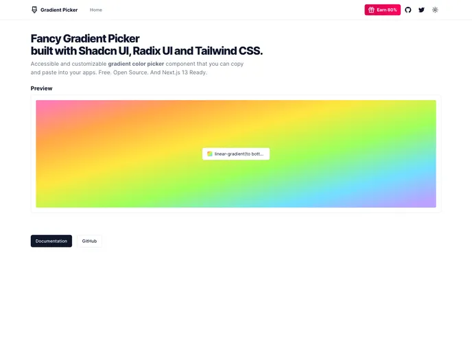
Gradient Picker is a lightweight tool to discover, tweak, and export gradients and color themes for UI design. Built with Shadcn UI, Radix UI, and Tailwind CSS, it delivers real-time gradient previews, solid colors, and background-image blends. Free and open source, with live examples and clean code/docs to accelerate theming in Shadcn projects.
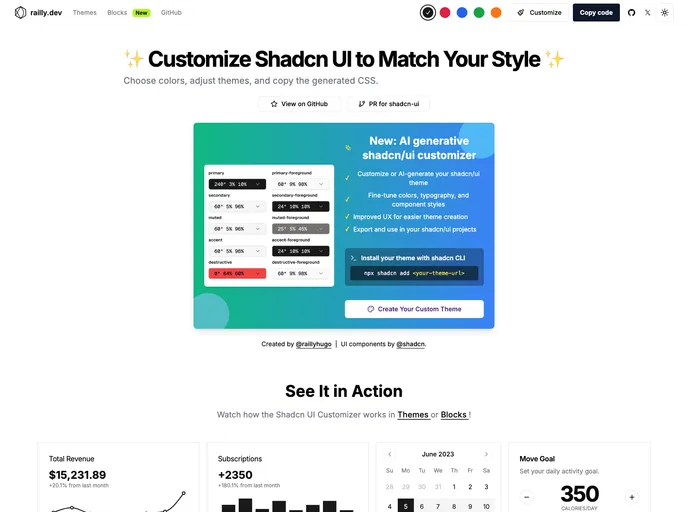
Shadcn UI Customizer is an open-source extension that lets you tailor Shadcn UI themes by tweaking CSS variables. It streamlines theming across React and Tailwind projects, enabling brand-consistent styles and faster iteration without modifying core components.
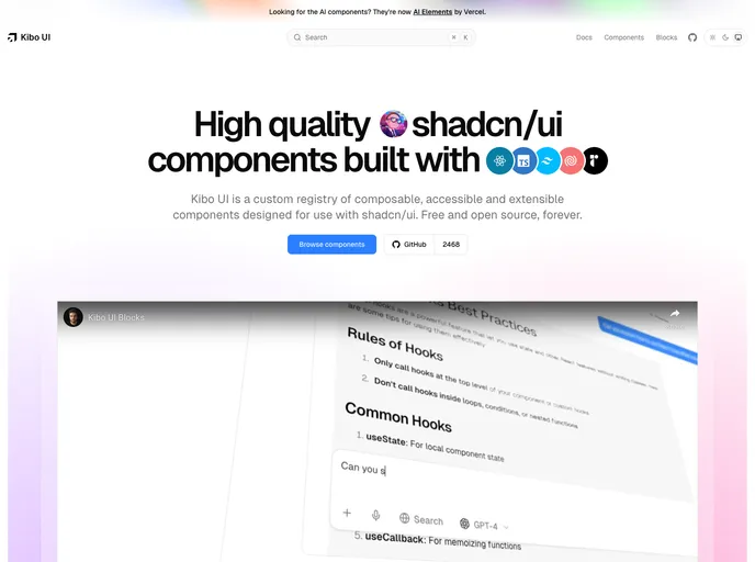
Kibo UI is a curated registry of composable, accessible, open-source UI building blocks designed to pair with shadcn/ui. Leveraging shadcn/ui CSS variables, these components slot into existing primitives to speed UI assembly, reduce boilerplate, and support responsive, theme-friendly interfaces.