Premium blocks, templates & marketing.
16 products found
originui.com
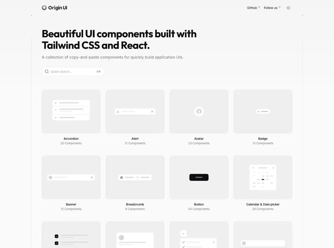
Origin UI
nativecn.vercel.app
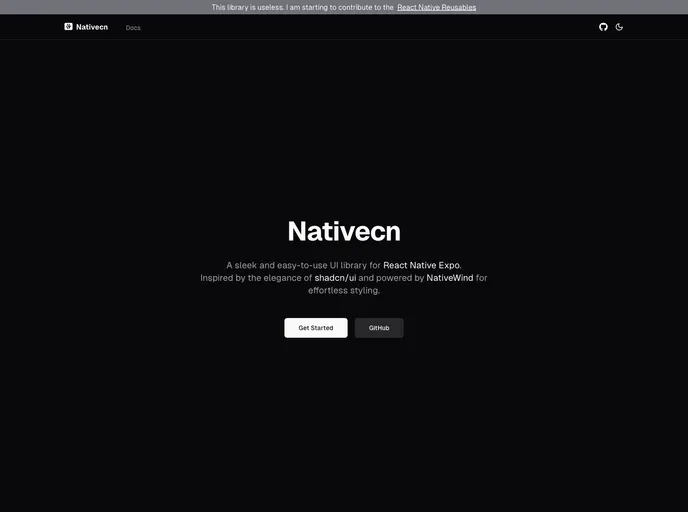
Nativecn
pricing-page-shadcn.ve...
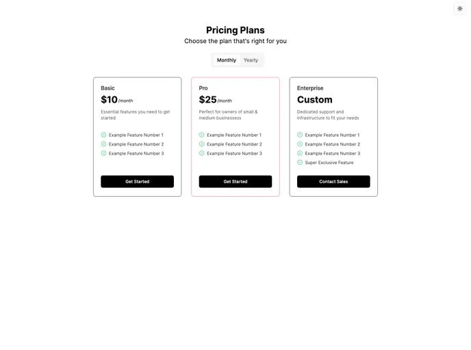
Pricing Page Shadcn
nativecn.mintlify.app
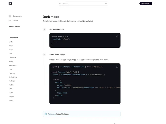
Nativecn UI
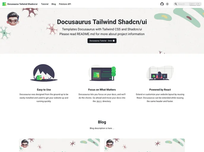
docusaurus-tailwind-sh...
Docusaurus Tailwind Shadcn Template
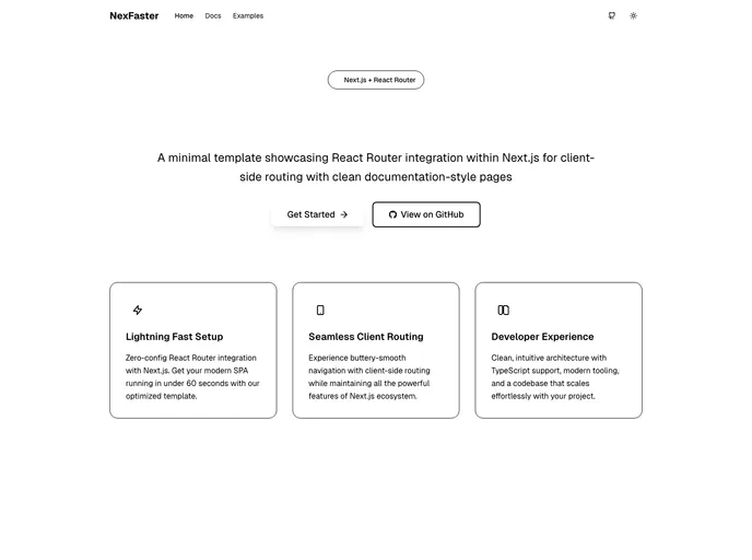
nexfaster.rdsx.dev
Nexfaster
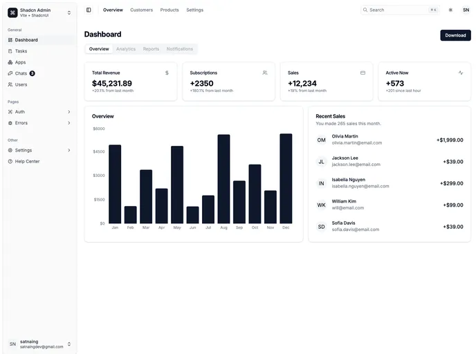
shadcn-admin.netlify.app
Shadcn Admin
Origin UI is a copy-paste component library for React and Next.js projects, designed to accelerate UI development with a consistent styling system, dark mode, and shadcn-friendly conventions. It streamlines setup by guiding you to copy registry files into your project, wire CSS variables, and adjust Tailwind config for fast, reliable UI integration.
Nativecn is a React Native UI component library inspired by shadcn-ui, crafted for fast, themeable mobile apps. It delivers highly customizable, accessible components with built-in dark mode, CSS variables, and NativeWind compatibility, enabling teams to ship cohesive UIs with minimal setup.
Pricing Page Shadcn is a theme-aware template that automatically adapts to light/dark modes and supports monthly or yearly billing. It highlights yearly savings and lets you spotlight plans with Popular or Exclusive tags, all while integrating smoothly with next-themes for hassle-free theme switching.
Nativecn UI is a React Native component library inspired by shadcn-ui, delivering a cohesive, customizable set of mobile UI elements designed to speed app development. It provides themeable components, consistent design primitives, and a straightforward integration path for rapid prototyping and collaboration.
A ready-to-run Docusaurus V3 template that blends TailwindCSS and Shadcn/UI to deliver a fast, modern docs site with accessible components, cohesive design, and local search powered by @easyops-cn/docusaurus-search-local. Ideal for teams seeking speed, branding consistency, and scalable documentation.
NexFaster fuses the power of Next.js with React Router–style client-side routing into a lean, modern app framework. It speeds navigation, ships a Tailwind UI, and supports TypeScript, dark mode, and protected routes. Ideal for rapid prototyping and scalable multi-page apps, while keeping development fast, approachable, and visually polished.
Shadcn Admin is a reusable admin dashboard boilerplate built with ShadcnUI, Tailwind, and Vite. It delivers responsive, accessible UI elements with light/dark modes, sidebar/header layouts, and 10+ pages for rapid admin app prototyping.
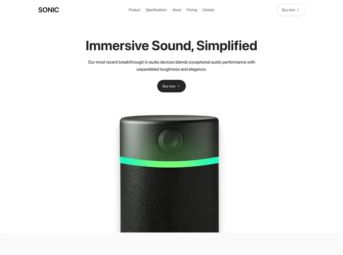
Sonic is a Next.js 15 landing page template built with shadcn/ui and Tailwind 4, designed to showcase physical and digital products with a clean, modern aesthetic. It ships 100+ components and 10+ pages for fast product launches, high-converting campaigns, and a polished marketing presence.
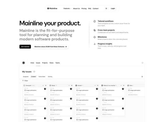
Mainline is a Next.js 15 + shadcn/ui + Tailwind 4 landing-page template designed for minimal, high-performance marketing sites. It pairs a clean aesthetic with fast, SEO-friendly rendering and straightforward component customization for rapid, polished launches.
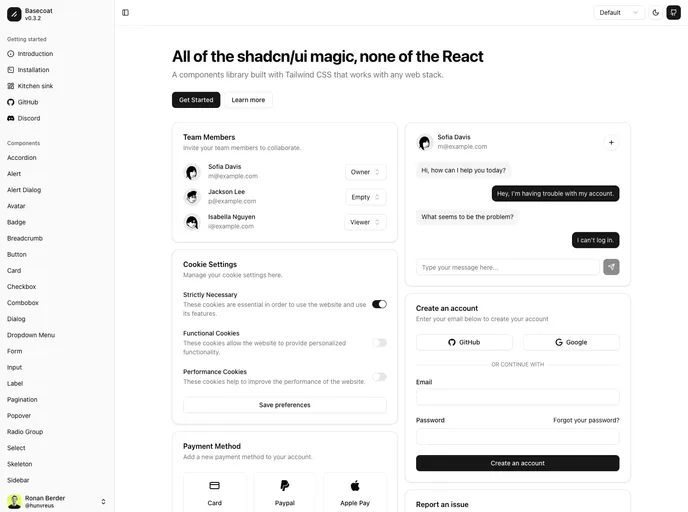
Basecoat is a modern, Tailwind-driven UI component library that works with any tech stack and doesn’t require React. It delivers accessible, themeable components you can drop into apps with minimal setup, helping you ship polished interfaces faster.
VITE-SHADCN Admin is a Vite-powered admin UI kit for Shadcn stacks, blending React and Zustand to enable fast, scalable dashboards. It includes dynamic permission-based routing, internationalization, a themeable UI, and a robust component library with ready-made admin patterns. Perfect for admin panels, dashboards, and lightweight enterprise apps.
Bund Admin Dashboard is a ready-to-use admin UI bundle designed for rapid backend interfaces. Built with Shadcn UI patterns, it bundles extensive dashboards, page libraries, and fully customizable components with flexible layouts, dark/light themes, and RTL/LTR support—empowering teams to ship polished admin experiences quickly.
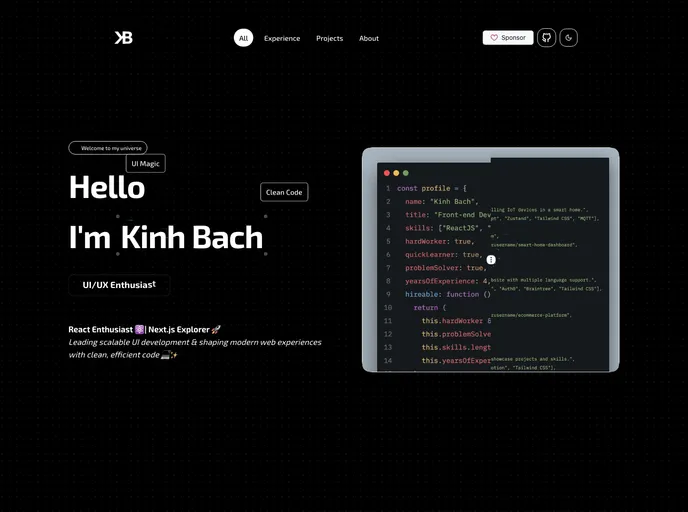
Kinhdev24 Portfolio is a modern Next.js 15–based portfolio template designed for speed, accessibility, and a polished developer presence. Built with MagicUI and AceternityUI, it delivers a clean, responsive layout with light/dark theming, interactive project showcases, and effortless customization for employers and clients.
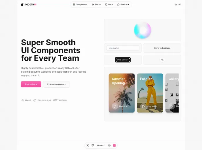
SmoothUI is a vibrant React component library built with Tailwind CSS and Motion, delivering accessible, responsive UI elements with delightful animations. With strong TypeScript support and easy integration, it helps teams craft polished interfaces quickly while keeping code scalable and branding consistent.
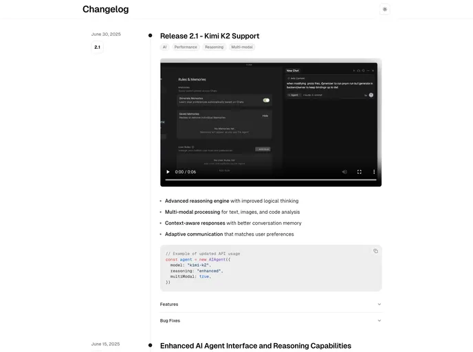
Changelog Template is a minimalist, Next.js + MDX template for publishing release notes and product updates with a clean timeline UI. It’s TypeScript-ready, Tailwind-styled, and optimized for fast Vercel deployment so teams can share progress clearly and professionally.
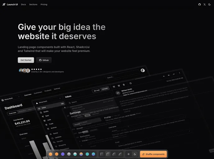
Launch UI is a production-ready Next.js website components template built with Shadcn/ui and Tailwind CSS. It ships ready-to-use, responsive components and layouts to accelerate modern site builds while emphasizing accessibility, performance, and SEO out of the box.