Premium blocks, templates & marketing.
25 products found
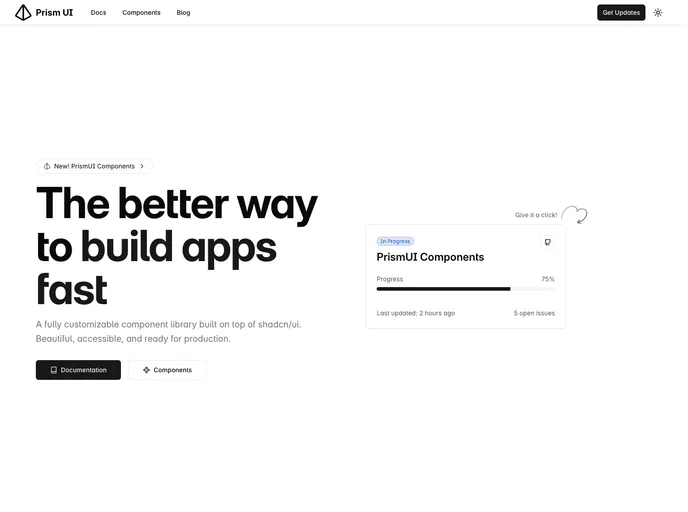
prismui.tech
Prism UI
next-ecommerce-shopco....
Next Ecommerce Shopco
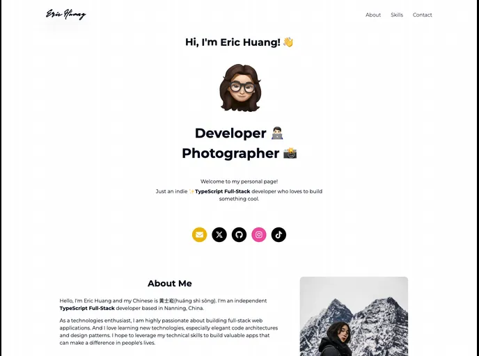
erichuang.top
Eric Portfolio Website
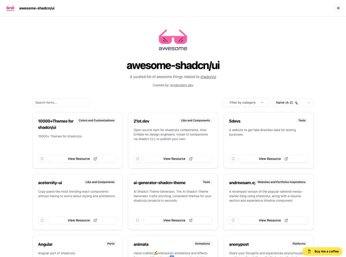
awesome-shadcn-ui.verc...
Awesome Shadcn UI
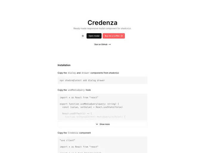
credenza.rdev.pro
Credenza
shadcn-ui-sidebar.sali...
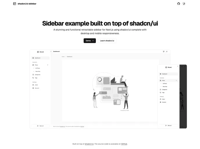
Shadcn UI Sidebar
time.openstatus.dev
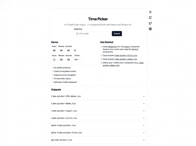
Time Picker
Prism UI is a Tailwind-friendly React component library that extends shadcn/ui with accessible, TypeScript-first components and pre-built page sections. It accelerates building polished, brandable web apps with composable patterns and deep customization.
Shopco is an open-source boilerplate that turns Figma e-commerce designs into production-ready, responsive storefronts. Built with Next.js 14, TypeScript, Tailwind CSS, Redux, Framer Motion, and ShadCN UI, it prioritizes SEO, performance, and accessibility to help teams ship maintainable, scalable shopfronts fast.
A clean, modern portfolio boilerplate built with Next.js 14, TailwindCSS, Framer Motion, and Shadcn/ui. This open-source starter helps developers launch a polished personal site quickly, with a clear content model and easy customization. Clone, install, and personalize your portfolio with minimal setup.
A curated Shadcn UI kit for React apps that accelerates UI development with ready-to-use, composable blocks. It includes camera-enabled components (capture-photo), AI chat elements, autocomplete, automatic form creation, and other reusable patterns to help teams prototype faster while preserving a cohesive, accessible design system.
Credenza is a responsive modal component built for the Shadcn UI ecosystem. It delivers sleek, accessible modal experiences with minimal setup, smooth background scaling, and reliable keyboard navigation, ideal for rapid prototyping or production-ready modals in shadcn/ui apps.
Shadcn UI Sidebar is a polished retractable navigation component for Next.js apps, offering a compact mini variant and a full-width desktop sidebar plus a mobile sheet menu. It’s responsive, accessible, and easy to integrate into admin dashboards or SaaS UIs, enabling organized, collapsible navigation without leaving the current view.
The Shadcn Time Picker is a lightweight, accessible time input component designed for quick, seamless integration into Shadcn UI projects. It presents a clean, responsive interface with easy HTML markup and straightforward JavaScript initialization, making time-based forms fast to implement without sacrificing accessibility or styling consistency.
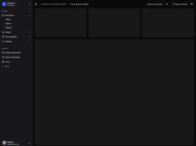
Resizable Sidebar for Next.js apps, built on shadcn/ui. It adds drag-to-resize, collapsible navigation with smooth transitions, theme support (light/dark), keyboard shortcuts, and cookie-backed persistence for a seamless, stateful UI.
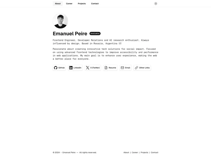
Emapeire Personal Site is a ready-to-use portfolio template that displays a creator's work, skills, and experience. It serves as a polished self-promo asset for attracting employers or clients, featuring a responsive layout, project details, and clear contact options.
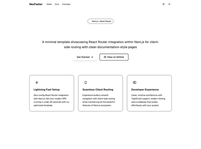
NexFaster fuses the power of Next.js with React Router–style client-side routing into a lean, modern app framework. It speeds navigation, ships a Tailwind UI, and supports TypeScript, dark mode, and protected routes. Ideal for rapid prototyping and scalable multi-page apps, while keeping development fast, approachable, and visually polished.
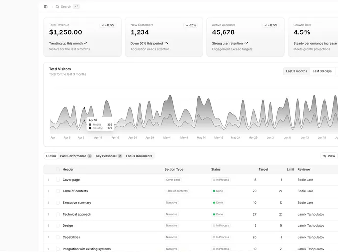
Next Shadcn Admin Dashboard is a modern, open‑source starter template for Next.js 15 and Shadcn UI. It ships with prebuilt admin screens, responsive layouts, and theme presets to accelerate building scalable dashboards. With RBAC, authentication flows, and reusable UI components, you can spin up a polished admin panel quickly while staying aligned with best practices and future‑ready tooling.
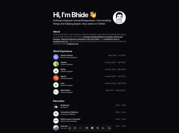
Bhide Portfolio Template is a minimalist, developer-first portfolio starter built with SvelteKit, TypeScript, and TailwindCSS. Open-source and Vercel-optimized, it helps you showcase projects, skills, and career journey with a clean, modern interface—designed for fast setup and effortless deployment.
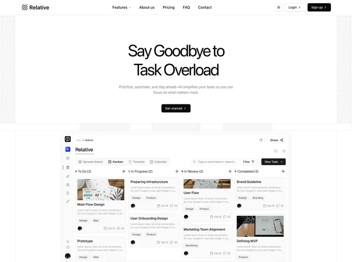
Relative is a Next.js landing-page template built with shadcn/ui and Tailwind, crafted to speed up marketing-site launches. It delivers a responsive, component-driven foundation with SEO-friendly structure and polished UI, ideal for personal portfolios or product campaigns. Customize quickly while keeping a cohesive, high-end look.
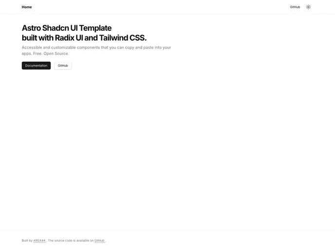
Astro Shadcn UI Template is a cohesive starter that blends Astro, Tailwind CSS, and shadcn/ui into a unified UI foundation. It accelerates modern web app development with ready-made components, a shared design system, and fast island-based rendering for responsive, production-ready interfaces.
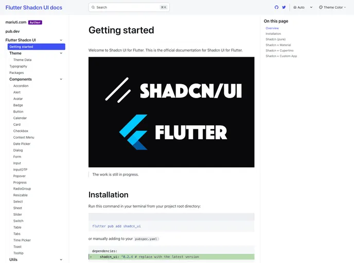
Flutter Shadcn UI is a community-driven Flutter port of the Shadcn UI component set, delivering a cohesive, design-token driven widget library for rapid app UIs. It includes Button, Card, Avatar, Input, Tooltip, Toast, and more, with consistent theming and accessible UX. The port is actively tracked by contributors on Twitter and is free and open-source.
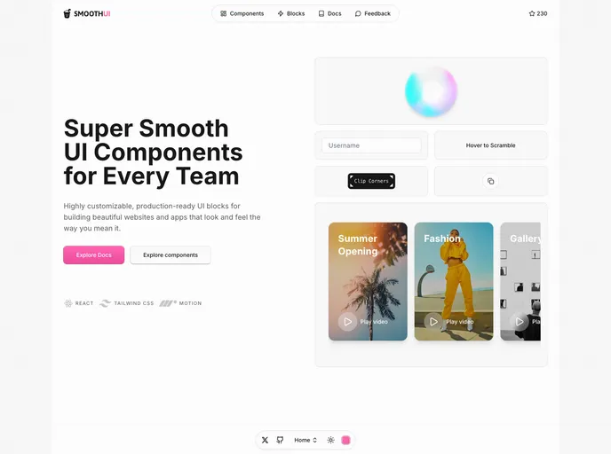
SmoothUI is a vibrant React component library built with Tailwind CSS and Motion, delivering accessible, responsive UI elements with delightful animations. With strong TypeScript support and easy integration, it helps teams craft polished interfaces quickly while keeping code scalable and branding consistent.
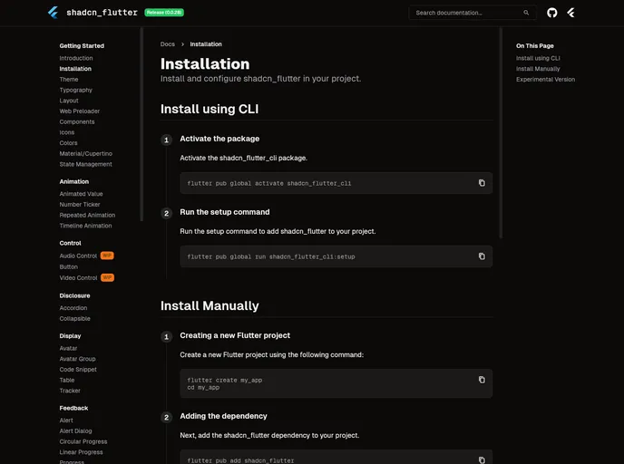
Shadcn Flutter ports the shadcn UI design system to Flutter, delivering a curated set of widgets, animations, forms, and layout utilities optimized for building polished Flutter web apps. With a CLI-friendly setup and theming support, it enables rapid UI composition with cohesive design tokens across projects.
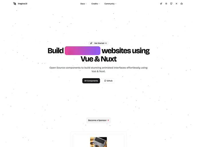
Inspira UI is a Vue and Nuxt-ready component library that blends the aesthetics of Aceternity UI and Magic UI into a cohesive, highly configurable kit. Open source and easily customizable, it helps teams ship polished, responsive interfaces quickly while maintaining design-system consistency across Vue/Nuxt apps. Install via npm or yarn and tailor components to project needs.
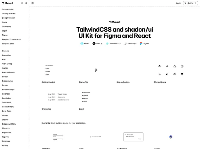
Myna UI is a TailwindCSS and shadcn/ui-based UI kit for React and Figma that helps teams rapidly prototype, theme, and ship modern interfaces. It provides a responsive, component-driven foundation with clear documentation, speeding design-to-dev handoffs and ensuring design-system consistency across projects.
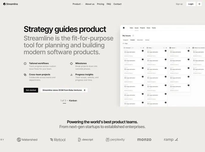
Streamline is a polished landing-page template built with Next.js 15, shadcn/ui, and Tailwind 4. It delivers a clean, minimalist aesthetic on a responsive, performance-focused foundation, with extensive customization options. Ideal for startups and portfolios seeking a modern, professional online presence with rapid prototyping.
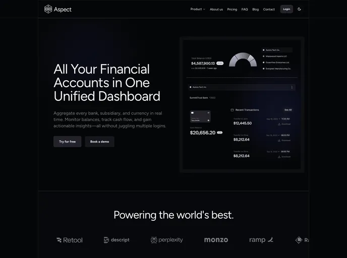
Aspect is a polished corporate marketing template built with Next.js 15, shadcn/ui, and Tailwind 4. It delivers a clean, engaging online presence with a robust block-based architecture, SEO-ready setup, and responsive, themeable UI—ideal for corporate sites and fast-growing brands.
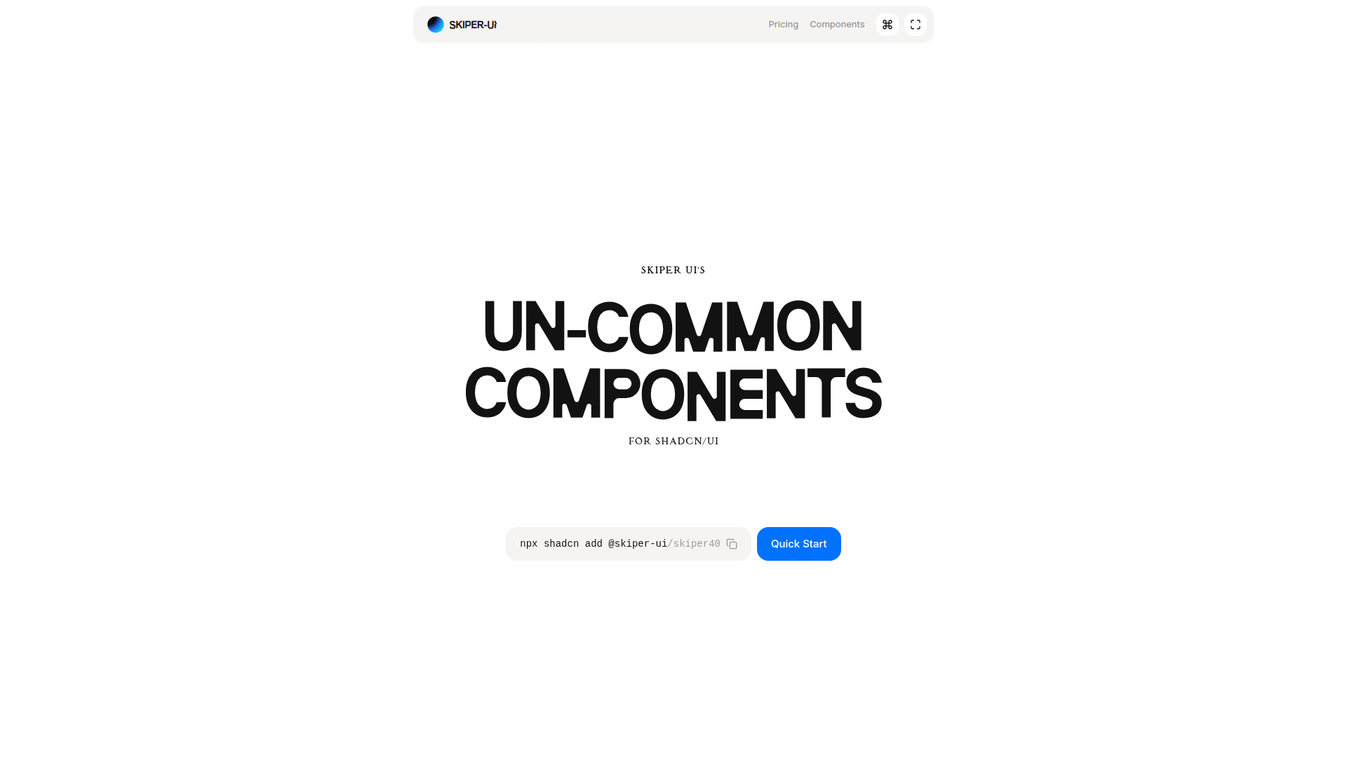
Skiper UI is an open-source component library focused on accessibility, customization, and rapid integration. With copy-and-paste ready components, you can assemble polished interfaces fast while maintaining a cohesive design system across apps.
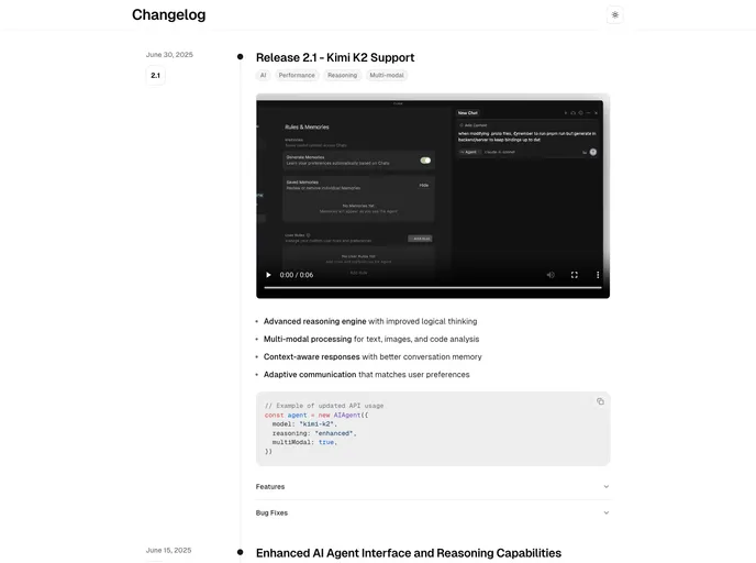
Changelog Template is a minimalist, Next.js + MDX template for publishing release notes and product updates with a clean timeline UI. It’s TypeScript-ready, Tailwind-styled, and optimized for fast Vercel deployment so teams can share progress clearly and professionally.
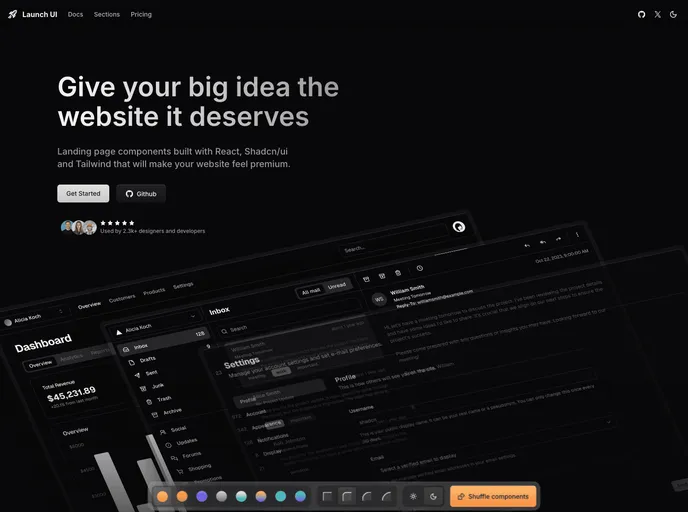
Launch UI is a production-ready Next.js website components template built with Shadcn/ui and Tailwind CSS. It ships ready-to-use, responsive components and layouts to accelerate modern site builds while emphasizing accessibility, performance, and SEO out of the box.
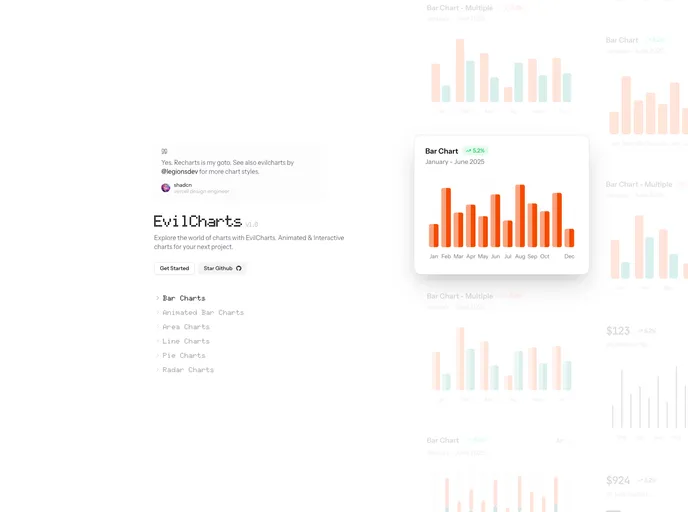
Evilcharts is a modern, visually striking chart UI kit for React and Next.js. Built on shadcn and recharts, it delivers customizable chart components for rapid, interactive data visualizations. Ideal for dashboards and data-driven pages, it blends style with performance and flexible branding options.