Premium blocks, templates & marketing.
30 products found
radix-ng.com
Primitives
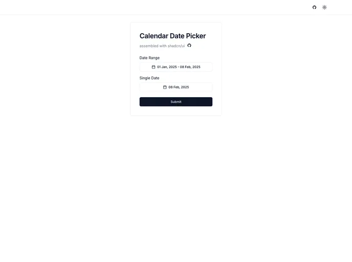
shadcn-calendar-compon...
Shadcn Calendar Component
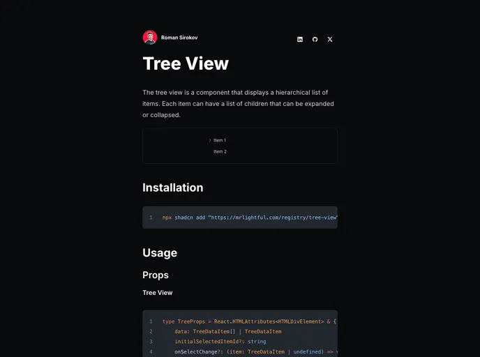
mrlightful.com/ui/tree...
Shadcn Tree View
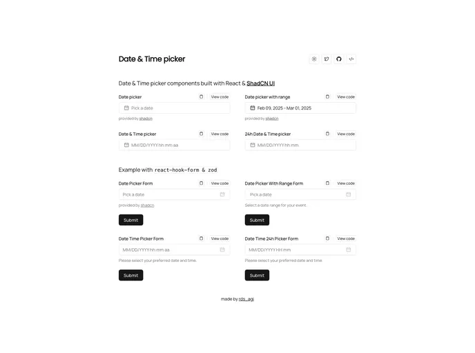
time.rdsx.dev
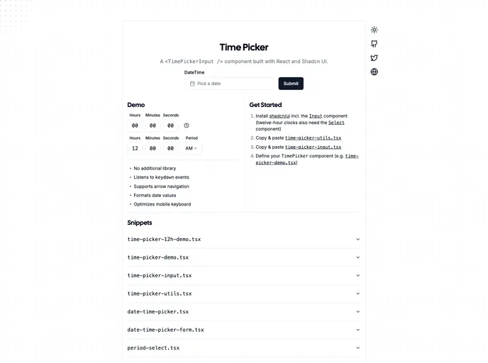
Shadcn Date Time Picker
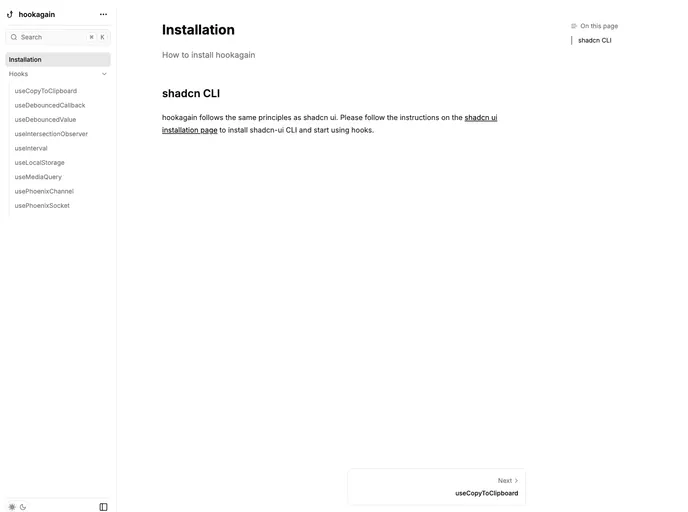
hookagain.vercel.app
Hookagain
next-ecommerce-shopco....
Next Ecommerce Shopco
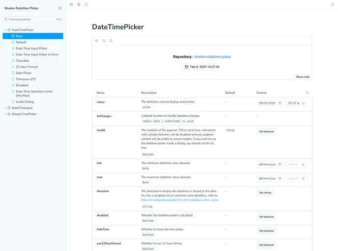
shadcn-datetime-picker...
Shadcn Datetime Picker
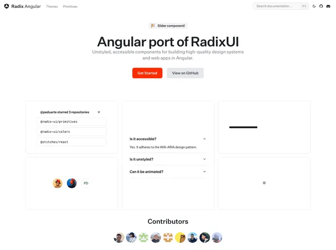
Primitives for Angular (Radix-NG) deliver accessible, low-level UI building blocks inspired by Radix UI. This unofficial port prioritizes accessibility, customization, and a developer-friendly API for incremental adoption in design systems. It ships with a base layer, clear docs, and a Storybook showcase to accelerate reliable UI.
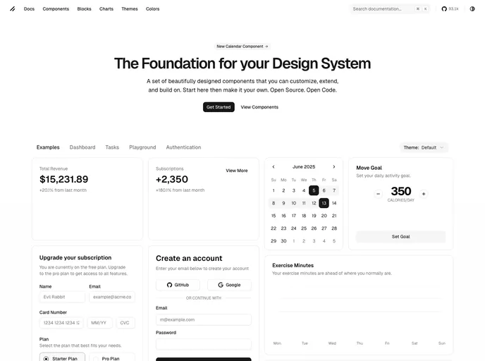
An accessible, drop-in calendar date picker for Next.js apps that blends Shadcn UI styling with Radix primitives. It delivers a keyboard-friendly interface for quick date selection, supports localization and flexible formatting, and plugs into your Next.js project with minimal configuration for a polished, consistent user experience.
Shadcn Tree View is a lightweight, accessible component for navigating hierarchical data with expandable and collapsible nodes. Following Shadcn UI patterns, it offers per-item icons, default node/leaf icons, item click handlers, and optional action buttons, enabling fast, keyboard-friendly navigation in dashboards, file trees, and nested menus.
Shadcn Date Time Picker delivers cohesive, adaptable date and time inputs built with ShadCN patterns for rapid integration into React/Next.js apps. Accessible, Tailwind-friendly components enable precise scheduling and streamlined form UX with consistent theming.
Hookagain offers a curated set of reusable React hooks designed for rapid UI development. Install via the shadcn CLI and drop these battle-tested hooks into your project to accelerate state, effect, data-fetching, and UX logic with a cohesive API.
Shopco is an open-source boilerplate that turns Figma e-commerce designs into production-ready, responsive storefronts. Built with Next.js 14, TypeScript, Tailwind CSS, Redux, Framer Motion, and ShadCN UI, it prioritizes SEO, performance, and accessibility to help teams ship maintainable, scalable shopfronts fast.
Shadcn Datetime Picker is a robust React component that blends seamlessly with the Shadcn UI framework to deliver polished, timezone-aware date and time selection. It provides date and time pickers, calendar navigation, and ready-to-use TSX files for quick, reliable integration in Next.js and Tailwind-powered apps.
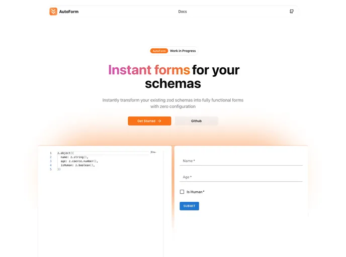
Autoform is an open-source form scaffolding tool for React apps. It speeds UI creation by auto-generating schemas from JSON or TypeScript, rendering accessible, themeable inputs with Shadcn-inspired primitives for consistent, rapid data collection.
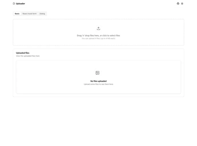
File Uploader is a reusable Next.js-friendly component built with shadcn/ui and react-dropzone. It leverages Tailwind CSS styling (via create-t3-app setup) and Zod for validation. Key features include a reusable useFileUpload hook, drag-and-drop with a live progress bar, and smooth form integration with react-hook-form. A file-dialog demo showcases accessible file selection for modern dashboards.
Shadcn Solid is an unofficial, community-led SolidJS port of shadcn/ui. It provides accessible, customizable Solid components you can drop into apps to rapidly assemble a shared component library. Free, open source, and designed for teams seeking a consistent design system with minimal setup.
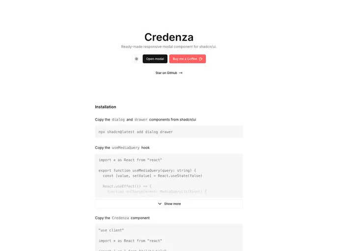
Credenza is a responsive modal component built for the Shadcn UI ecosystem. It delivers sleek, accessible modal experiences with minimal setup, smooth background scaling, and reliable keyboard navigation, ideal for rapid prototyping or production-ready modals in shadcn/ui apps.
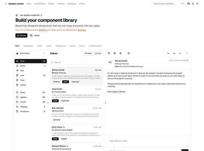
Shadcn Svelte is an unofficial, community-led port of the popular shadcn/ui library tailored for the Svelte ecosystem. It delivers accessible, customizable UI components with a copy-paste workflow, enabling teams to build cohesive interfaces quickly while staying aligned with the trusted design language.
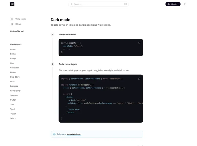
Nativecn UI is a React Native component library inspired by shadcn-ui, delivering a cohesive, customizable set of mobile UI elements designed to speed app development. It provides themeable components, consistent design primitives, and a straightforward integration path for rapid prototyping and collaboration.
The Shadcn Time Picker is a lightweight, accessible time input component designed for quick, seamless integration into Shadcn UI projects. It presents a clean, responsive interface with easy HTML markup and straightforward JavaScript initialization, making time-based forms fast to implement without sacrificing accessibility or styling consistency.
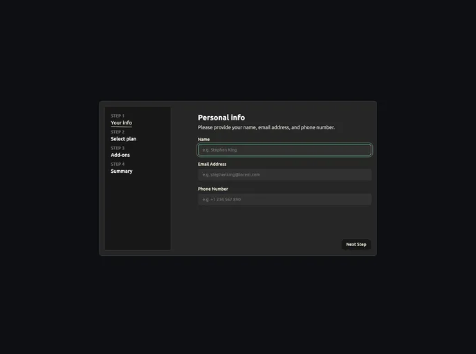
Open-source boilerplate for building robust multi-step forms with Next.js, React, and Tailwind. Includes a flexible wizard, accessible controls, built-in validation hooks, and simple form-state management for rapid prototyping and production-ready experiences.
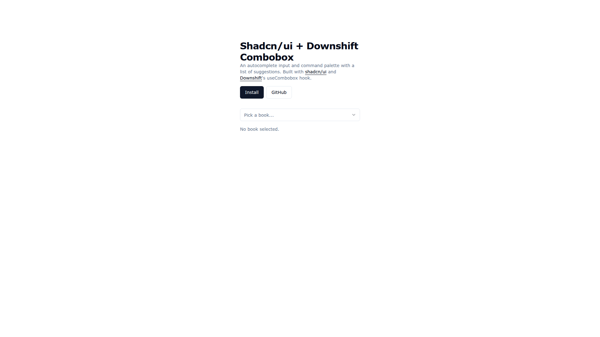
Downshift Shadcn Combobox merges Shadcn UI visuals with Downshift's useCombobox to deliver an accessible autocomplete input and command palette. It enables keyboard-friendly suggestions, cohesive theming, and rapid prototyping, with easy installation via the shadcn CLI and practical demo code for real-world usage.
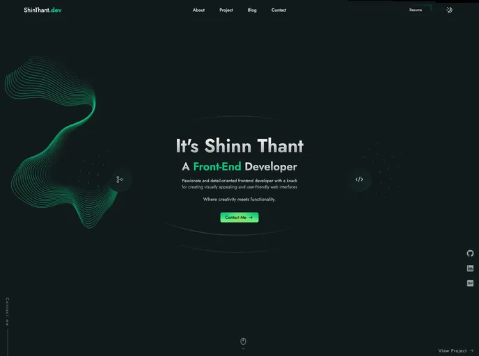
Shinthant.dev is a Next.js (SSG) portfolio boilerplate written in TypeScript, styled with Tailwind CSS and GSAP animations. It delivers a responsive, accessible, SEO-friendly personal site with light/dark themes and a streamlined clone-and-run workflow for rapid prototyping and project showcases.
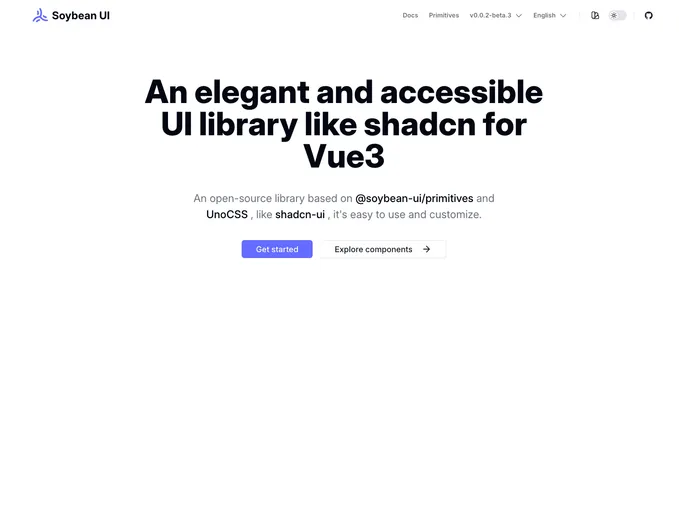
SoybeanUI is a clean, accessible UI library for Vue3, built on @soybean-ui/primitives and UnoCSS. It delivers elegant, production-ready components with easy theming and seamless integration. Lightweight yet powerful, it helps teams ship beautiful, responsive interfaces quickly while prioritizing accessibility and developer ergonomics.
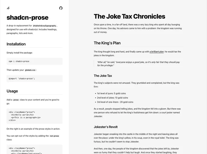
Shadcn Prose is a polished typography package designed for shadcn/ui that serves as a drop-in replacement for @tailwindcss/typography. It standardizes headings, paragraphs, lists, and content blocks with a refined, readable aesthetic, responsive scales, and accessible defaults. Install, wire into globals.css, and elevate your app's text presentation in minutes.
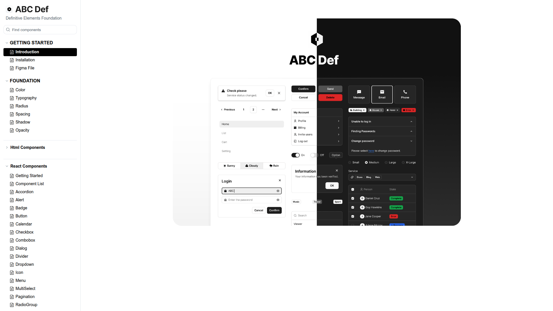
ABC Def (ABC Studio's Definitive Elements Foundation) is a headless design system that streamlines web component development with a three-tier token scheme and Headless UI primitives. It enforces consistency while enabling flexible customization, backed by a Turborepo-based monorepo, Tailwind CSS, and React. Organized into focused packages with thorough docs, it accelerates building responsive, accessible UIs and scalable themes for teams.
Kinhdev24 Portfolio is a modern Next.js 15–based portfolio template designed for speed, accessibility, and a polished developer presence. Built with MagicUI and AceternityUI, it delivers a clean, responsive layout with light/dark theming, interactive project showcases, and effortless customization for employers and clients.
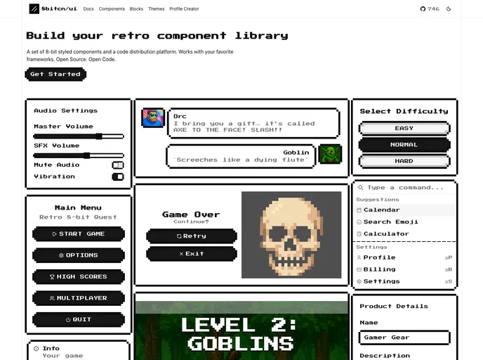
8bitcn UI is a retro-inspired component library that blends nostalgic visuals with modern accessibility. MIT-licensed and open source, it’s easy to drop into projects, customize, and contribute. Ideal for rapid prototyping, cohesive theming, and inclusive interfaces across web apps.
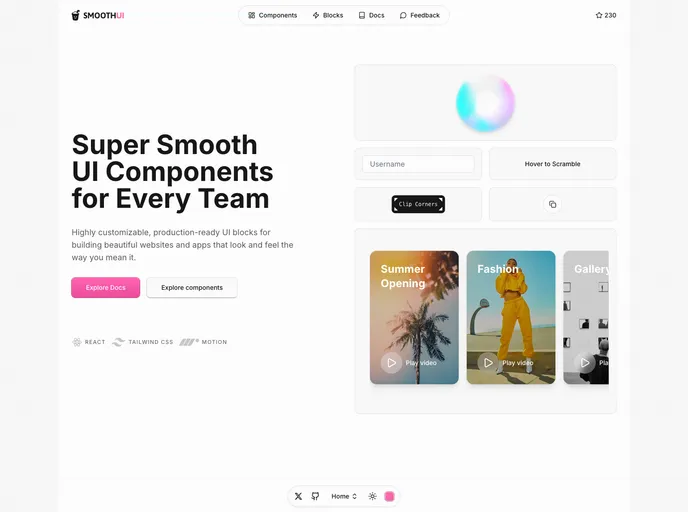
SmoothUI is a vibrant React component library built with Tailwind CSS and Motion, delivering accessible, responsive UI elements with delightful animations. With strong TypeScript support and easy integration, it helps teams craft polished interfaces quickly while keeping code scalable and branding consistent.
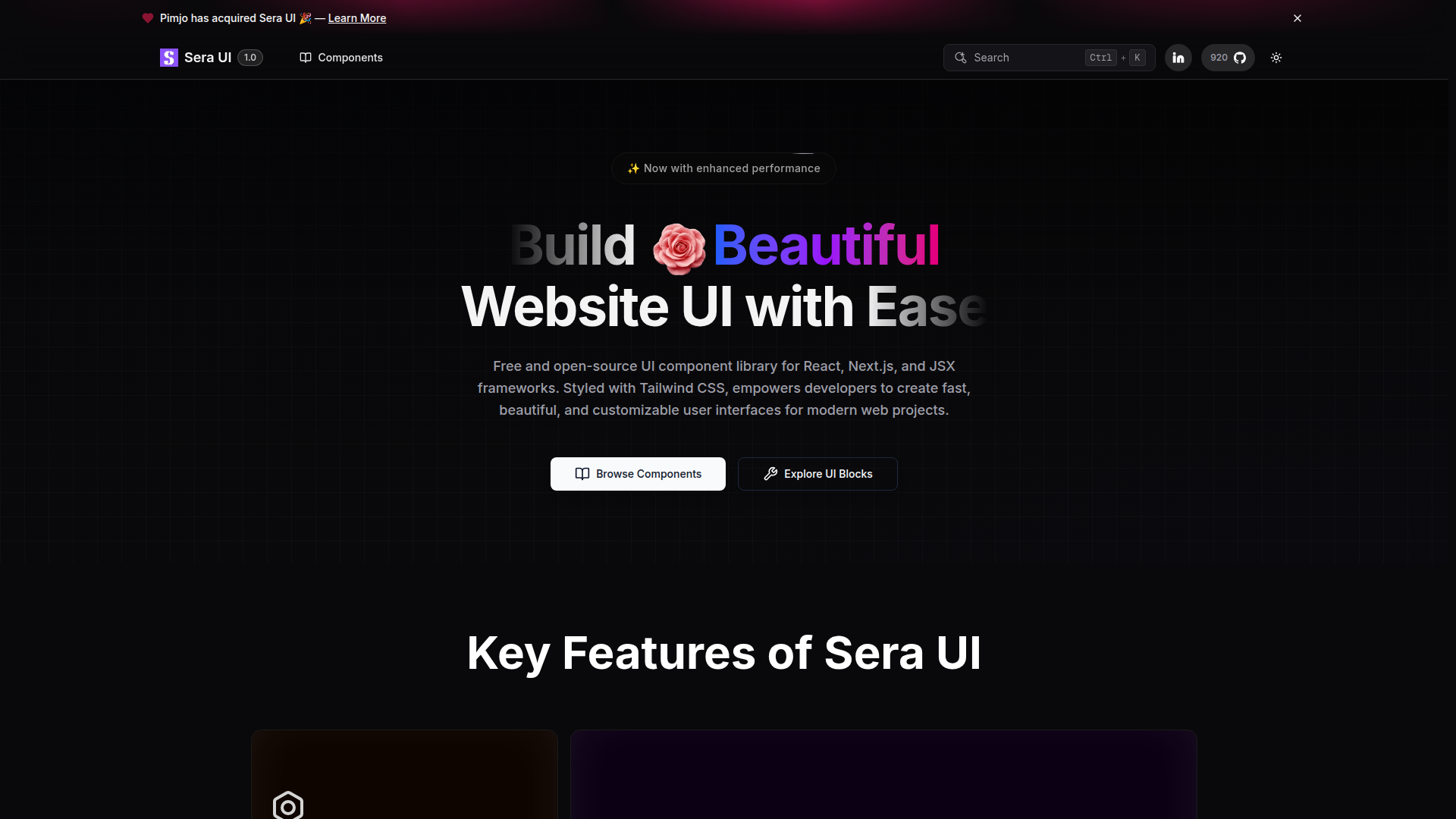
Sera UI is an accessible, high‑performance React/Next.js component library focused on reusable UI, easy customization, and modern aesthetics. Built from real developer needs, it delivers a growing set of components with smooth animations, an open‑source license, and quick setup to help teams ship polished interfaces with less boilerplate.
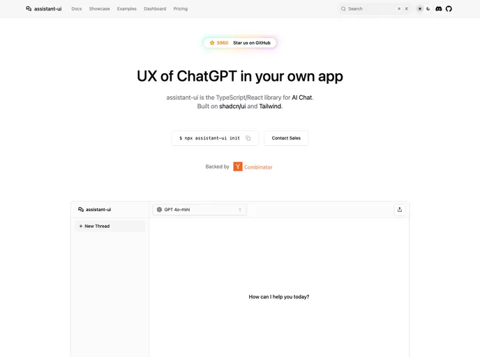
Assistant UI is an open-source TypeScript/React library for rapid, production-ready AI chat UIs. It delivers composable primitives, streaming, auto-scroll, accessibility, and theme customization, enabling developers to craft polished chat experiences that integrate with multiple AI models and backend services. Built for real-time interactions and excellent DX, it lets teams ship reliable AI chat apps faster while handling UI complexity.
Shadcn Vue is a community-driven port of shadcn/ui for Vue, delivering accessible, highly customizable UI components you can drop into Vue apps. Independent but blessed by the original project, it provides a modern, free, open-source component set to accelerate UI development in Vue teams.
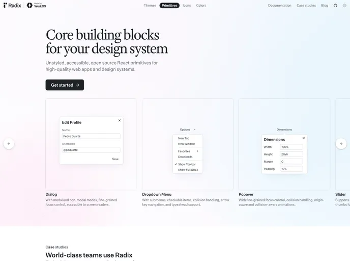
Radix Primitives delivers accessible, low-level UI building blocks for React that you can trust as the foundation of a design system or to augment existing apps. With a11y-first primitives and modular composition, you can build robust, keyboard-friendly interactions incrementally.
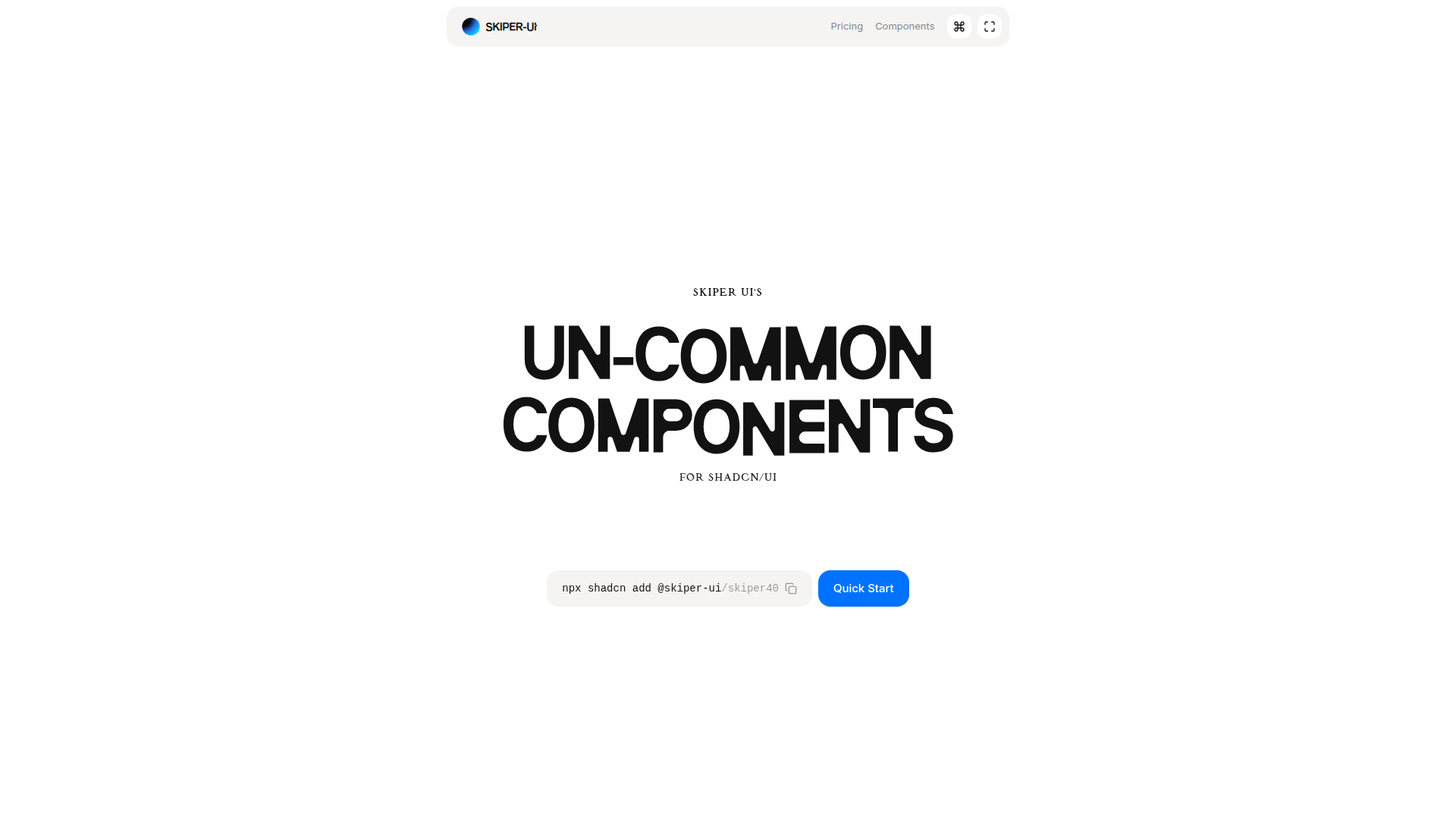
Skiper UI is an open-source component library focused on accessibility, customization, and rapid integration. With copy-and-paste ready components, you can assemble polished interfaces fast while maintaining a cohesive design system across apps.
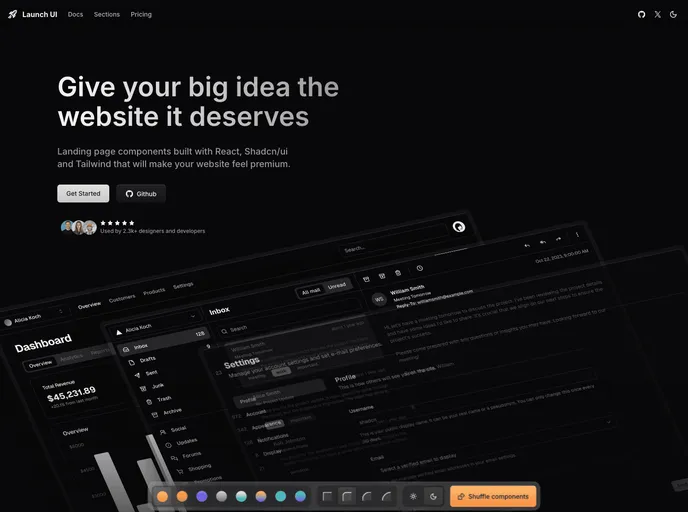
Launch UI is a production-ready Next.js website components template built with Shadcn/ui and Tailwind CSS. It ships ready-to-use, responsive components and layouts to accelerate modern site builds while emphasizing accessibility, performance, and SEO out of the box.
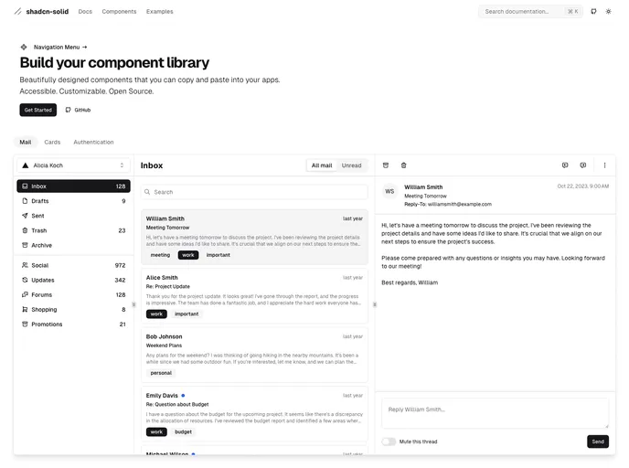
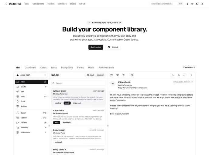
shadcn/ui is a React component library built on Radix UI and Tailwind CSS, designed for a copy-paste workflow. It ships as self-contained components you can browse in a central registry, paste into your project, and customize with no external dependencies. A CLI manages components across apps, delivering fast, accessible UIs out of the box.