Premium blocks, templates & marketing.
18 products found
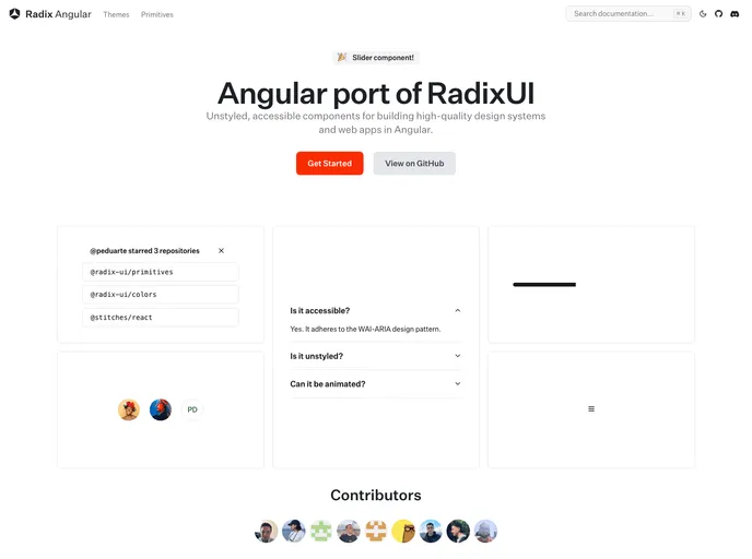
radix-ng.com
Primitives
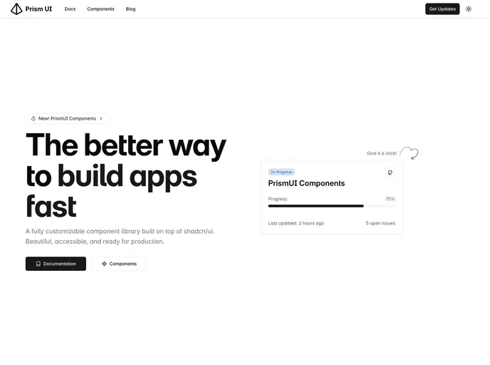
prismui.tech
Prism UI
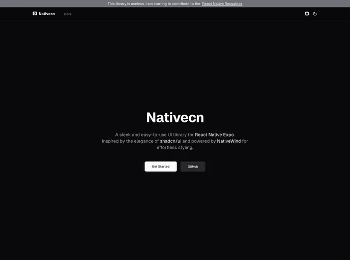
nativecn.vercel.app
Nativecn
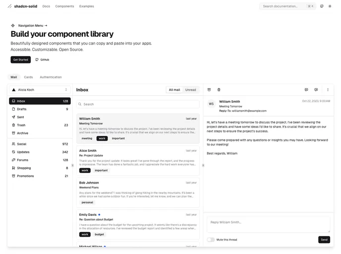
shadcn-solid.vercel.app
Shadcn Solid
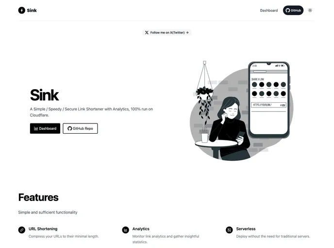
sink.cool
Sink
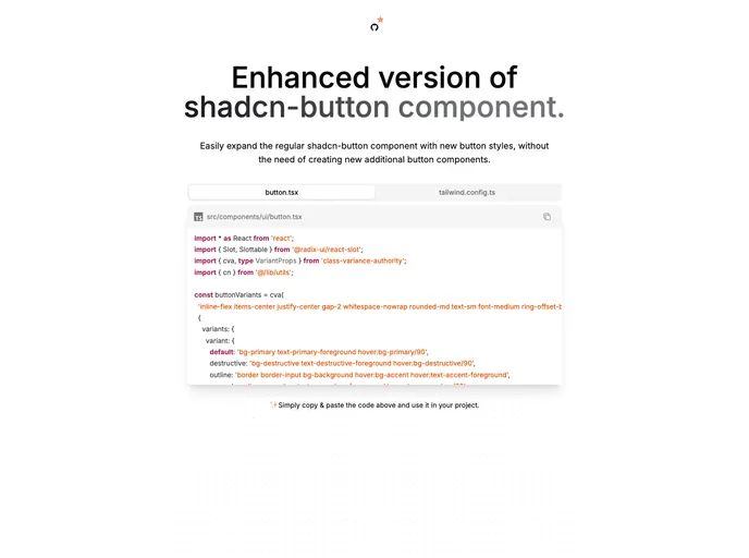
enhanced-button.vercel...
Enhanced Button
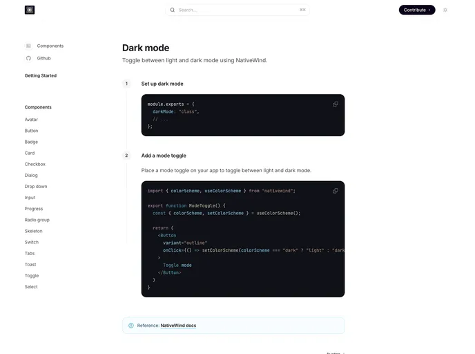
nativecn.mintlify.app
Nativecn UI
Primitives for Angular (Radix-NG) deliver accessible, low-level UI building blocks inspired by Radix UI. This unofficial port prioritizes accessibility, customization, and a developer-friendly API for incremental adoption in design systems. It ships with a base layer, clear docs, and a Storybook showcase to accelerate reliable UI.
Prism UI is a Tailwind-friendly React component library that extends shadcn/ui with accessible, TypeScript-first components and pre-built page sections. It accelerates building polished, brandable web apps with composable patterns and deep customization.
Nativecn is a React Native UI component library inspired by shadcn-ui, crafted for fast, themeable mobile apps. It delivers highly customizable, accessible components with built-in dark mode, CSS variables, and NativeWind compatibility, enabling teams to ship cohesive UIs with minimal setup.
Shadcn Solid is an unofficial, community-led SolidJS port of shadcn/ui. It provides accessible, customizable Solid components you can drop into apps to rapidly assemble a shared component library. Free, open source, and designed for teams seeking a consistent design system with minimal setup.
Sink is a free, open-source UI toolkit and boilerplate designed to accelerate front-end development within the Shadcn ecosystem. It bundles ready-made blocks, templates, and starter scaffolds tailored for Tailwind-based Nuxt/Next projects, enabling consistent design systems and rapid prototyping without vendor lock-in.
Enhanced Button is a drop-in upgrade for the shadcn button, delivering richer variants and cohesive, theme-ready styles with minimal code. Replace your existing button.tsx and copy a small set of Tailwind config lines to align all projects with a single, maintainable UI button standard.
Nativecn UI is a React Native component library inspired by shadcn-ui, delivering a cohesive, customizable set of mobile UI elements designed to speed app development. It provides themeable components, consistent design primitives, and a straightforward integration path for rapid prototyping and collaboration.
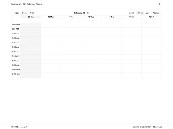
Shadcn UI Big Calendar is a Next.js open-source boilerplate that demonstrates dynamic, theme-aware styling by wiring Shadcn CSS variables into React Big Calendar. The calendar adapts instantly to the active theme, enabling rapid prototyping of themed scheduling dashboards.
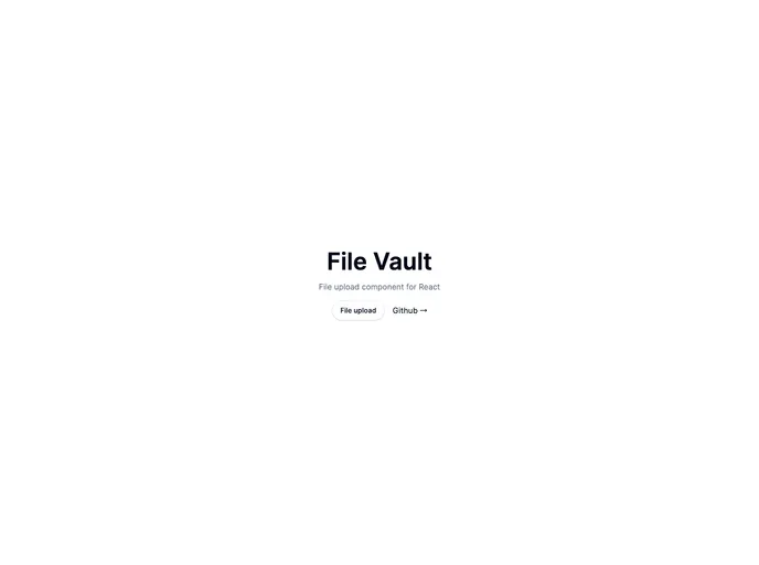
Open-source Vault UI kit for building secure, scalable file-management interfaces. File Vault provides ready-to-use components for file lists, folders, uploads, previews, search, and RBAC-friendly interactions—designed to plug into Shadcn-driven applications with clean APIs and accessible design.
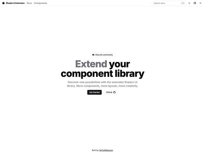
The Shadcn Extension provides accessible, customizable UI components that extend the Shadcn library. It enables you to preview every component, read integrated docs, and contribute with a streamlined workflow. Build consistent interfaces faster while staying aligned with your design system and community-driven improvements.
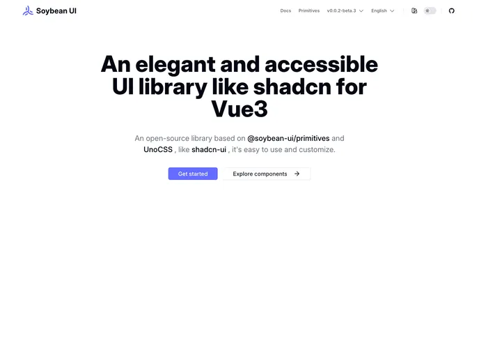
SoybeanUI is a clean, accessible UI library for Vue3, built on @soybean-ui/primitives and UnoCSS. It delivers elegant, production-ready components with easy theming and seamless integration. Lightweight yet powerful, it helps teams ship beautiful, responsive interfaces quickly while prioritizing accessibility and developer ergonomics.
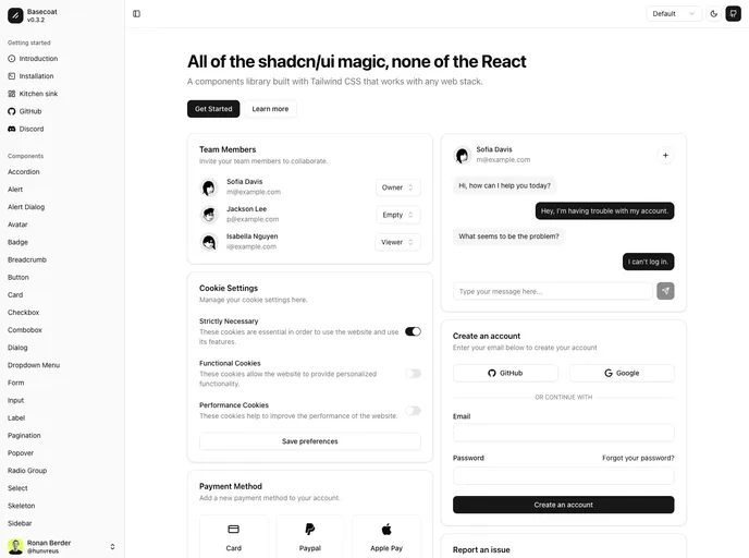
Basecoat is a modern, Tailwind-driven UI component library that works with any tech stack and doesn’t require React. It delivers accessible, themeable components you can drop into apps with minimal setup, helping you ship polished interfaces faster.
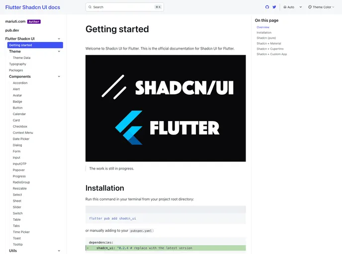
Flutter Shadcn UI is a community-driven Flutter port of the Shadcn UI component set, delivering a cohesive, design-token driven widget library for rapid app UIs. It includes Button, Card, Avatar, Input, Tooltip, Toast, and more, with consistent theming and accessible UX. The port is actively tracked by contributors on Twitter and is free and open-source.
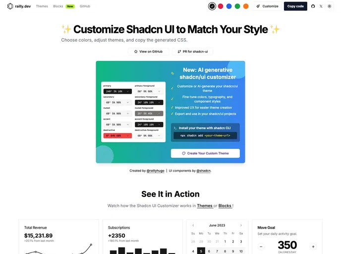
Shadcn UI Customizer is an open-source extension that lets you tailor Shadcn UI themes by tweaking CSS variables. It streamlines theming across React and Tailwind projects, enabling brand-consistent styles and faster iteration without modifying core components.
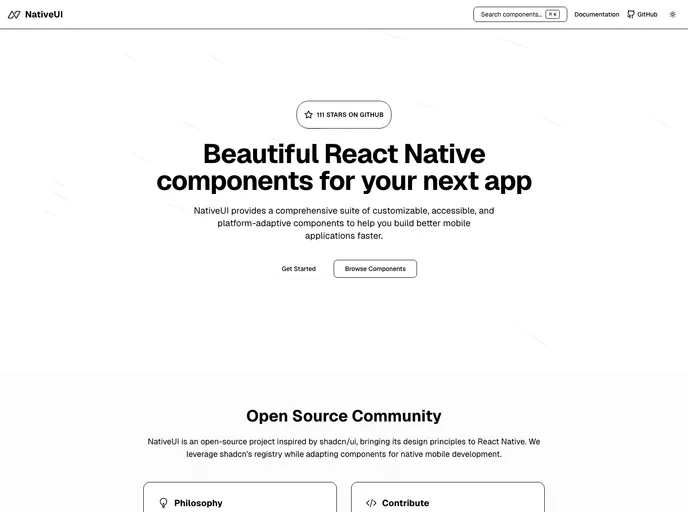
Native UI is a mobile-first React Native component suite focused on accessibility and rapid integration. Drop-in components can be pasted into RN projects with minimal setup, delivering polished, customizable UI for iOS and Android while prioritizing keyboard navigation and screen reader support.
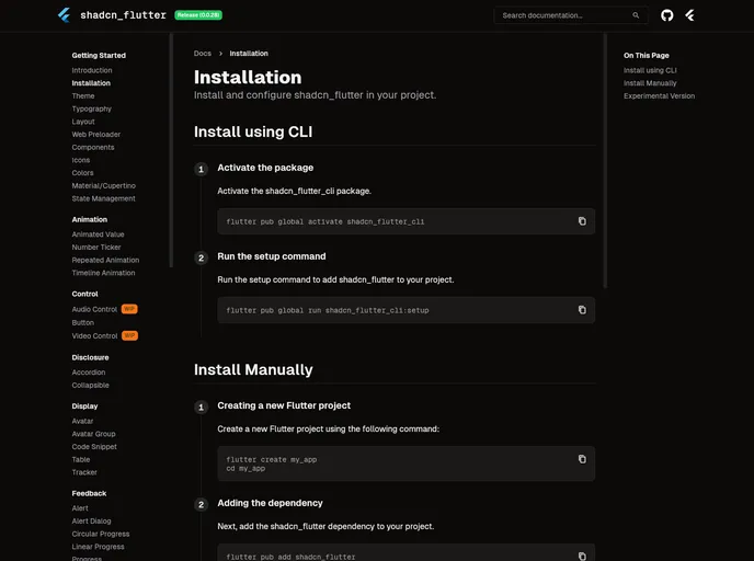
Shadcn Flutter ports the shadcn UI design system to Flutter, delivering a curated set of widgets, animations, forms, and layout utilities optimized for building polished Flutter web apps. With a CLI-friendly setup and theming support, it enables rapid UI composition with cohesive design tokens across projects.
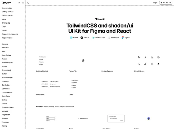
Myna UI is a TailwindCSS and shadcn/ui-based UI kit for React and Figma that helps teams rapidly prototype, theme, and ship modern interfaces. It provides a responsive, component-driven foundation with clear documentation, speeding design-to-dev handoffs and ensuring design-system consistency across projects.
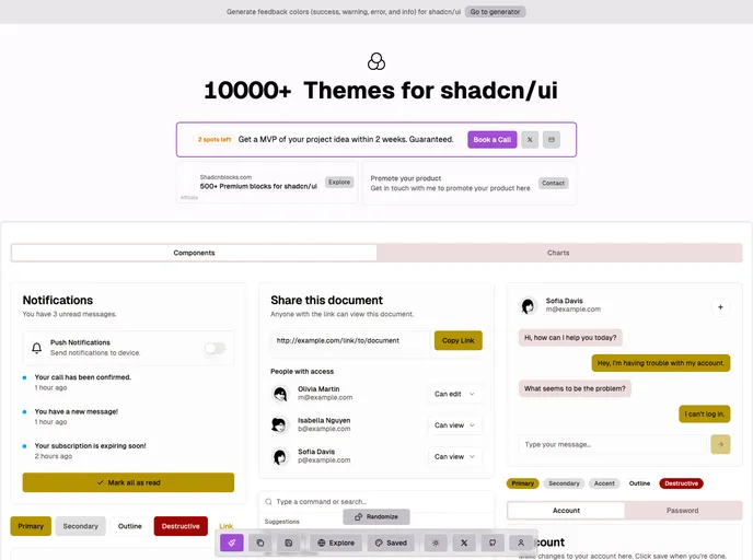
UI.jln.dev is a vast, open-source theme collection for shadcn/ui, offering 10k+ themes to color and style Next.js and React apps. It streamlines design exploration with instant theme switching, deep customization, and steady updates. Built for developers, it pairs seamless shadcn/ui integration with clear docs and an active community.