Premium blocks, templates & marketing.
55 products found
chaibuilder.com
Sdk
radix-ng.com
Primitives
uibuilder.app
UI Builder
beta.vimfn.in
Www
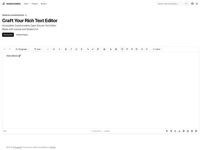
shadcn-editor.vercel.app
Shadcn Editor
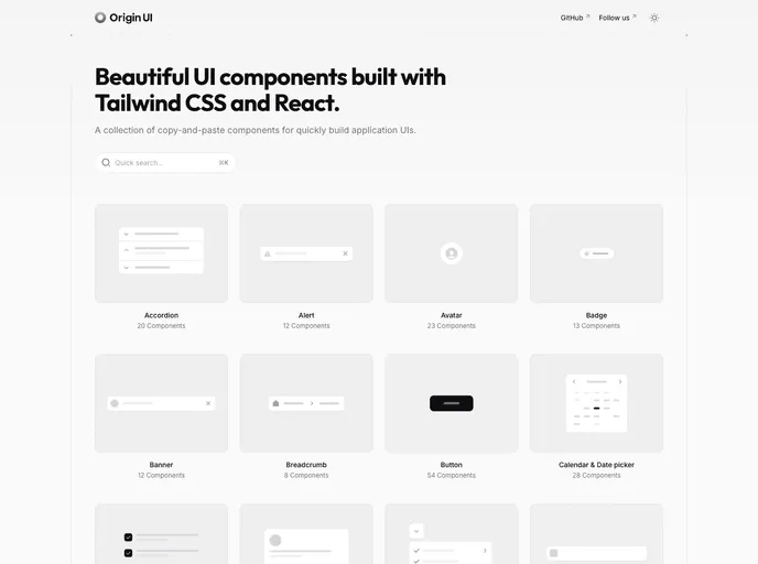
originui.com
Origin UI
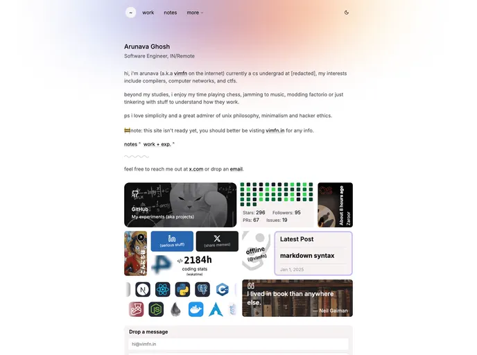
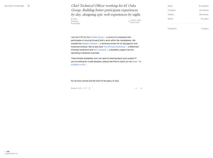
zacchary.me
Blog
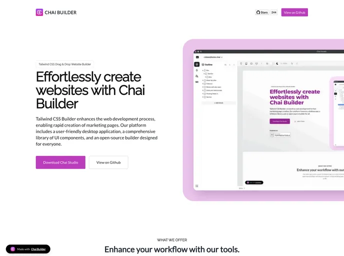
Chai Builder is an open-source low-code visual builder for React + TailwindCSS. Drag and drop blocks to compose web pages and email templates, then embed the component into any React app. It ships with a blocks catalog, customizable Tailwind configurations, and straightforward integration for rapid prototyping and design-system consistency.
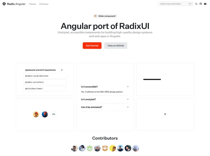
Primitives for Angular (Radix-NG) deliver accessible, low-level UI building blocks inspired by Radix UI. This unofficial port prioritizes accessibility, customization, and a developer-friendly API for incremental adoption in design systems. It ships with a base layer, clear docs, and a Storybook showcase to accelerate reliable UI.
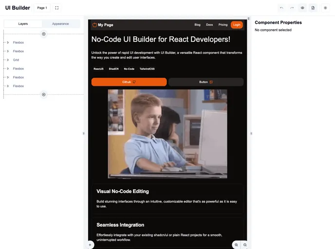
UI Builder for shadcn/ui is a React-based visual no-code editor that speeds UI creation and iteration. It ships with core components, supports custom components, and integrates seamlessly with existing shadcn/ui projects. Design landing pages, forms, and dashboards with a consistent theme, enabling rapid delivery for internal tooling and customer-facing apps.
Www is a lightweight frontend boilerplate built for React/Next.js with Tailwind, prioritizing minimalist design, fast performance, and responsive layouts. It enables quick onboarding: clone the repo, install dependencies, and start the dev server to prototype production-ready interfaces fast.
Shadcn Editor lets you host a private React component registry with a Next.js template. Define components, hooks, and pages in a registry.json and serve them as static JSON under public/r/[name].json, enabling easy distribution across projects. Fully compatible with the shadcn CLI for building and publishing—great for teams adopting a centralized design system.
Origin UI is a copy-paste component library for React and Next.js projects, designed to accelerate UI development with a consistent styling system, dark mode, and shadcn-friendly conventions. It streamlines setup by guiding you to copy registry files into your project, wire CSS variables, and adjust Tailwind config for fast, reliable UI integration.
Open-source Blog template built for Next.js and Tailwind, delivering a clean, content-first starting point for personal or project blogs. It emphasizes fast iteration, reusable UI components, and Markdown/MDX support to accelerate publishing.
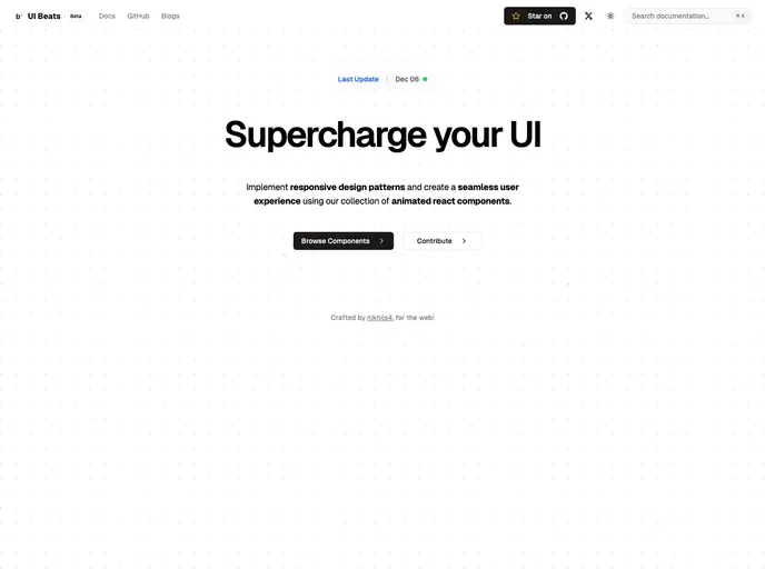
UI Beats is an open-source theme crafted for rapid UI prototyping. It offers thorough documentation, a clear contributing guide, and an MIT license, enabling teams to clone, install dependencies, and run a local dev server with ease. A practical starting point for OSS-friendly frontends and design-driven projects.
Open-source portfolio starter template for developers to showcase projects, blogs, and expertise. Built with Next.js and Tailwind, it emphasizes speed, accessibility, and easy customization, with clean, component-driven UI inspired by Shadcn patterns.
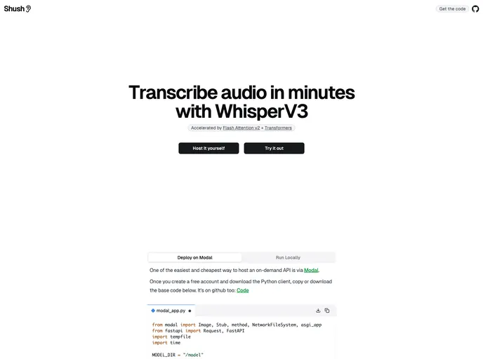
Shush demonstrates a WhisperV3 deployment with Flash Attention v2 on Modal, delivered through a Next.js UI. This end-to-end demo highlights on-demand, auto-scaling AI hosting and provides a reusable boilerplate for high-performance model workloads.
Enscribe.dev is a Next.js + Tailwind CSS blog boilerplate for personal information security. This open-source starter acts as a learning hub, practical reference, and inspiration for security-focused projects, featuring a TypeScript-first codebase and streamlined Vercel deployment for fast, interactive experiences.
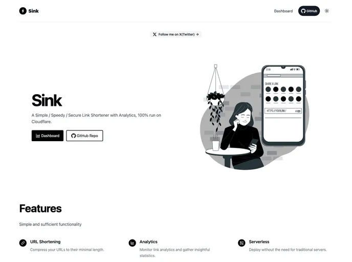
Sink is a free, open-source UI toolkit and boilerplate designed to accelerate front-end development within the Shadcn ecosystem. It bundles ready-made blocks, templates, and starter scaffolds tailored for Tailwind-based Nuxt/Next projects, enabling consistent design systems and rapid prototyping without vendor lock-in.
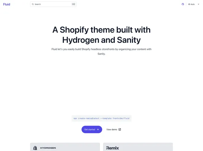
Fluid is a Hydrogen-based theme for Shopify headless storefronts, paired with Sanity CMS for real-time content editing and live previews. Build pages by assembling modular sections, mirroring Liquid-style workflows, while editors see updates instantly through visual editing and live previews.
Epigram is an open-source collection of Next.js + Tailwind ready boilerplates, UI blocks, and templates designed to accelerate site bootstrapping for news and content-driven projects. It includes theming presets and a Shadcn-style component registry for fast, cohesive UI.
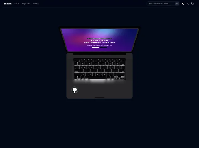
Shadxn is an experimental CLI that accelerates component-driven development by enabling seamless integration of shadcn-style components and dependencies into projects. It adds custom registry support, framework-agnostic compatibility, and streamlined project initialization with sensible defaults.
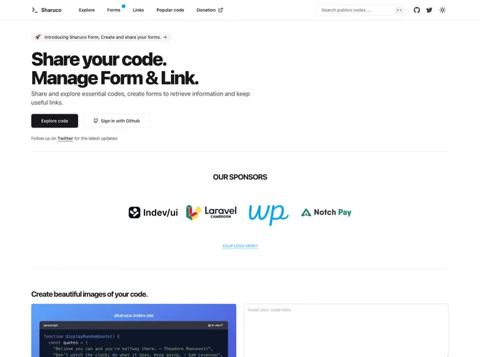
Sharuco is an open-source Next.js + React boilerplate delivering ready-to-use starter templates, modular UI blocks, and cohesive styling via Tailwind and SCSS. It emphasizes Shadcn-compatible components to speed up prototyping while ensuring design consistency across teams and projects.
React Fancy Switch delivers a polished, accessible multi-option toggle for React apps. It supports primitive and object options, smooth highlight transitions, and fully customizable styling for radios and the highlighter, enabling elegant, friction-free option switching in forms, dashboards, and settings UI.
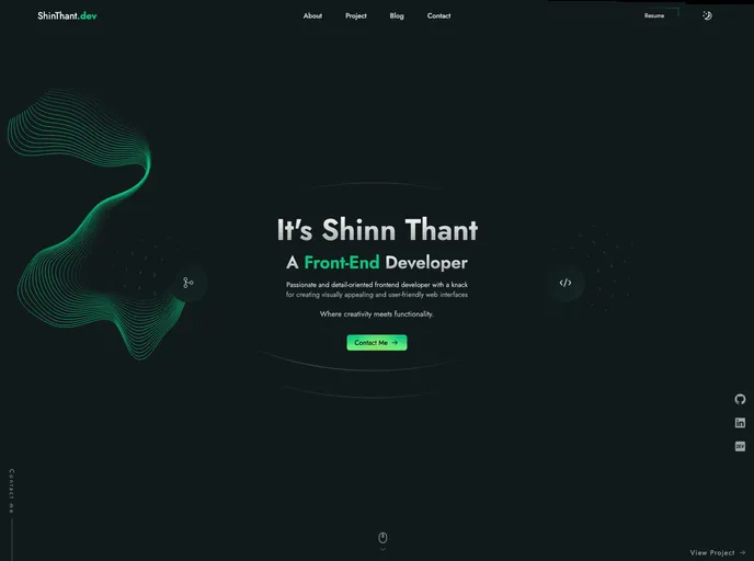
Shinthant.dev is a Next.js (SSG) portfolio boilerplate written in TypeScript, styled with Tailwind CSS and GSAP animations. It delivers a responsive, accessible, SEO-friendly personal site with light/dark themes and a streamlined clone-and-run workflow for rapid prototyping and project showcases.
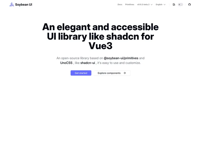
SoybeanUI is a clean, accessible UI library for Vue3, built on @soybean-ui/primitives and UnoCSS. It delivers elegant, production-ready components with easy theming and seamless integration. Lightweight yet powerful, it helps teams ship beautiful, responsive interfaces quickly while prioritizing accessibility and developer ergonomics.
An Astro-powered personal site starter designed for speed, simplicity, and a polished portfolio. This lightweight template highlights modern design while keeping development fast and approachable, ideal for quickly showcasing work with minimal setup.
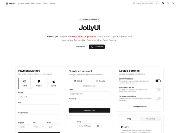
Jolly UI is a fast, accessible collection of React ARIA components designed for quick integration into any app. Built for accessibility, customization, and open-source collaboration, these components let you ship polished, keyboard-friendly UI with minimal boilerplate.
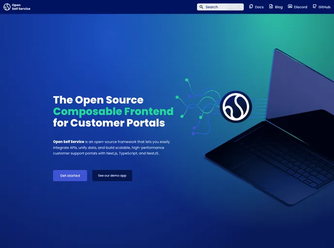
Open Self Service (O2S) is an open-source development kit for building composable customer self-service portals. It weaves multiple headless APIs into a scalable Next.js frontend, enabling tailored, maintainable portals. With a TypeScript-powered stack and API harmonization, you can swap backend services without frontend changes.
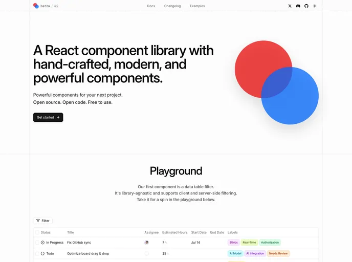
Bazza UI is an open-source UI framework that streamlines web app development with flexible, composable components and solid documentation. Built for React and Next.js workflows, it helps teams ship polished interfaces faster. MIT-licensed and community-driven, it invites collaboration and contributions.
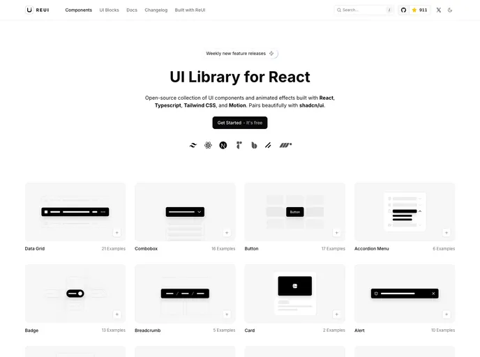
ReUI is an open-source React UI component library that blends a fresh aesthetic with motion-driven interactivity. Built on React, TypeScript, Tailwind CSS, and Motion, it delivers polished, reusable components that play well with shadcn/ui, boosting developer productivity and UI consistency across apps.
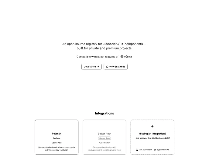
Zeta is an open-source registry for shadcn/ui components that securely distributes private or premium widgets. Integrated with Polar.sh for license key management and validation, it delivers precise access control so teams can focus on building. With clear docs and robust protections, Zeta makes publishing, sharing, and consuming components easy and safe.
Thien.me is a curated, open-source collection of boilerplates, templates, and UI kits built on Next.js, Tailwind, and Shadcn UI. It accelerates prototyping and production launches with modular components, Prisma/Supabase-ready backends, Notion-inspired content blocks, and a Theme Generator for fast styling.
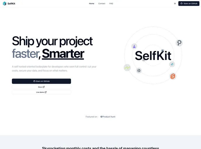
SelfKit is a self-hosted SaaS boilerplate designed for developers who want speed without vendor lock. It emphasizes open-source tooling and Docker-compatible hosting (Coolify or similar), delivering essential SaaS foundations—auth, payments, SEO, blog, analytics—plus a reusable UI kit and internationalization hooks.
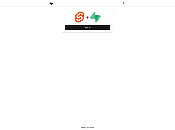
Efficient SvelteKit + Supabase boilerplate that jump-starts full-stack apps with built-in auth, realtime data, and a Tailwind-based UI scaffold. It delivers sensible defaults, type-safe data access via drizzle-orm, and serverless-ready deployment for Vercel, making rapid prototyping and production-ready builds easier.
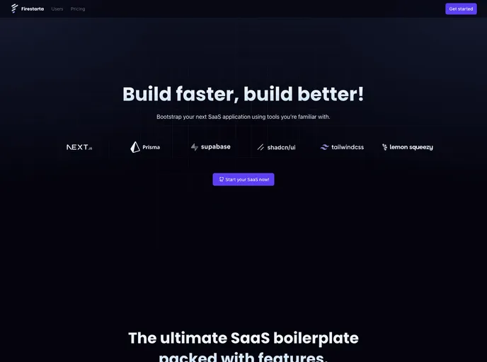
Firestarta is a Next.js SaaS boilerplate that jump-starts authenticated, subscription-based apps. Built with Prisma + Postgres (via Supabase), NextAuth, TypeScript, and Lemon Squeezy, it ships with app routing, user profiles, account management, and a reusable component library to accelerate SaaS delivery.
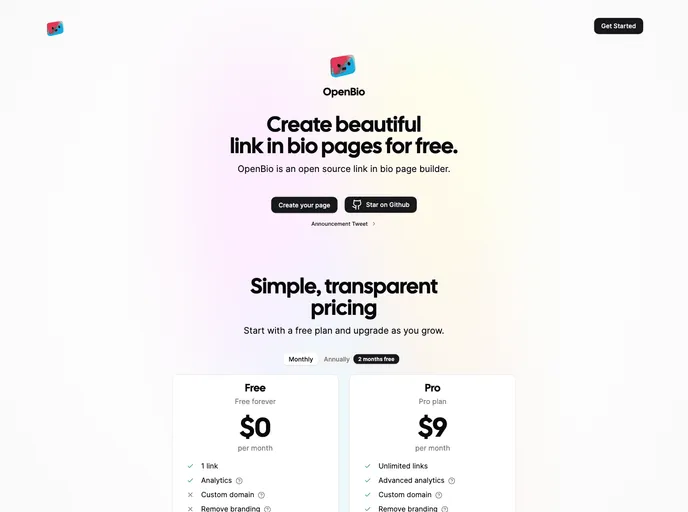
OpenBio is an open-source link-in-bio page builder for crafting customizable bio landing pages. It emphasizes easy local setup, environment-variable configuration, and a collaborative model for developers to tailor pages for campaigns, brands, or creator profiles.
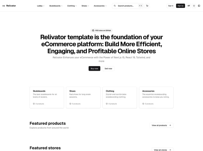
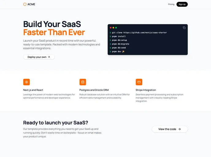
Relivator Next.js Template is a production-ready Next.js 14 starter that streamlines project setup with multi-auth, integrated tooling, and effortless deployment. Ideal for rapid prototyping, reliable production apps, and scalable SaaS ventures.
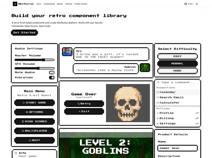
8bitcn UI is a retro-inspired component library that blends nostalgic visuals with modern accessibility. MIT-licensed and open source, it’s easy to drop into projects, customize, and contribute. Ideal for rapid prototyping, cohesive theming, and inclusive interfaces across web apps.
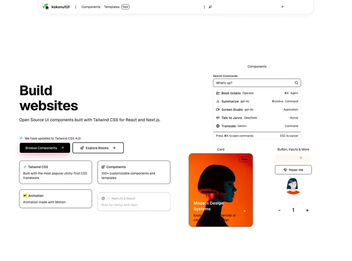
Kokonut UI is an open-source collection of TailwindCSS-powered UI components designed for design engineers and developers. Built with Motion for React and Next.js, it delivers accessible, ready-to-use components. Clone, install, and accelerate UI development in your React or Next.js apps.
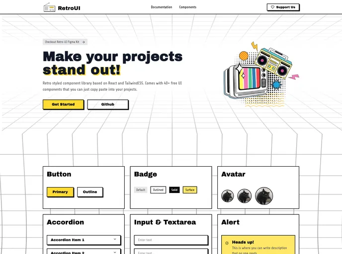
RetroUI is a retro-inspired Tailwind CSS component library for modern web apps. It blends classic UI aesthetics with a utility-first workflow and solid documentation, enabling rapid prototyping and production-ready interfaces with minimal setup.
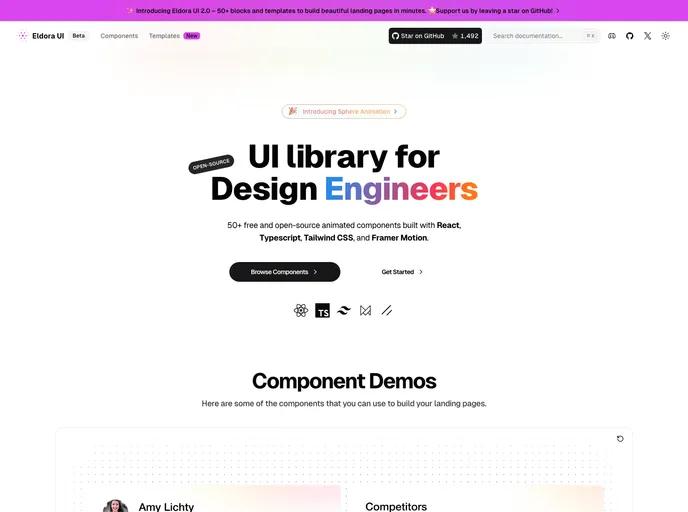
Eldora UI is an open-source React component library with TypeScript, Tailwind CSS, and Framer Motion-driven animations. Fully customizable and modular, these reusable UI elements accelerate modern web development and empower teams to prototype and ship polished interfaces quickly.
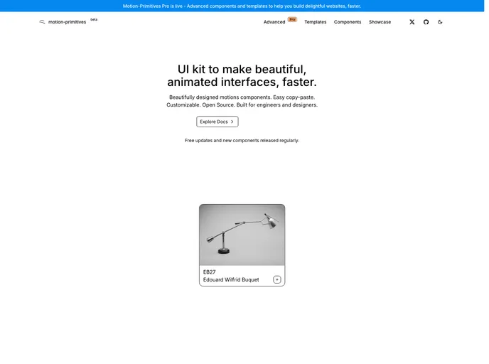
Motion Primitives delivers a ready-made library of motion components built with Framer Motion and Tailwind CSS. It’s designed for rapid, polished interactions in React apps, with a cohesive motion design system. The project is in beta with frequent updates and an MIT license, enabling fast iteration and open collaboration.
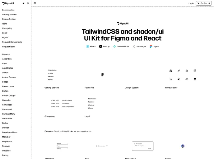
Myna UI is a TailwindCSS and shadcn/ui-based UI kit for React and Figma that helps teams rapidly prototype, theme, and ship modern interfaces. It provides a responsive, component-driven foundation with clear documentation, speeding design-to-dev handoffs and ensuring design-system consistency across projects.
Pro Motion Primitives provides handcrafted motion components and templates to empower developers to add fluid, interactive animations to modern web apps. Built for React and Tailwind ecosystems, it enables fast, performance-friendly UI motion that enhances engagement while keeping accessibility and maintainability in focus.
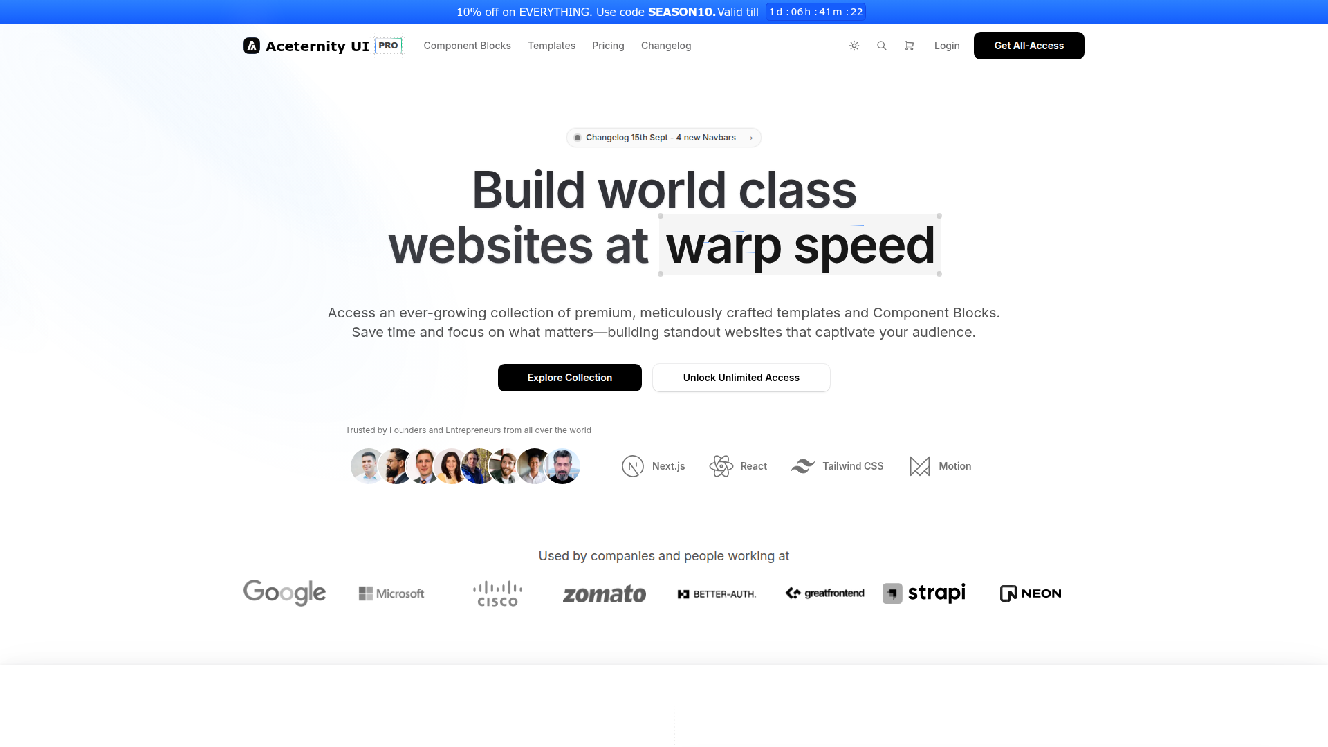
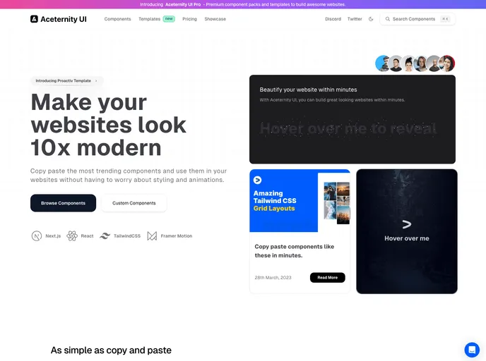
Aceternity UI Pro is a developer-first UI toolkit for rapid Next.js + Tailwind projects, delivering ready-made templates, a robust UI kit, a rich block library, boilerplates, a Theme Generator, and AI-assisted prototyping. It accelerates design-to-code workflows within the Shadcn ecosystem, helping teams ship polished interfaces faster.
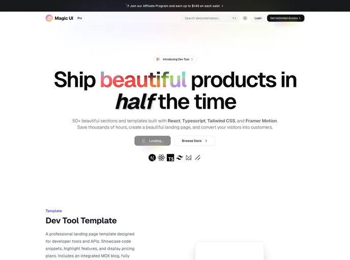
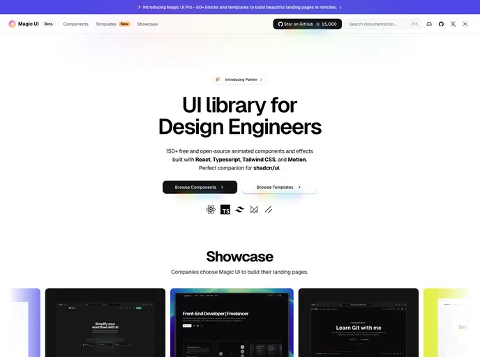
Magic UI Pro accelerates UI creation with a rich React/TS/Tailwind toolkit. Explore 50+ sections and templates, animated with Framer Motion, and ready for responsive, accessible interfaces. Perfect for developers who want fast, polished UI foundations and smooth, scalable customization.
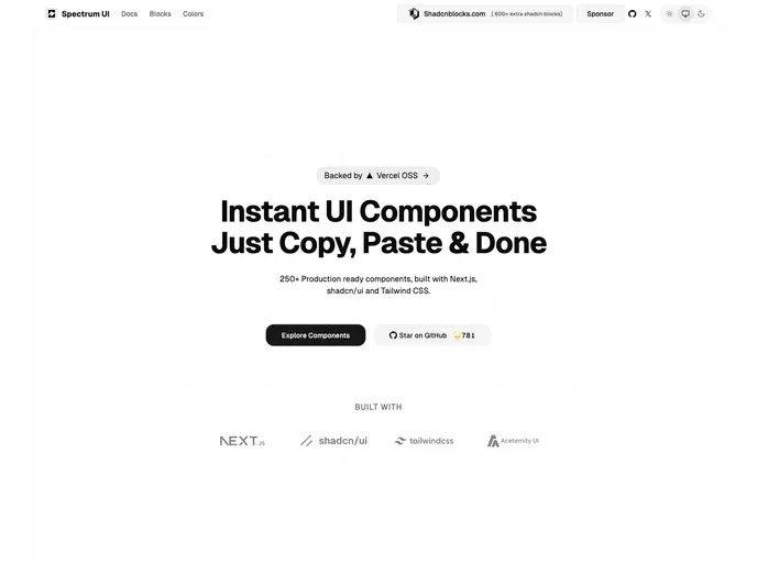
Spectrum UI is an open-source component library where developers contribute bug fixes, new features, and improvements. This guide outlines a clear, Git-driven workflow: fork, branch, implement, test, and submit pull requests. Join the community and help evolve Spectrum UI with collaborative contributions.
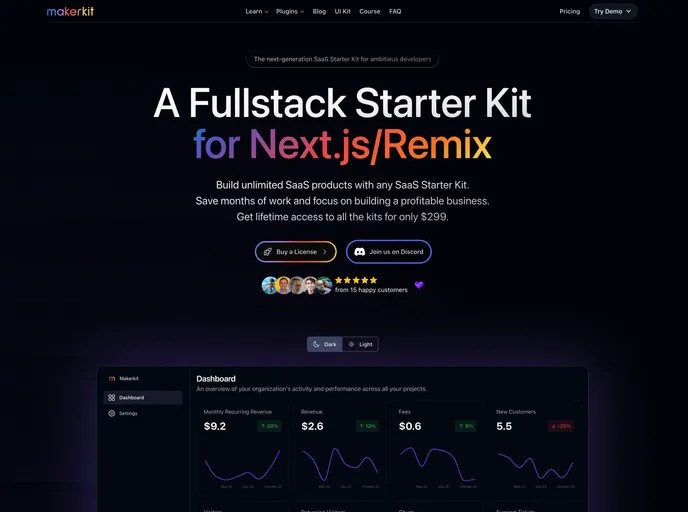
Makerkit is a turnkey starter kit that accelerates modern web app development with Next.js, Remix, React, Tailwind, and Shadcn UI. It delivers production-ready boilerplates, ready-made components, and data/auth integrations (Firebase/Supabase) for fast prototyping and scalable production apps.
Aceternity UI is a React + Tailwind component library that speeds UI construction with ready-made, copy-paste components. It emphasizes consistent design, rapid prototyping, and approachable documentation, helping teams ship polished interfaces quickly.
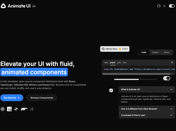
Animate UI is a beta toolkit of customizable UI components designed to accelerate interface prototyping. It offers modular primitives, clear docs, and ongoing updates. As an open-source project under the MIT license, it invites community contributions to shape the final product while you experiment with early features.
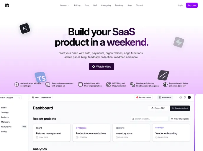
Nextbase Pro is a comprehensive SaaS starter kit built with Next.js and Supabase. It delivers core auth, payments, orgs, edge functions, an admin panel, blog integration, feedback collection, and changelog/roadmap tooling, providing an all-in-one, scalable foundation for rapid SaaS development.
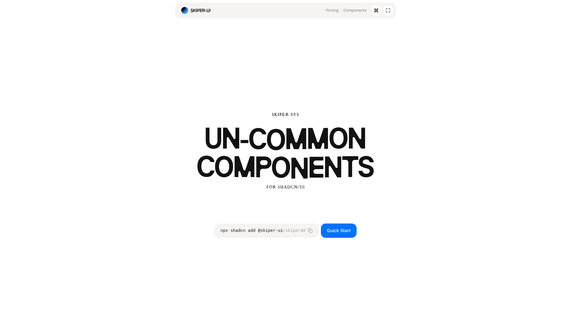
Skiper UI is an open-source component library focused on accessibility, customization, and rapid integration. With copy-and-paste ready components, you can assemble polished interfaces fast while maintaining a cohesive design system across apps.
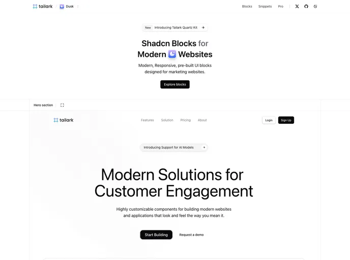
Tailark Blocks delivers a responsive library of pre-built UI blocks for marketing sites, based on shadcn-UI and TailwindCSS. It accelerates page assembly with ready-to-use components and a lightweight footprint—just run the dev server and preview in moments. Open-source and highly customizable.
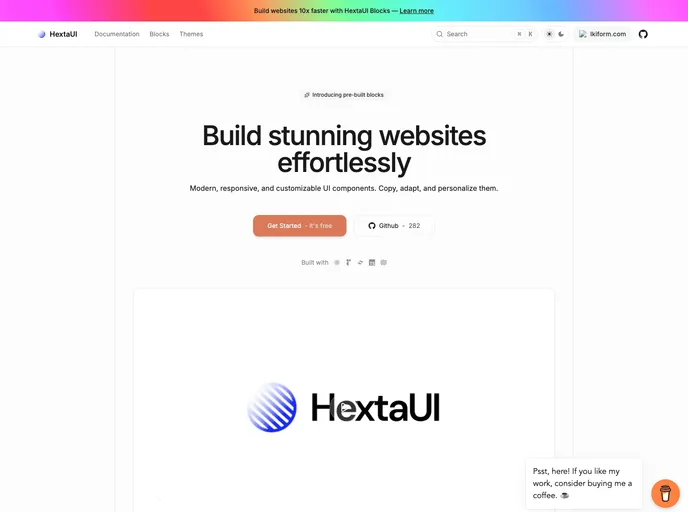
HextaUI is an open-source toolkit of modern, responsive UI components you can copy, adapt, and brand to ship polished web interfaces faster. Designed for developers who value both aesthetics and accessibility, it pairs ready-made blocks with clear docs and thriving community contributions, balancing speed with robust functionality.
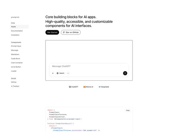
Prompt Kit is a free, open-source collection of high-quality, customizable UI components built for AI apps. It accelerates building chat experiences, AI agents, autonomous assistants, and related interfaces, delivering polished, consistent UIs that scale with your AI projects.
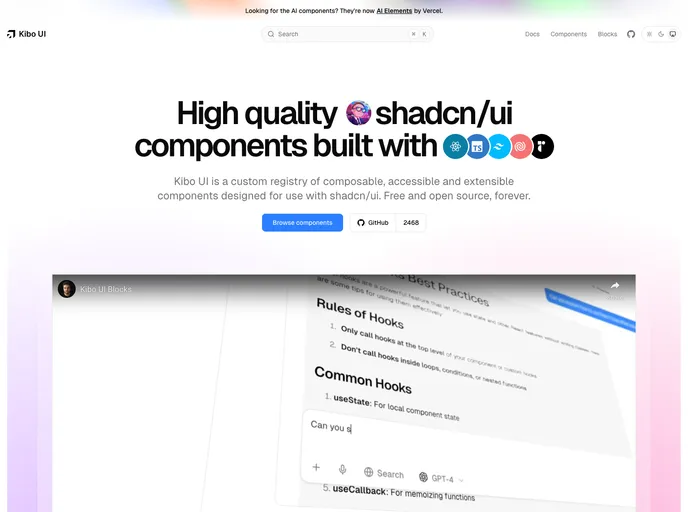
Kibo UI is a curated registry of composable, accessible, open-source UI building blocks designed to pair with shadcn/ui. Leveraging shadcn/ui CSS variables, these components slot into existing primitives to speed UI assembly, reduce boilerplate, and support responsive, theme-friendly interfaces.
Nextjs SaaS Starter is an open-source, zero-config boilerplate for building scalable SaaS apps with Next.js. It blends Tailwind CSS, Drizzle-ORM, and a solid multi-tenant foundation with pluggable auth and API routes, helping teams ship MVPs and production-grade features faster.
shadcn/ui is a React component library built on Radix UI and Tailwind CSS, designed for a copy-paste workflow. It ships as self-contained components you can browse in a central registry, paste into your project, and customize with no external dependencies. A CLI manages components across apps, delivering fast, accessible UIs out of the box.
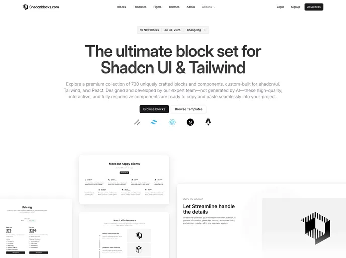
Shadcnblocks extends Shadcn UI with a premium library of ready-to-use blocks and components for Tailwind CSS, built on top of shadcn/ui. This collection enables rapid, consistent UI assembly—from hero sections and features to galleries and dashboards—accelerating prototyping and production UI.
Magic UI offers a sleek, modern design system you can drop into any project. With a clean visual language, responsive behavior, and straightforward customization, it helps you ship polished interfaces faster. MIT-licensed and open source, it’s ideal for prototyping, marketing sites, and SaaS dashboards alike.
AI Elements is an open-source TypeScript toolkit for accelerating AI-powered web apps. Designed to slot into Next.js projects, it offers pre-built AI UI components and a flexible, extensible architecture so developers can ship intelligent experiences—from responsive chat UIs to AI-enabled workflows—faster with fewer boilerplate efforts.