Premium blocks, templates & marketing.
40 products found
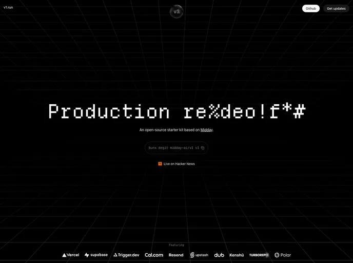
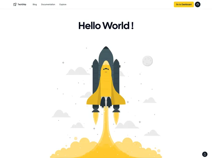
v1.run
V1
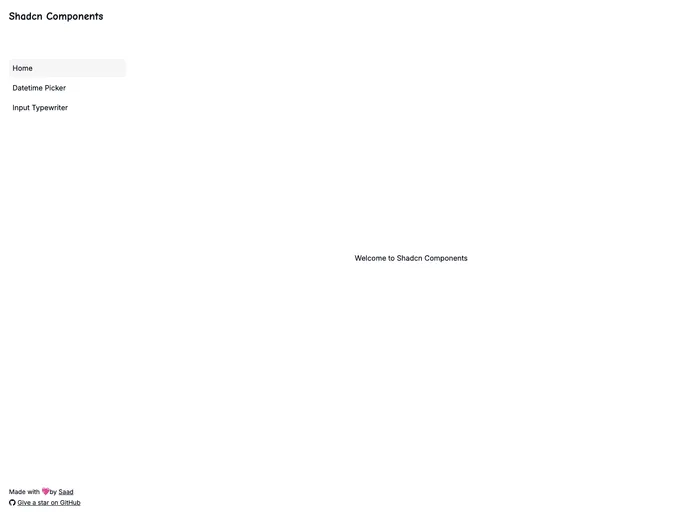
shadcn-datetime-picker...
Shadcn Datetime Picker
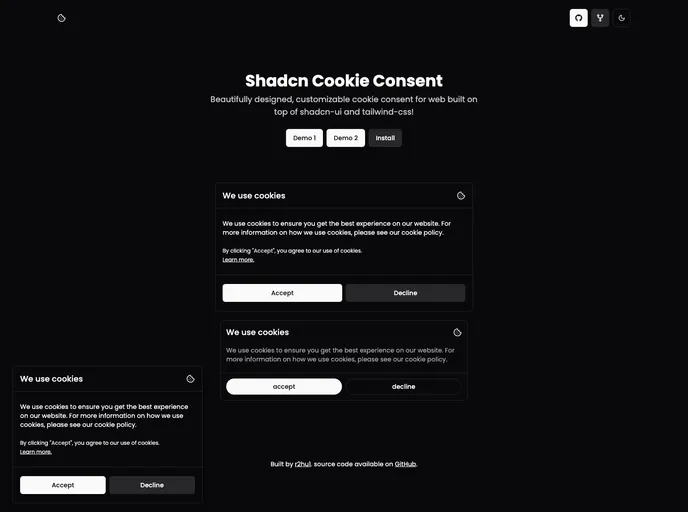
shadcn-cookie-consent....
Shadcn Cookie Consent
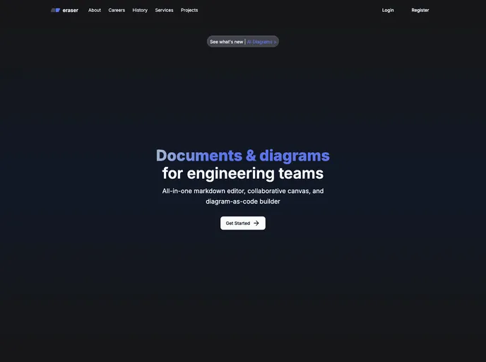
eraser-kaif.vercel.app
Eraser_clone
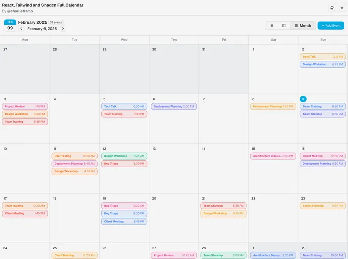
calendar-shadcn.vercel...
Calendar
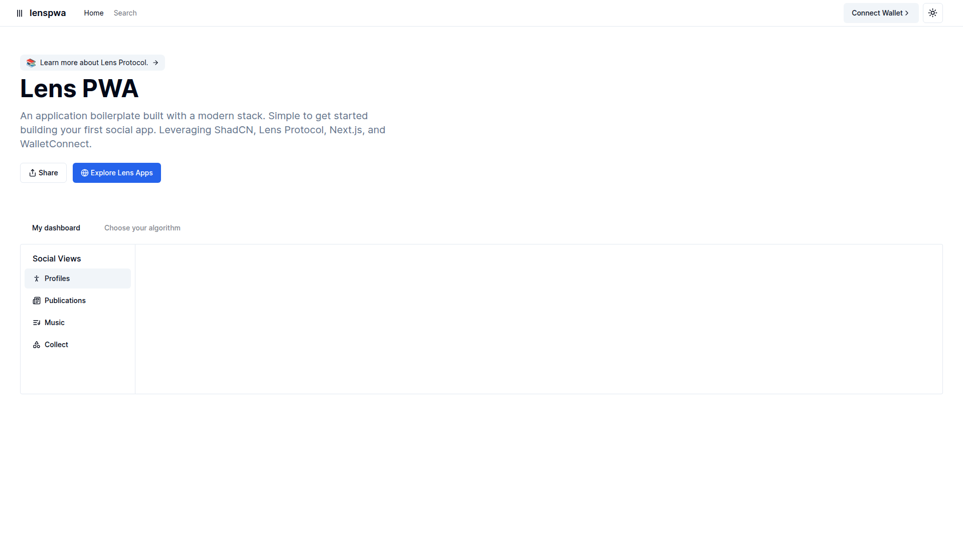
lens-pwa-lyart.vercel.app
Lens Pwa
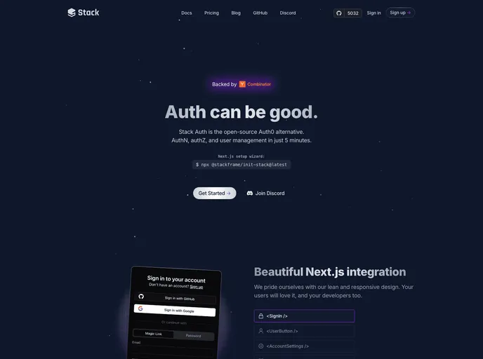
stack-auth.com
Stack
V1 (hero theme) is an opinionated, production-ready Next.js SaaS starter that bundles a modern stack—Turborepo, Biome, TailwindCSS, shadcn, TypeScript, Supabase, Upstash and email/observability tools—to accelerate development, enforce best practices, and scale with your product.
Shadcn Datetime Picker is a compact, reusable UI component for selecting dates and times in Shadcn-based apps. It includes a dedicated time picker and is designed to work smoothly inside popovers. Version 2 fixes layout stability and simplifies integration with a script tag, CSS import in head, and straightforward JS initialization.
Shadcn Cookie Consent provides a ready-to-use, Tailwind-based cookie consent banner built with Shadcn UI. It ships as a client component with two visual variants (Smallpreview and Defaultpreview) and is easy to drop into Next.js or React apps. Fully customizable via CSS, Tailwind config, or Shadcn theme to match your brand while helping you meet cookie regulations.
Eraser_clone is a Next.js 14-based replica of Eraser.io, showcasing a modern stack with Tailwind CSS, Shadcn/UI, Convex DB, and Kinde Authentication. It serves as a practical, open-source boilerplate for learning, prototyping, and collaborating on frontend architecture while staying production-ready.
React/ShadCN Calendar: a Tailwind-first, dashboard-focused calendar component. Built with ShadCN patterns and Radix UI accessibility, it supports dark mode, responsive layouts, multiple views, and robust event management. Fully customizable and ready for seamless integration into React apps.
Lens Pwa is a Next.js + Tailwind-based PWA scaffold featuring modular UI blocks and templates for rapid app development. Open-source and deployment-ready on Vercel, it emphasizes a clean project structure, performance, and easy reuse of components across pages.
Stack is a Next.js + React starter kit with prebuilt authentication flows, Tailwind CSS and Shadcn UI integration, and deployment-ready boilerplate. It accelerates full-stack app kickoffs with modular components, accessible design, and a scalable architecture.
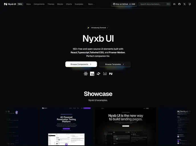
nyxbui.design offers a lightweight, open-source UI kit with thorough docs, contribution guidance, and flexible deployment options. Explore authors, project statistics, star history, and MIT licensing. Deploy quickly on Vercel with Next.js, Tailwind, and Radix UI components.
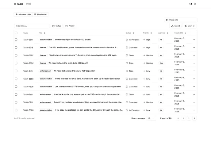
Next.js-based Shadcn Table component styled with Tailwind and powered by TanStack React Table. It provides server-side pagination, sorting, and filtering, plus debounced search and dynamic facet filters. The project is in active development and not yet production-ready.
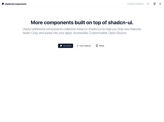
Shadcn UI Expansions extend the shadcn/ui toolkit with ready-to-use components for faster, scalable UI development. Features include advanced multi-select, loading buttons, and infinite scroll—drop-in code you can copy, paste, and tailor to your app. Free and open source for personal and commercial use.
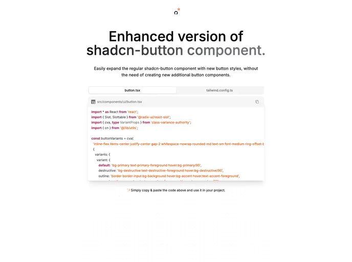
Enhanced Button is a drop-in upgrade for the shadcn button, delivering richer variants and cohesive, theme-ready styles with minimal code. Replace your existing button.tsx and copy a small set of Tailwind config lines to align all projects with a single, maintainable UI button standard.
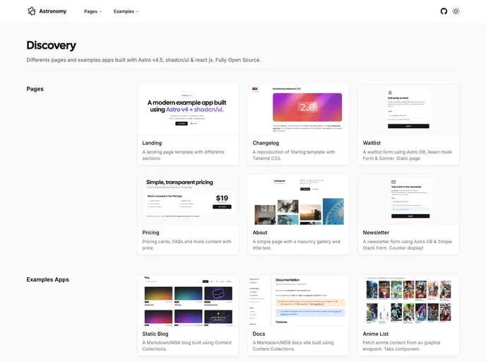
Astro Nomy is an open-source starter for Astro v4 and shadcn/ui that demonstrates a modern app with authentication, subscriptions, API routes, MDX docs, and Content Collections. This experimental project showcases practical patterns for building scalable, well-typed apps while keeping styling minimal and ready for customization.
Next.js-based personal site starter with Lucide icons, Upstash-backed claps, Next MDX Remote blog rendering, Tailwind styling, and a clean, modular structure ready for Vercel deployment. A practical boilerplate for fast portfolio sites and blog-driven personal brands, with clear API routes and scalable components.
A Next.js 14 boilerplate monorepo powered by Turborepo. It uses the new router, server components, and multi-app workflows to accelerate development in a single repo. Includes Clerk authentication, Radix UI with Tailwind, TypeScript-first tooling (ESLint/Prettier), and Vercel remote caching for fast builds.
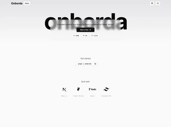
Onborda is a lightweight Next.js onboarding flow with Framer Motion animations and Tailwind CSS styling. It provides fully customizable tooltips, supports multiple product tours, and ships with ready-to-use Global layout.tsx and Components & page.tsx scaffolding for rapid integration into modern web apps.
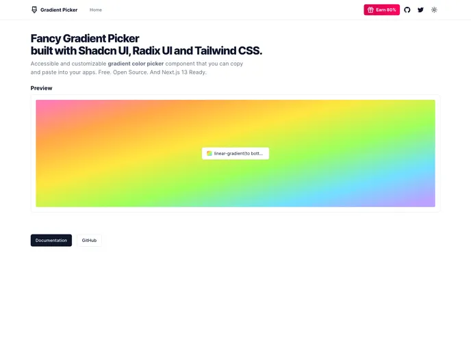
Gradient Picker is a lightweight tool to discover, tweak, and export gradients and color themes for UI design. Built with Shadcn UI, Radix UI, and Tailwind CSS, it delivers real-time gradient previews, solid colors, and background-image blends. Free and open source, with live examples and clean code/docs to accelerate theming in Shadcn projects.
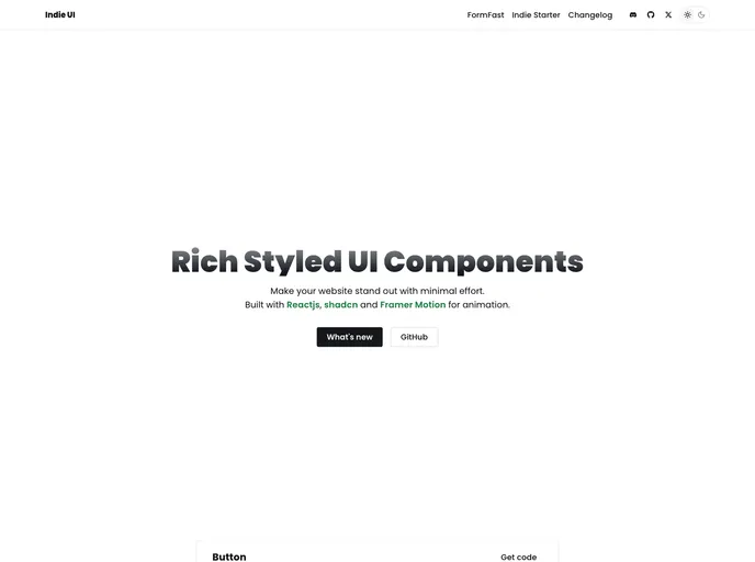
Indie UI is a free, open-source collection of React components designed for rapid web app development. Tailwind CSS-ready and npm-installable, it offers ready-to-use UI blocks you can import and compose into production interfaces with minimal setup. Ideal for prototyping, dashboards, and MVPs.
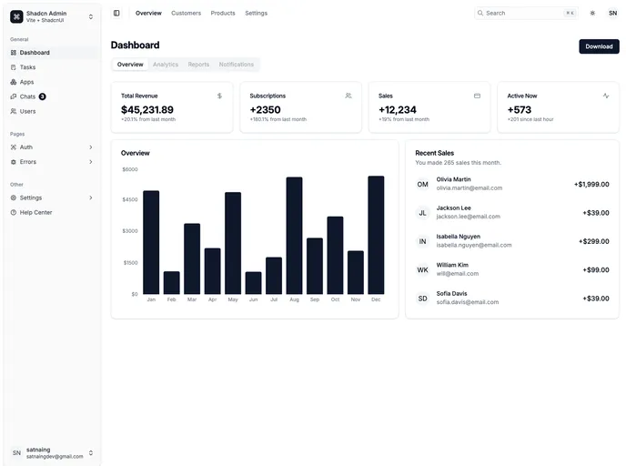
Shadcn Admin is a reusable admin dashboard boilerplate built with ShadcnUI, Tailwind, and Vite. It delivers responsive, accessible UI elements with light/dark modes, sidebar/header layouts, and 10+ pages for rapid admin app prototyping.
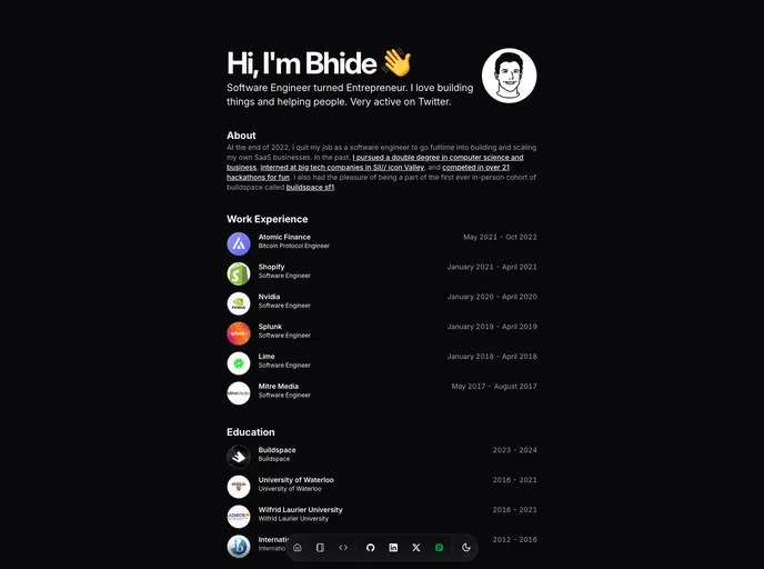
Bhide Portfolio Template is a minimalist, developer-first portfolio starter built with SvelteKit, TypeScript, and TailwindCSS. Open-source and Vercel-optimized, it helps you showcase projects, skills, and career journey with a clean, modern interface—designed for fast setup and effortless deployment.
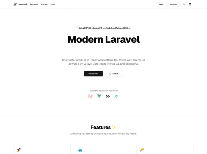
Larasonic Vue is a modern, open-source SaaS starter kit combining Laravel, Vue.js, TailwindCSS, and Inertia to accelerate SaaS development with production-grade boilerplate, API-first design, payments, AI hooks, and a flexible UI with FilamentPHP admin.
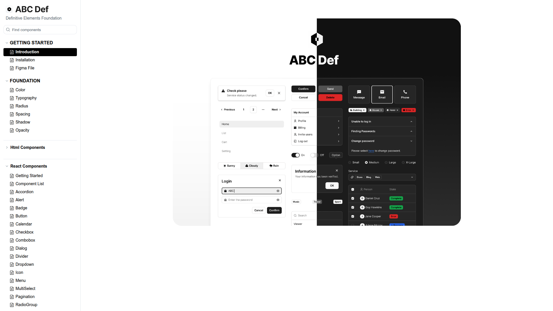
ABC Def (ABC Studio's Definitive Elements Foundation) is a headless design system that streamlines web component development with a three-tier token scheme and Headless UI primitives. It enforces consistency while enabling flexible customization, backed by a Turborepo-based monorepo, Tailwind CSS, and React. Organized into focused packages with thorough docs, it accelerates building responsive, accessible UIs and scalable themes for teams.
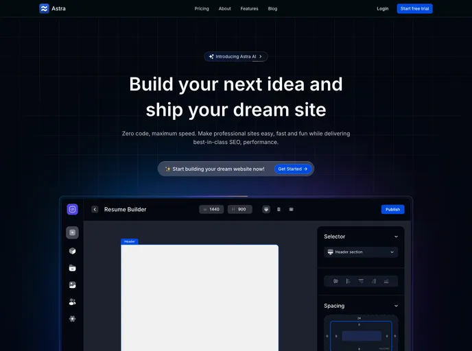
Astra is a modern Next.js starter kit styled with TailwindCSS and shadcn UI, featuring Clerk-powered authentication and SSR-ready rendering. It delivers a responsive, production-ready scaffold for marketing sites, dashboards, and SaaS front-ends—speeding up prototyping with a cohesive design system.
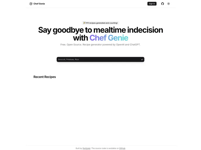
Chef Gpt is a developer-friendly boilerplate for AI-powered recipe apps built with Next.js and Shadcn UI. It scaffolds OpenAI/ChatGPT integration, UI primitives, authentication, and data handling, plus deployment-ready patterns. Still in active development and not recommended for production use.
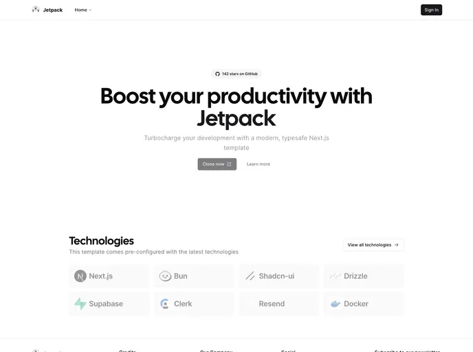
Jetpack is an open-source Next.js starter template that pairs Next.js, Supabase, Tailwind, Clerk, Drizzle ORM, and shadcn/ui with Docker-based deployment and Resend-powered emails. Deployed on Vercel and welcoming community contributions.
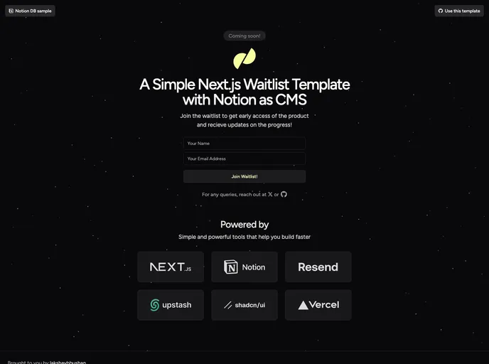
Next.js Notion Waitlist Template lets you spin up a production-ready waitlist using Next.js 14 and Notion as a CMS, with no backend required. It adds lightweight rate limiting via Upstash Redis, email workflows with Resend, and a UI built on shadcn/ui, Magic UI, and Tailwind. Deploy to Vercel and wire up env vars (NOTION_SECRET, NOTION_DB, RESEND_API_KEY, UPSTASH_REDIS_REST_URL, UPSTASH_REDIS_REST_TOKEN) for instant go-live.
A ready-to-run Next.js 14 e-commerce boilerplate with admin panel, TypeScript, Prisma, Tailwind, and shadcn/ui. It combines React Server Components, MDX-powered blogs, Cloudinary uploads, cookie-based auth, SEO/i18n support, and production-ready patterns to bootstrap online stores fast.
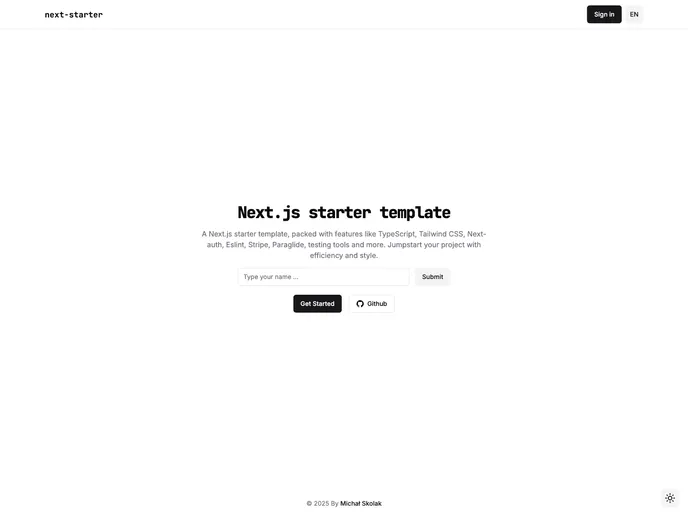
Next Starter is a robust Next.js 14 boilerplate with App Router, TypeScript, Tailwind, and a ready-made DevOps setup. It ships with Next-auth, Prisma, Zod, React Hook Form, Jest, RTL, Playwright, and Shadcn UI, plus linting, pre-commit hooks, and GitHub Actions to accelerate reliable, scalable app development from day one.
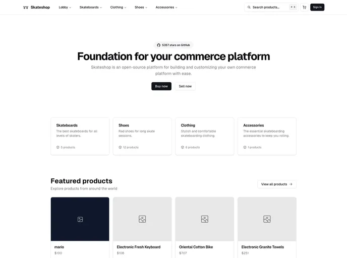
Skateshop is an open-source Next.js 14 e-commerce scaffold styled with Tailwind CSS and powered by Drizzle ORM. It delivers essential storefront capabilities—user management, email workflows, content management, and Stripe-based payments—designed as a developer-friendly starting point for rapid customization. Note: development in progress and not recommended for production use.
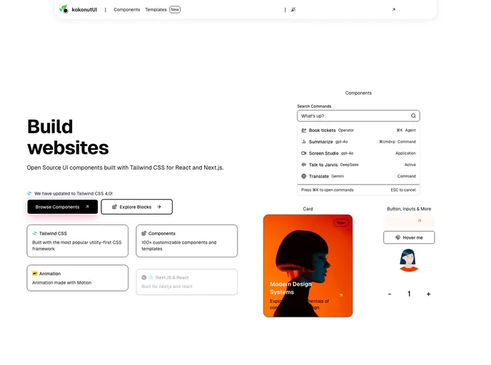
Kokonut UI is an open-source collection of TailwindCSS-powered UI components designed for design engineers and developers. Built with Motion for React and Next.js, it delivers accessible, ready-to-use components. Clone, install, and accelerate UI development in your React or Next.js apps.
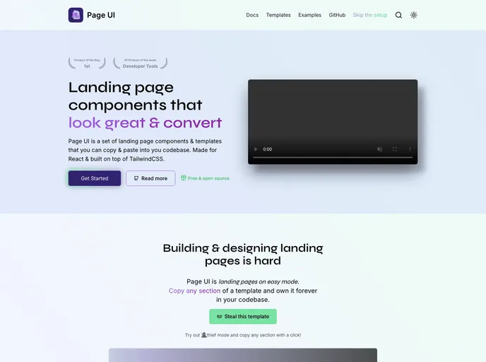
Page UI is a turnkey library of landing-page templates, components, and examples for React and Next.js. Open-source and Tailwind CSS–friendly, it provides a fast, customizable starter experience with a CLI scaffold and ready-to-implement pages—an approachable alternative to Shadcn UI for web projects.
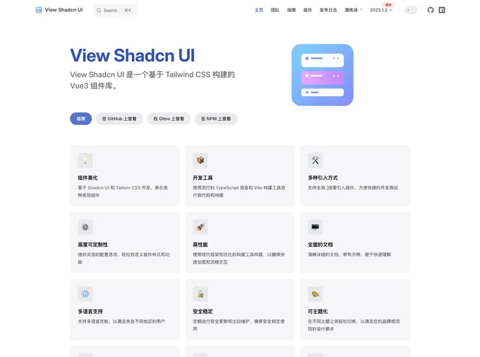
View Shadcn UI is a Vue 3 component library built on Tailwind CSS, delivering a ready-to-use collection of modular UI elements for Vue apps. With simple installation and straightforward imports, you can quickly assemble consistent, scalable interfaces while keeping code clean and maintainable.
UI Layouts is an open-source component library that streamlines website development with ready-to-use, creatively designed UI blocks. It focuses on essential, reusable components suitable for landing pages, dashboards, and marketing sites, while fitting Tailwind CSS and Framer Motion workflows. Ongoing contributions keep the library fresh for developers and designers alike.
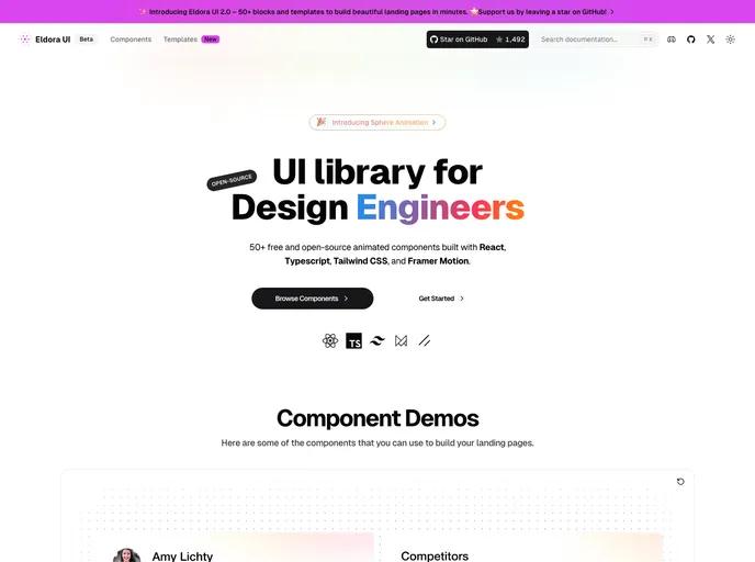
Eldora UI is an open-source React component library with TypeScript, Tailwind CSS, and Framer Motion-driven animations. Fully customizable and modular, these reusable UI elements accelerate modern web development and empower teams to prototype and ship polished interfaces quickly.
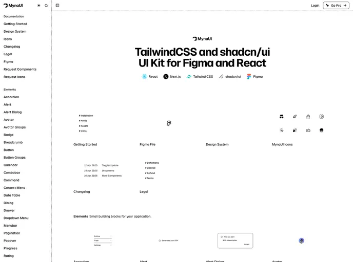
Myna UI is a TailwindCSS and shadcn/ui-based UI kit for React and Figma that helps teams rapidly prototype, theme, and ship modern interfaces. It provides a responsive, component-driven foundation with clear documentation, speeding design-to-dev handoffs and ensuring design-system consistency across projects.
New Cult is a Pro-grade fullstack Next.js template built on React, TypeScript, Tailwind CSS, and Motion. It pairs a polished UI with a scalable component library and an easy setup that accelerates building responsive, production-ready web apps. Ideal for teams and solo developers seeking strong visuals, performance, and flexible customization in a single, maintainable starter kit.
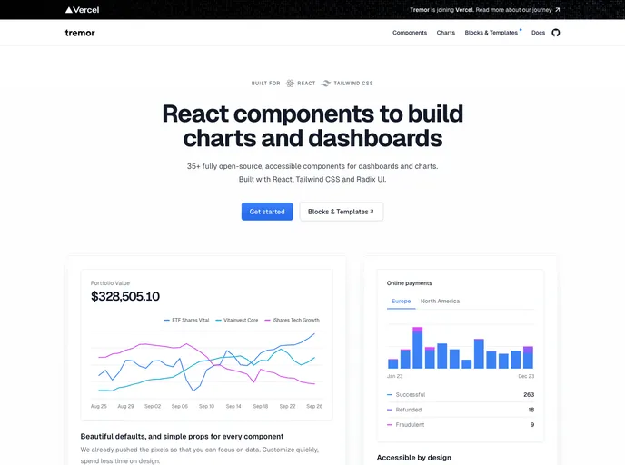
An open-source dashboard UI toolkit for data scientists and developers to rapidly assemble modular, design-forward analytics interfaces. Tremor provides ready-to-use components, Tailwind CSS-based styling (Tailwind setup required), and Next.js 13.4+ compatibility to help teams ship polished dashboards with less boilerplate.
Next.js 14+ SaaS boilerplate with Tailwind CSS 3.4 and TypeScript, optimized for fast iteration and production-grade quality. Includes App Router scaffolding, Clerk authentication, DrizzleORM data layer, and Sentry monitoring, with deep customization for multi-tenant SaaS apps.
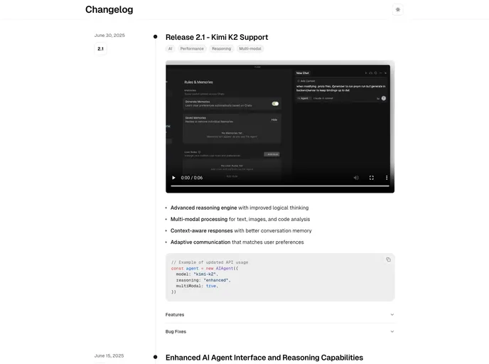
Changelog Template is a minimalist, Next.js + MDX template for publishing release notes and product updates with a clean timeline UI. It’s TypeScript-ready, Tailwind-styled, and optimized for fast Vercel deployment so teams can share progress clearly and professionally.
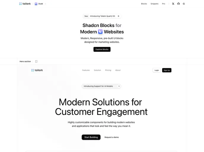
Tailark Blocks delivers a responsive library of pre-built UI blocks for marketing sites, based on shadcn-UI and TailwindCSS. It accelerates page assembly with ready-to-use components and a lightweight footprint—just run the dev server and preview in moments. Open-source and highly customizable.
Cook is a modern, bento-box styled portfolio boilerplate for developers, designers, and creatives. Built with Next.js, Tailwind, shadcn/ui, and magic-ui, it targets top Lighthouse scores, accessibility, and effortless deployment to Vercel, with GitHub API integration, Pocketbase backend, and Umami analytics.