Premium blocks, templates & marketing.
42 products found
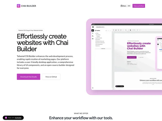
chaibuilder.com
Sdk
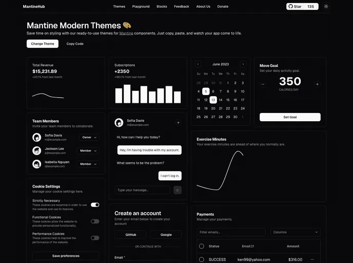
mantinehub.com
Mantine Theme Builder
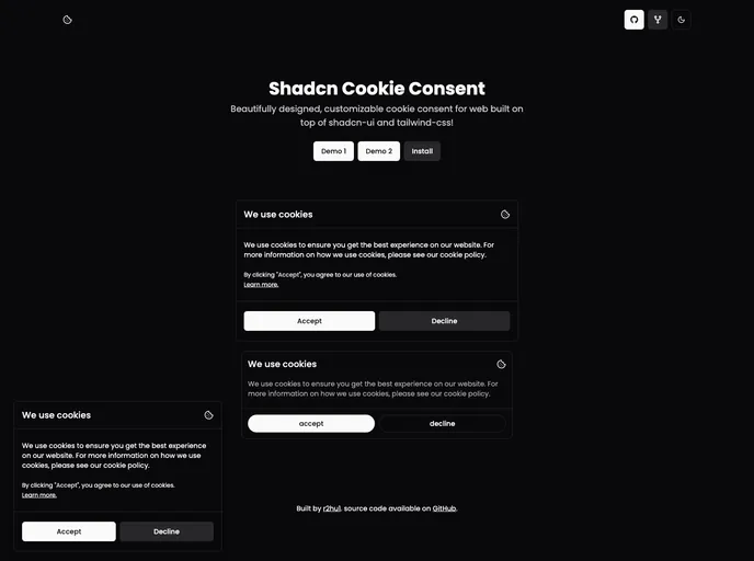
shadcn-cookie-consent....
Shadcn Cookie Consent
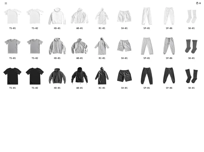
nextzy.vercel.app
Next Minimal Store
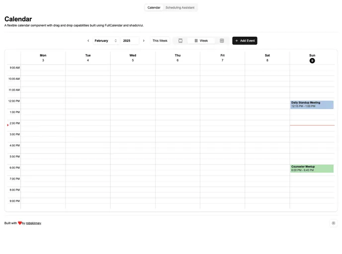
fullcalendar-shadcn-ex...
Shadcn UI Fullcalendar Example
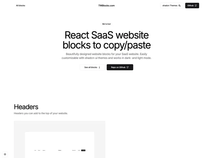
twblocks.com
TWBlocks
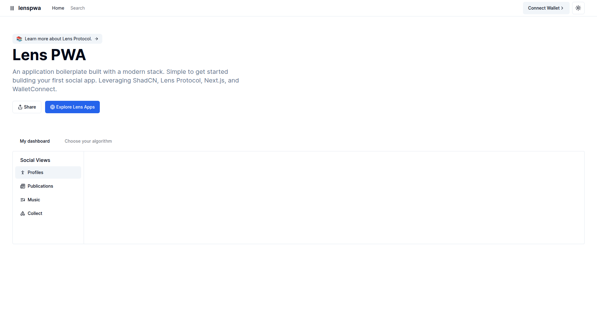
lens-pwa-lyart.vercel.app
Lens Pwa
Chai Builder is an open-source low-code visual builder for React + TailwindCSS. Drag and drop blocks to compose web pages and email templates, then embed the component into any React app. It ships with a blocks catalog, customizable Tailwind configurations, and straightforward integration for rapid prototyping and design-system consistency.
Mantine Theme Builder is a Mantine toolkit that goes beyond simple themes to support all Mantine components. It ships with Shadcn-inspired presets, a Blocks library for rapid UI composition, and a copy-paste workflow to export a Mantine theme object for MantineProvider integration. Fast, flexible theming for real-world apps.
Shadcn Cookie Consent provides a ready-to-use, Tailwind-based cookie consent banner built with Shadcn UI. It ships as a client component with two visual variants (Smallpreview and Defaultpreview) and is easy to drop into Next.js or React apps. Fully customizable via CSS, Tailwind config, or Shadcn theme to match your brand while helping you meet cookie regulations.
Next Minimal Store is a lightweight, open-source storefront boilerplate built with Next.js, Tailwind, and Shadcn UI. It delivers a lean set of reusable storefront components and routing boilerplate to accelerate prototyping and production-ready storefronts.
Shadcn UI Fullcalendar Example is a Next.js boilerplate that demonstrates integrating FullCalendar with Shadcn UI components. Bootstrapped with create-next-app, it includes a development server, next/font-based Geist font optimization, learning resources, and Vercel-ready deployment. A practical starter for fast prototyping and learning modern UI tooling.
TWBlocks is a free, open-source collection of React UI blocks you can copy-paste into your project for rapid prototyping. Built for shadcn-ui compatibility, it includes dark and light themes and a growing set of ready-to-use sections. Install shadcn (and any required shadcn-ui dependencies), then drop blocks from the /blocks directory into your app and wire data as needed.
Lens Pwa is a Next.js + Tailwind-based PWA scaffold featuring modular UI blocks and templates for rapid app development. Open-source and deployment-ready on Vercel, it emphasizes a clean project structure, performance, and easy reuse of components across pages.
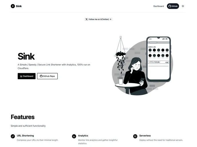
Sink is a free, open-source UI toolkit and boilerplate designed to accelerate front-end development within the Shadcn ecosystem. It bundles ready-made blocks, templates, and starter scaffolds tailored for Tailwind-based Nuxt/Next projects, enabling consistent design systems and rapid prototyping without vendor lock-in.
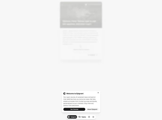
Epigram is an open-source collection of Next.js + Tailwind ready boilerplates, UI blocks, and templates designed to accelerate site bootstrapping for news and content-driven projects. It includes theming presets and a Shadcn-style component registry for fast, cohesive UI.
Notpad is a free, open-source boilerplate for rapid UI prototyping of note-taking apps. It delivers modular components, Tailwind-ready styling, and Vite-powered scaffolding to speed up development. Designed for quick theming and lightweight editor UIs, Notpad makes it easy to bootstrap polished note interfaces with minimal setup.
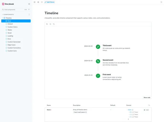
Shadcn Timeline is a lightweight, reusable timeline component crafted for Shadcn-based UI and Next.js apps. It enables clean, data-driven visualization of events in chronological order, with easy integration, accessible markup, and Tailwind-friendly styling for rapid adoption in modern React projects.
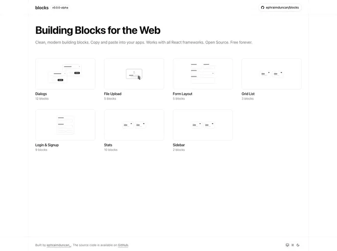
Blocks.so is a free, MIT-licensed library of accessible, copy-paste UI blocks for fast prototyping and production UI. Built for developers who value speed and quality, it enables you to drop in well-structured components without licensing friction, while benefiting from community-driven improvements.
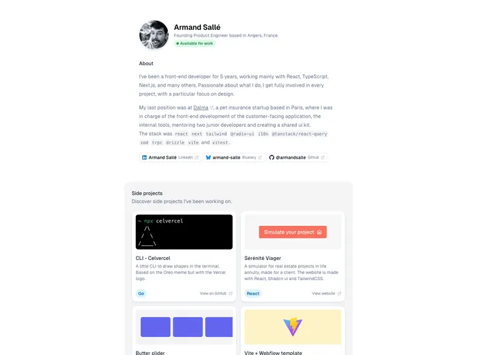
An Astro-powered personal site starter designed for speed, simplicity, and a polished portfolio. This lightweight template highlights modern design while keeping development fast and approachable, ideal for quickly showcasing work with minimal setup.
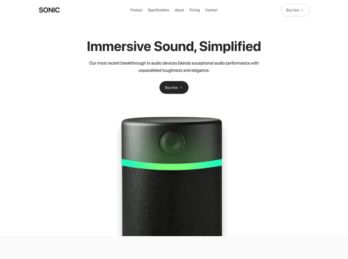
Sonic is a Next.js 15 landing page template built with shadcn/ui and Tailwind 4, designed to showcase physical and digital products with a clean, modern aesthetic. It ships 100+ components and 10+ pages for fast product launches, high-converting campaigns, and a polished marketing presence.
Thien.me is a curated, open-source collection of boilerplates, templates, and UI kits built on Next.js, Tailwind, and Shadcn UI. It accelerates prototyping and production launches with modular components, Prisma/Supabase-ready backends, Notion-inspired content blocks, and a Theme Generator for fast styling.
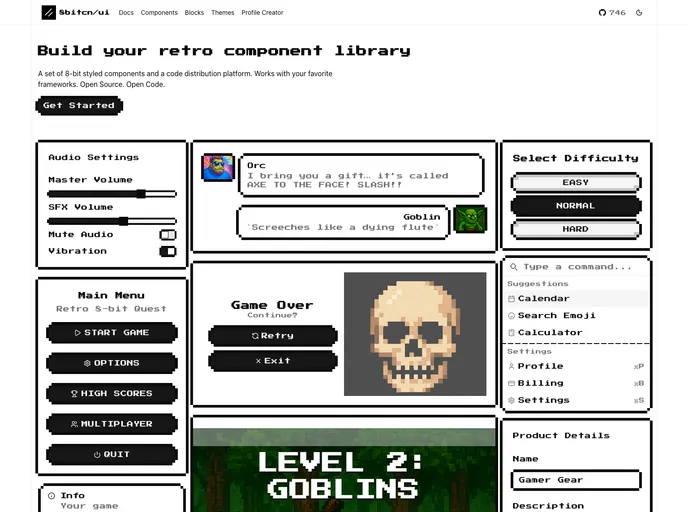
8bitcn UI is a retro-inspired component library that blends nostalgic visuals with modern accessibility. MIT-licensed and open source, it’s easy to drop into projects, customize, and contribute. Ideal for rapid prototyping, cohesive theming, and inclusive interfaces across web apps.
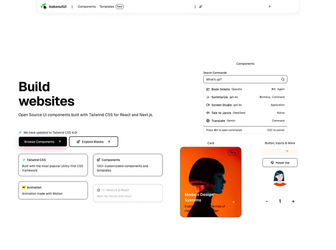
Kokonut UI is an open-source collection of TailwindCSS-powered UI components designed for design engineers and developers. Built with Motion for React and Next.js, it delivers accessible, ready-to-use components. Clone, install, and accelerate UI development in your React or Next.js apps.
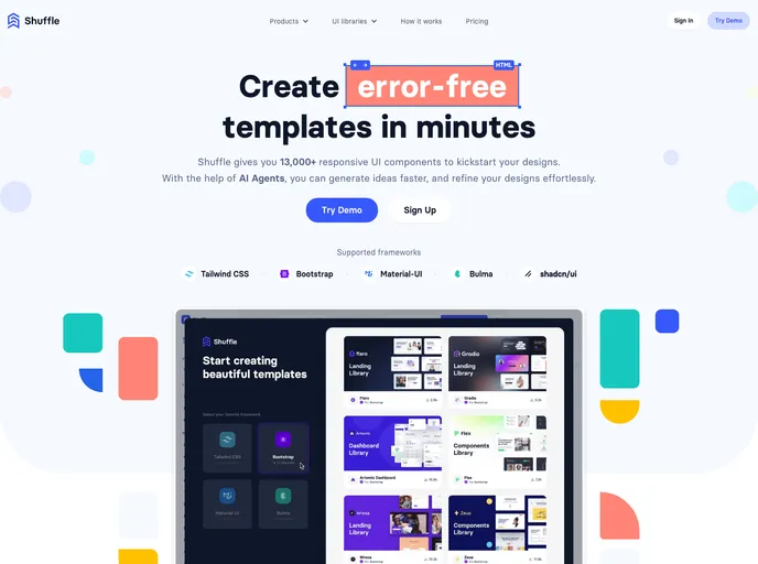
Shuffle UI Kit Bundle is a versatile collection of ready-made UI components designed for fast integration with Tailwind, Bootstrap, and Shadcn/UI. It accelerates design workflows, delivers polished, responsive elements, and helps teams ship cohesive, professional interfaces across projects with confidence.
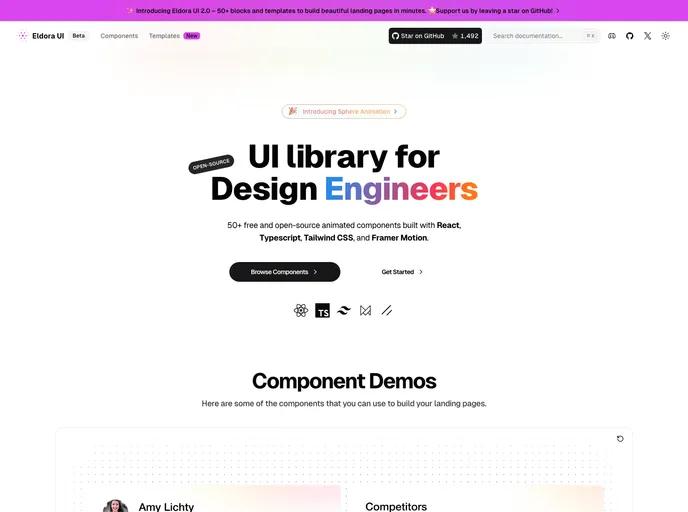
Eldora UI is an open-source React component library with TypeScript, Tailwind CSS, and Framer Motion-driven animations. Fully customizable and modular, these reusable UI elements accelerate modern web development and empower teams to prototype and ship polished interfaces quickly.
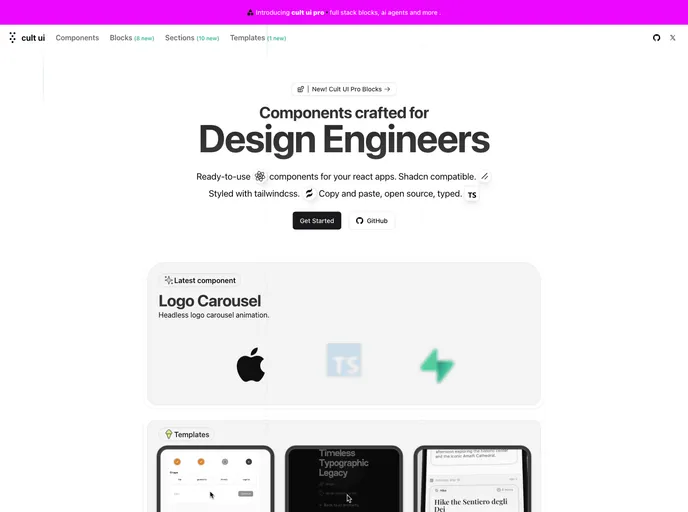
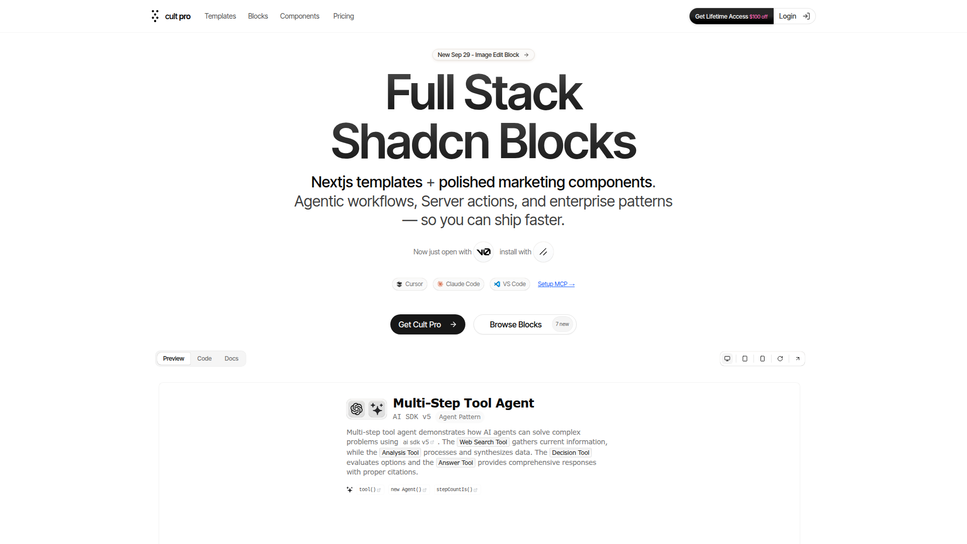
Cult UI is a curated, open-source collection of unique Shadcn-compatible components styled with Tailwind CSS. Built for design engineers and rapid prototyping, it plugs into your existing Shadcn projects with minimal setup, delivering polished, modern interfaces while preserving a cohesive design language. With MIT licensing, Cult UI enables teams to explore ideas faster and ship professional UI quickly.
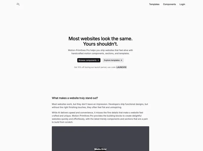
Motion Primitives delivers a ready-made library of motion components built with Framer Motion and Tailwind CSS. It’s designed for rapid, polished interactions in React apps, with a cohesive motion design system. The project is in beta with frequent updates and an MIT license, enabling fast iteration and open collaboration.
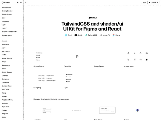
Myna UI is a TailwindCSS and shadcn/ui-based UI kit for React and Figma that helps teams rapidly prototype, theme, and ship modern interfaces. It provides a responsive, component-driven foundation with clear documentation, speeding design-to-dev handoffs and ensuring design-system consistency across projects.
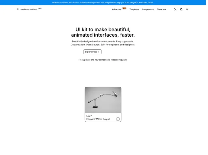
Pro Motion Primitives provides handcrafted motion components and templates to empower developers to add fluid, interactive animations to modern web apps. Built for React and Tailwind ecosystems, it enables fast, performance-friendly UI motion that enhances engagement while keeping accessibility and maintainability in focus.
New Cult is a Pro-grade fullstack Next.js template built on React, TypeScript, Tailwind CSS, and Motion. It pairs a polished UI with a scalable component library and an easy setup that accelerates building responsive, production-ready web apps. Ideal for teams and solo developers seeking strong visuals, performance, and flexible customization in a single, maintainable starter kit.
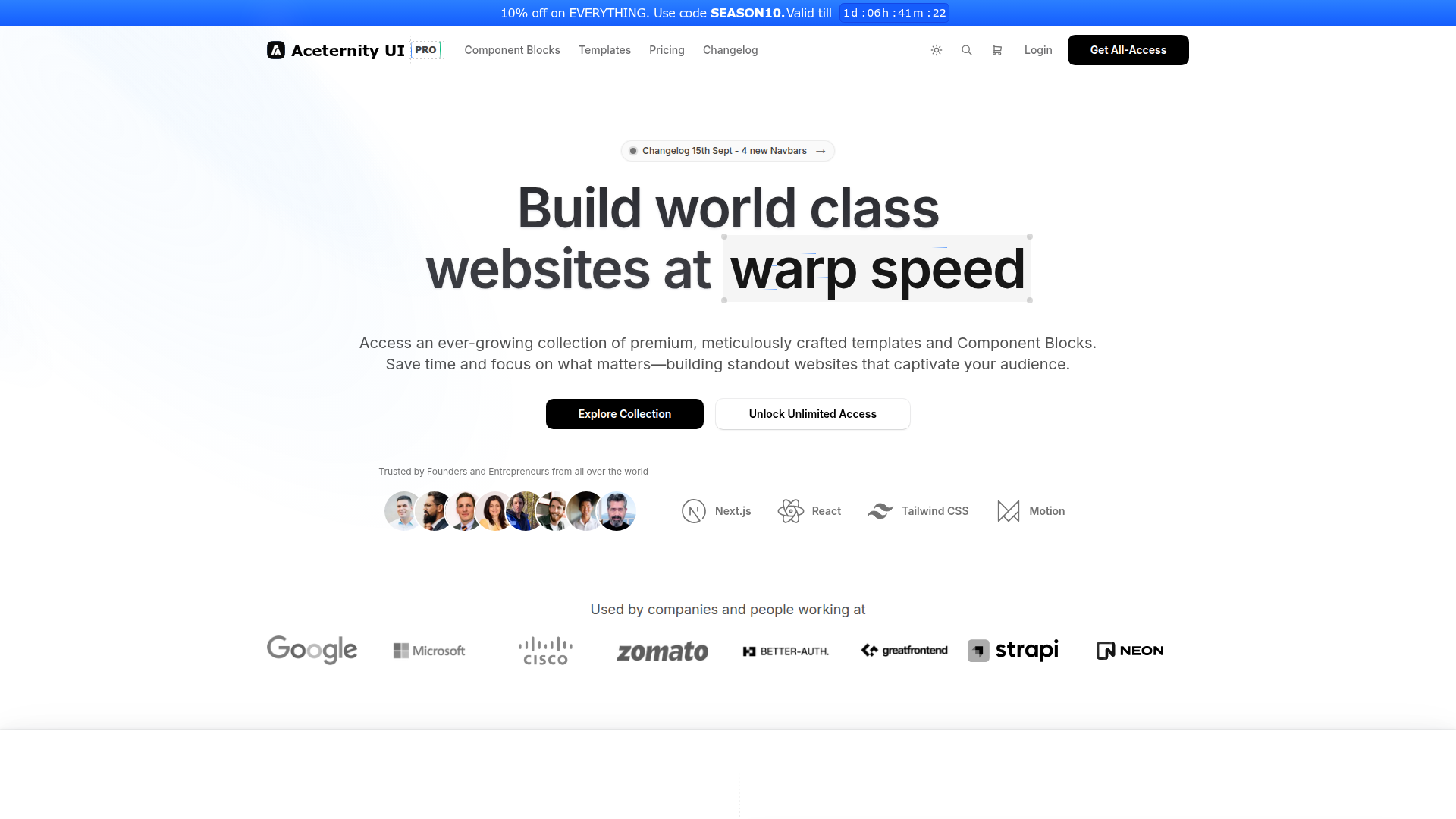
Aceternity UI Pro is a developer-first UI toolkit for rapid Next.js + Tailwind projects, delivering ready-made templates, a robust UI kit, a rich block library, boilerplates, a Theme Generator, and AI-assisted prototyping. It accelerates design-to-code workflows within the Shadcn ecosystem, helping teams ship polished interfaces faster.
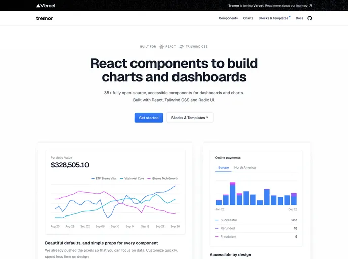
An open-source dashboard UI toolkit for data scientists and developers to rapidly assemble modular, design-forward analytics interfaces. Tremor provides ready-to-use components, Tailwind CSS-based styling (Tailwind setup required), and Next.js 13.4+ compatibility to help teams ship polished dashboards with less boilerplate.
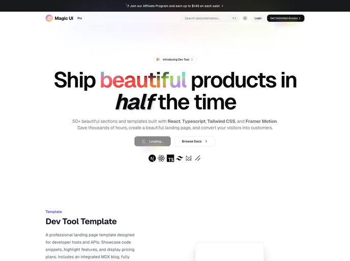
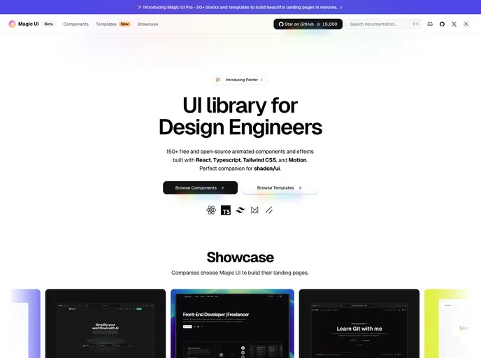
Magic UI Pro accelerates UI creation with a rich React/TS/Tailwind toolkit. Explore 50+ sections and templates, animated with Framer Motion, and ready for responsive, accessible interfaces. Perfect for developers who want fast, polished UI foundations and smooth, scalable customization.
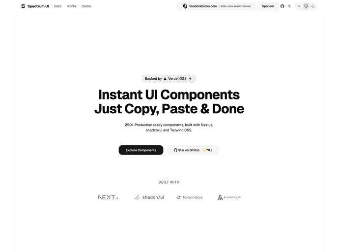
Spectrum UI is an open-source component library where developers contribute bug fixes, new features, and improvements. This guide outlines a clear, Git-driven workflow: fork, branch, implement, test, and submit pull requests. Join the community and help evolve Spectrum UI with collaborative contributions.
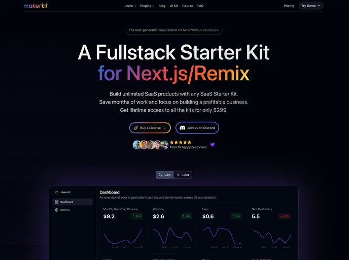
Makerkit is a turnkey starter kit that accelerates modern web app development with Next.js, Remix, React, Tailwind, and Shadcn UI. It delivers production-ready boilerplates, ready-made components, and data/auth integrations (Firebase/Supabase) for fast prototyping and scalable production apps.
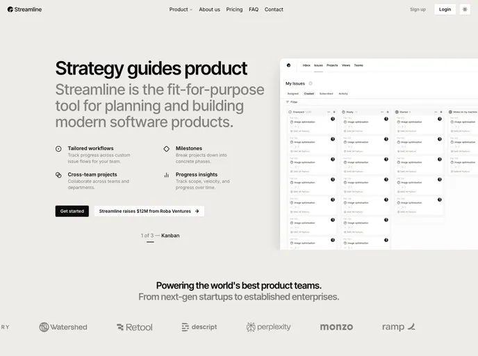
Streamline is a polished landing-page template built with Next.js 15, shadcn/ui, and Tailwind 4. It delivers a clean, minimalist aesthetic on a responsive, performance-focused foundation, with extensive customization options. Ideal for startups and portfolios seeking a modern, professional online presence with rapid prototyping.
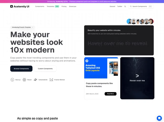
Aceternity UI is a React + Tailwind component library that speeds UI construction with ready-made, copy-paste components. It emphasizes consistent design, rapid prototyping, and approachable documentation, helping teams ship polished interfaces quickly.
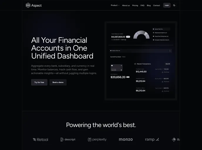
Aspect is a polished corporate marketing template built with Next.js 15, shadcn/ui, and Tailwind 4. It delivers a clean, engaging online presence with a robust block-based architecture, SEO-ready setup, and responsive, themeable UI—ideal for corporate sites and fast-growing brands.
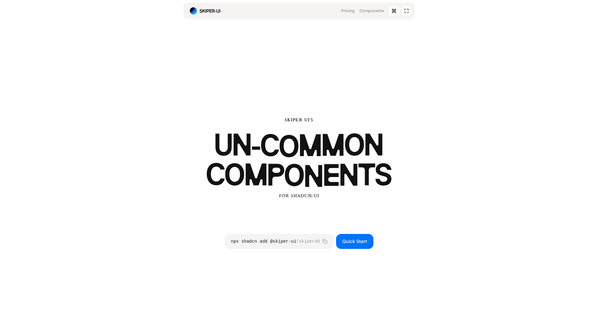
Skiper UI is an open-source component library focused on accessibility, customization, and rapid integration. With copy-and-paste ready components, you can assemble polished interfaces fast while maintaining a cohesive design system across apps.
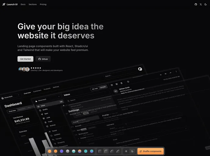
Launch UI is a production-ready Next.js website components template built with Shadcn/ui and Tailwind CSS. It ships ready-to-use, responsive components and layouts to accelerate modern site builds while emphasizing accessibility, performance, and SEO out of the box.
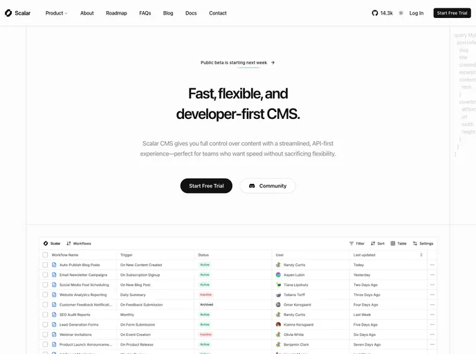
Scalar is a modern SaaS & startup template built with Next.js 15, shadcn/ui, and Tailwind 4. It delivers a modular, block-based foundation with a tech-forward design to launch professional SaaS sites quickly, featuring ready components, pages, and MDX/JSON content support.
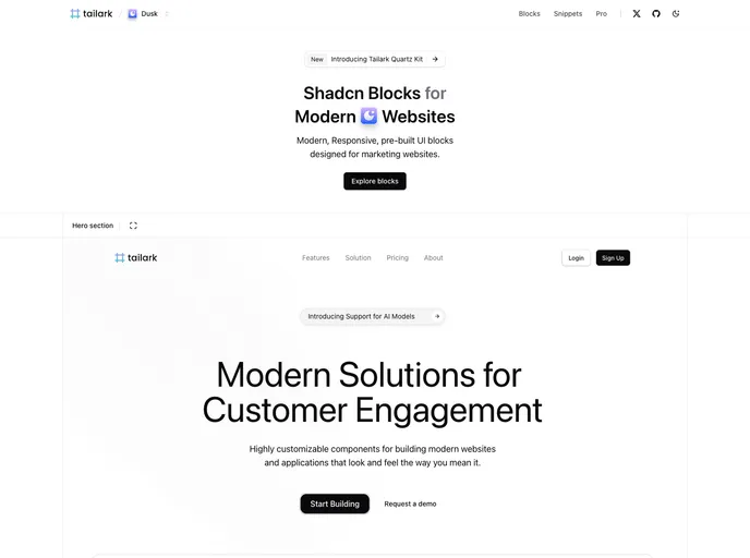
Tailark Blocks delivers a responsive library of pre-built UI blocks for marketing sites, based on shadcn-UI and TailwindCSS. It accelerates page assembly with ready-to-use components and a lightweight footprint—just run the dev server and preview in moments. Open-source and highly customizable.
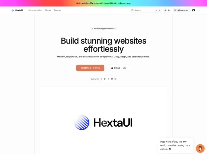
HextaUI is an open-source toolkit of modern, responsive UI components you can copy, adapt, and brand to ship polished web interfaces faster. Designed for developers who value both aesthetics and accessibility, it pairs ready-made blocks with clear docs and thriving community contributions, balancing speed with robust functionality.
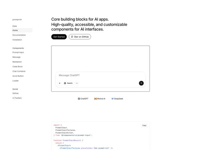
Prompt Kit is a free, open-source collection of high-quality, customizable UI components built for AI apps. It accelerates building chat experiences, AI agents, autonomous assistants, and related interfaces, delivering polished, consistent UIs that scale with your AI projects.
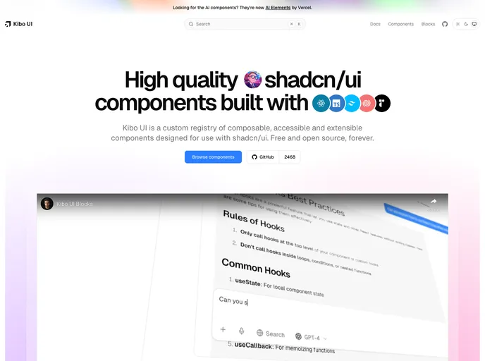
Kibo UI is a curated registry of composable, accessible, open-source UI building blocks designed to pair with shadcn/ui. Leveraging shadcn/ui CSS variables, these components slot into existing primitives to speed UI assembly, reduce boilerplate, and support responsive, theme-friendly interfaces.
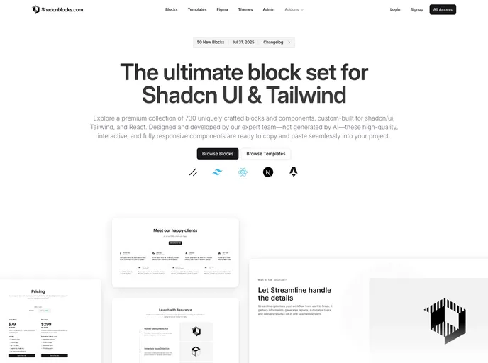
Shadcnblocks extends Shadcn UI with a premium library of ready-to-use blocks and components for Tailwind CSS, built on top of shadcn/ui. This collection enables rapid, consistent UI assembly—from hero sections and features to galleries and dashboards—accelerating prototyping and production UI.
Magic UI offers a sleek, modern design system you can drop into any project. With a clean visual language, responsive behavior, and straightforward customization, it helps you ship polished interfaces faster. MIT-licensed and open source, it’s ideal for prototyping, marketing sites, and SaaS dashboards alike.
AI Elements is an open-source TypeScript toolkit for accelerating AI-powered web apps. Designed to slot into Next.js projects, it offers pre-built AI UI components and a flexible, extensible architecture so developers can ship intelligent experiences—from responsive chat UIs to AI-enabled workflows—faster with fewer boilerplate efforts.