Premium blocks, templates & marketing.
89 products found
shadcn-image-cropper.v...
Shadcn Image Cropper
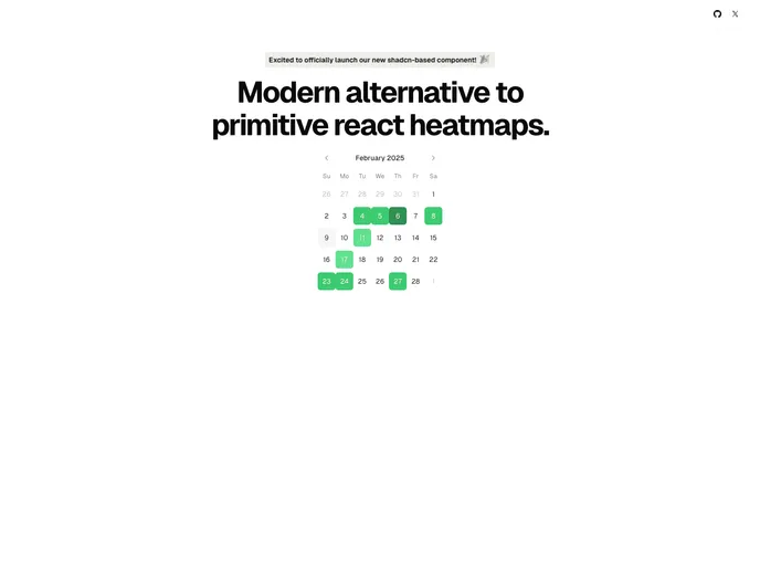
shadcn-calendar-compon...
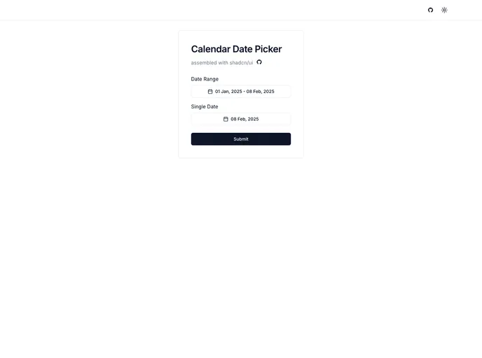
Shadcn Calendar Component
laravel-luvi.com
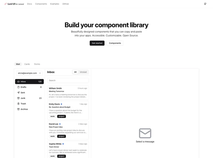
Laravel Luvi
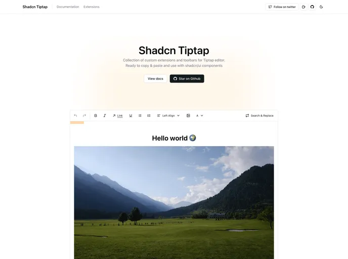
reactjs-tiptap-editor....
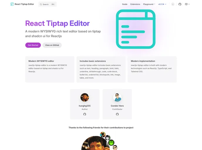
Reactjs Tiptap Editor
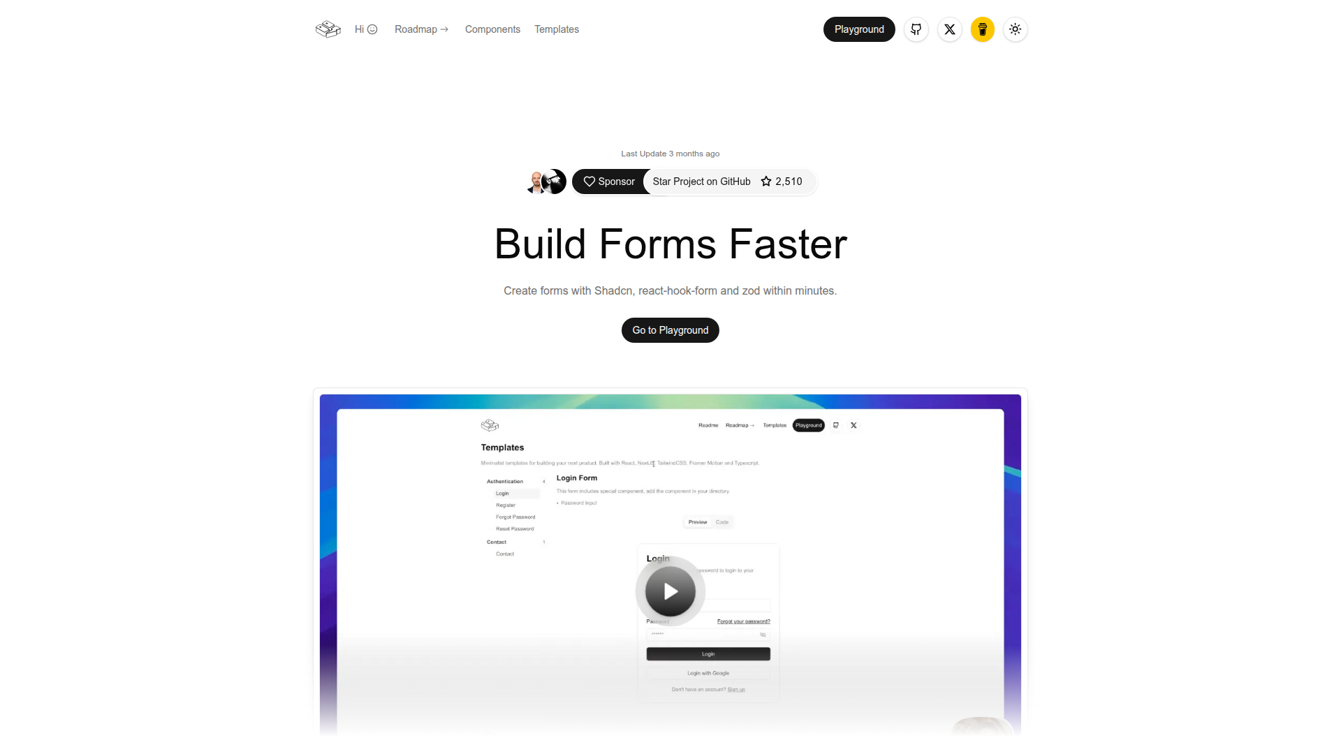
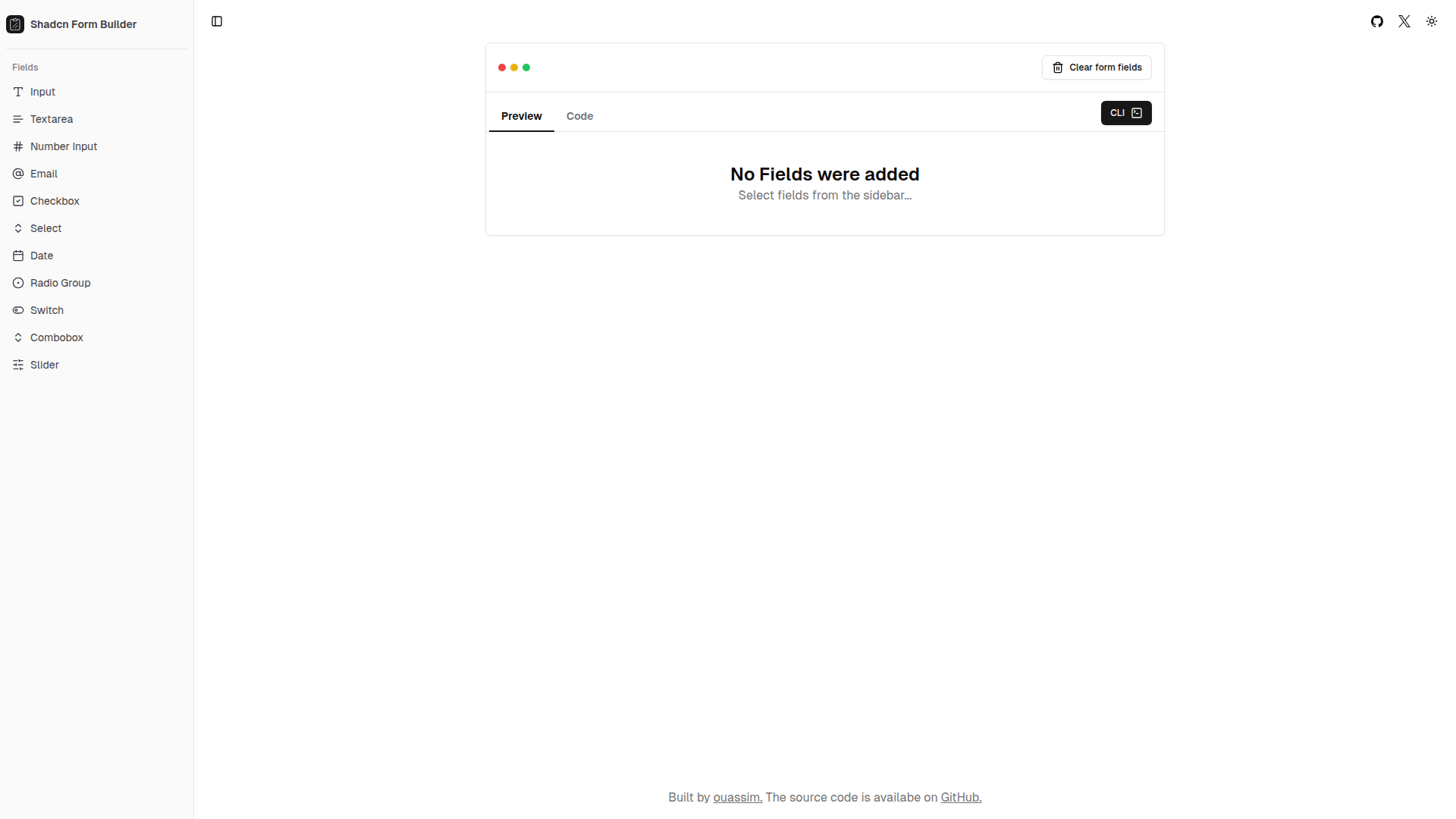
shadcn-form.com
Form Builder
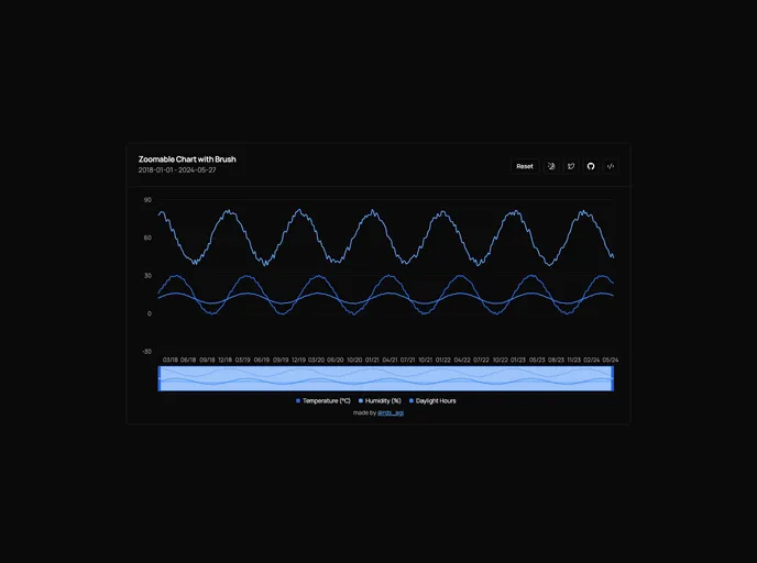
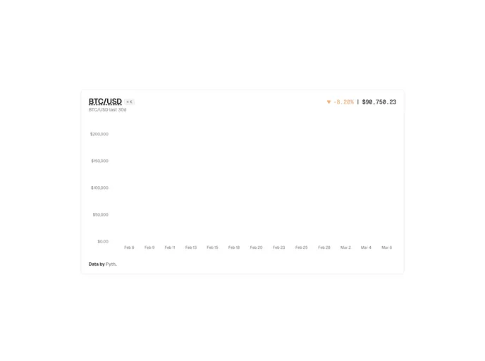
shadcn-chart-brush.rds...
Shadcn Chart Brush
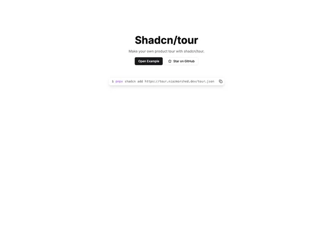
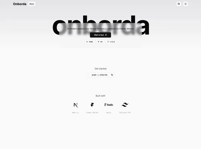
tour.niazmorshed.dev
Shadcn Tour
Minimal, responsive image cropper UI built with shadcn and react-image-crop. This lightweight component delivers a clean cropping surface ideal for Next.js and Tailwind-based apps, enabling quick integration and reliable client-side image clipping.
An accessible, drop-in calendar date picker for Next.js apps that blends Shadcn UI styling with Radix primitives. It delivers a keyboard-friendly interface for quick date selection, supports localization and flexible formatting, and plugs into your Next.js project with minimal configuration for a polished, consistent user experience.
Luvi UI for Laravel is an open-source UI kit delivering polished Blade components and layout primitives to accelerate modern Laravel interfaces. Install with Composer, customize visuals under the MIT license, and enjoy a consistent, production-ready design system across your Laravel projects.
A React wrapper around TipTap's rich-text editor, delivering a fast, extensible editing component for modern React apps. Leverage TipTap's extension system via React hooks, with ready-made UI controls and a straightforward setup for admin panels, blogs, and documentation portals.
Form Builder is a developer-centric tool to rapidly compose, customize, and validate web forms in React and Next.js apps. With Zod-powered validation and a clean drag-and-drop interface, it speeds form creation, ensures consistent UX, and supports server-side rendering for scalable, production-ready forms.
Shadcn Chart Brush provides a zoomable, brush-enabled charting experience for React apps. Built with shadcn charts and Recharts, it supports click-and-drag zoom, scroll-to-zoom, brush-driven pan and zoom, and a quick Reset. Includes essential libraries and integration examples for rapid, customizable data visuals.
Shadcn Tour is a lightweight, motion-rich product-tour system for Shadcn-based apps. It provides TourProvider, TourAlertDialog, and the useTour hook to craft guided walks with smooth transitions and clear step highlighting. Install, wrap your app, define steps, and guide users through polished onboarding experiences.
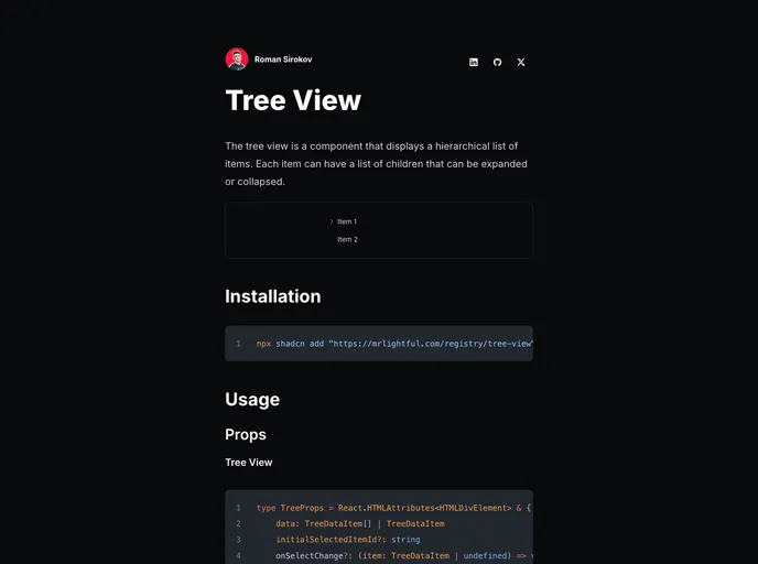
Shadcn Tree View is a lightweight, accessible component for navigating hierarchical data with expandable and collapsible nodes. Following Shadcn UI patterns, it offers per-item icons, default node/leaf icons, item click handlers, and optional action buttons, enabling fast, keyboard-friendly navigation in dashboards, file trees, and nested menus.
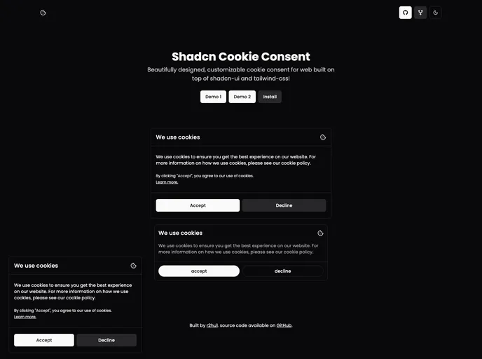
Shadcn Cookie Consent provides a ready-to-use, Tailwind-based cookie consent banner built with Shadcn UI. It ships as a client component with two visual variants (Smallpreview and Defaultpreview) and is easy to drop into Next.js or React apps. Fully customizable via CSS, Tailwind config, or Shadcn theme to match your brand while helping you meet cookie regulations.
Dialog Stack provides a concise, stack-based approach to managing layered modal dialogs in React apps. Track active dialogs, preserve focus order, and deliver accessible, predictable UX across complex flows with minimal boilerplate.
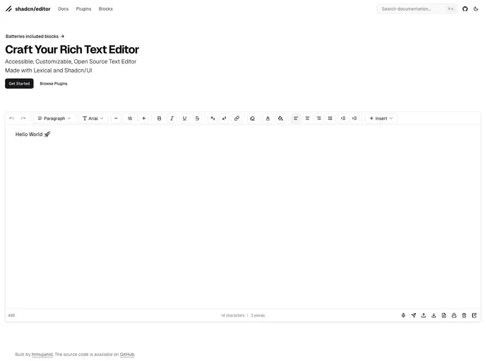
Shadcn Editor lets you host a private React component registry with a Next.js template. Define components, hooks, and pages in a registry.json and serve them as static JSON under public/r/[name].json, enabling easy distribution across projects. Fully compatible with the shadcn CLI for building and publishing—great for teams adopting a centralized design system.
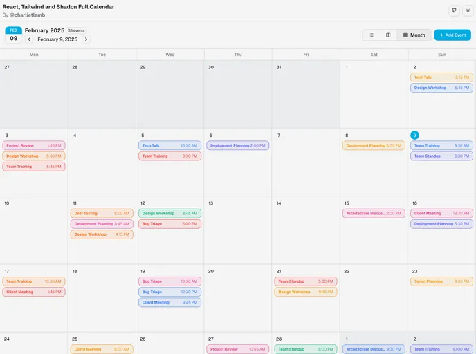
React/ShadCN Calendar: a Tailwind-first, dashboard-focused calendar component. Built with ShadCN patterns and Radix UI accessibility, it supports dark mode, responsive layouts, multiple views, and robust event management. Fully customizable and ready for seamless integration into React apps.
Shadcn Calendar Heatmap is a Next.js boilerplate starter for building calendar heatmap dashboards with Shadcn UI. Bootstrapped with create-next-app, it provides a dev server, font optimization with Inter, and Vercel-ready deployment—designed for rapid experimentation and customization by developers.
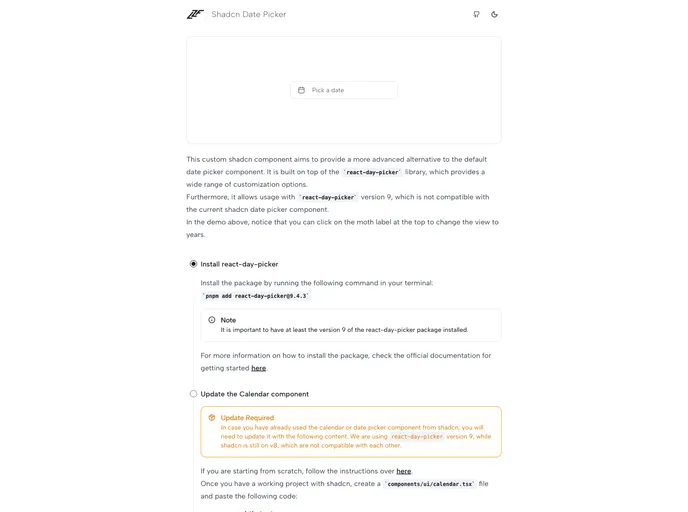
A flexible React date picker built atop react-day-picker, designed to integrate with Shadcn themes. It offers rich customization, view switching, and accessible, keyboard-friendly date selection for modern web apps.
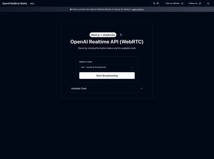
Openai Realtime Api Nextjs is a Next.js boilerplate for building real-time AI chat apps with OpenAI's streaming API. It ships with Tailwind + Shadcn UI, secure env-based key management, and serverless API routes, delivering live token updates and deployment-ready scaffolding for rapid prototyping.
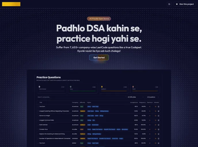
Codejeet provides open-source boilerplates and reusable UI components for Next.js, React, and Tailwind, enabling rapid prototyping and scalable apps. Fork, customize, and extend with design tokens and accessible components for consistent, production-ready experiences.
Photography Blog is a modern, open-source boilerplate for photographers to share their work. Built with Next.js, Tailwind, and Shadcn UI, it includes automatic EXIF extraction, secure Better Auth, Cloudflare R2 storage, location-based organization, fast performance, SEO, and a Hono.js API—clone, customize, and deploy fast.
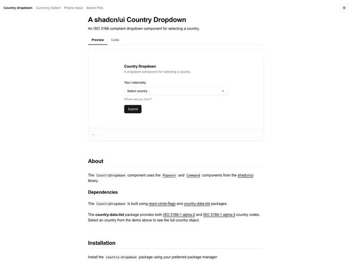
Shadcn Country Dropdown is a Next.js starter boilerplate that demonstrates a clean, accessible country selector built with Shadcn UI patterns. It boots from a minimal dev server, uses next/font to optimize the Geist font for Vercel, and ships with a deployment-ready setup you can edit in app/page.tsx. Ideal for rapid forms, onboarding flows, and prototyping country-aware experiences.
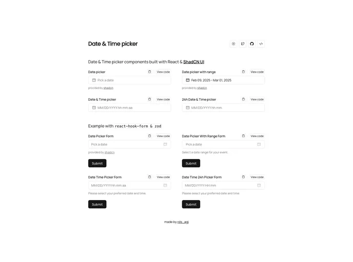
Shadcn Date Time Picker delivers cohesive, adaptable date and time inputs built with ShadCN patterns for rapid integration into React/Next.js apps. Accessible, Tailwind-friendly components enable precise scheduling and streamlined form UX with consistent theming.
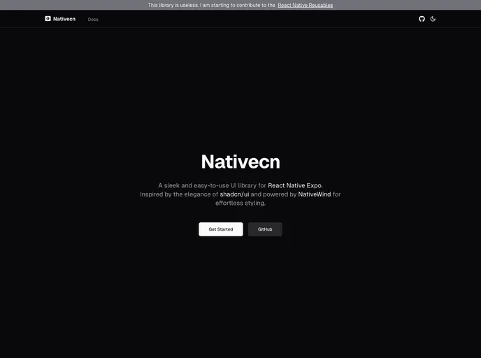
Nativecn is a React Native UI component library inspired by shadcn-ui, crafted for fast, themeable mobile apps. It delivers highly customizable, accessible components with built-in dark mode, CSS variables, and NativeWind compatibility, enabling teams to ship cohesive UIs with minimal setup.
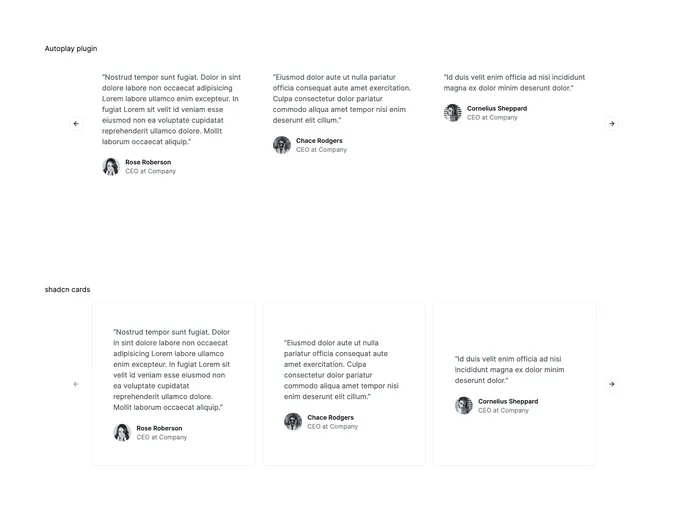
Engaging UI carousel for showcasing testimonials with smooth transitions. Built for Next.js and optimized with the Inter font, it's easy to drop into marketing or product pages, customize via app/page.tsx, and deliver strong social proof with minimal setup.
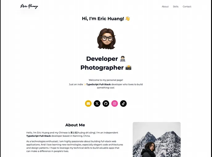
A clean, modern portfolio boilerplate built with Next.js 14, TailwindCSS, Framer Motion, and Shadcn/ui. This open-source starter helps developers launch a polished personal site quickly, with a clear content model and easy customization. Clone, install, and personalize your portfolio with minimal setup.
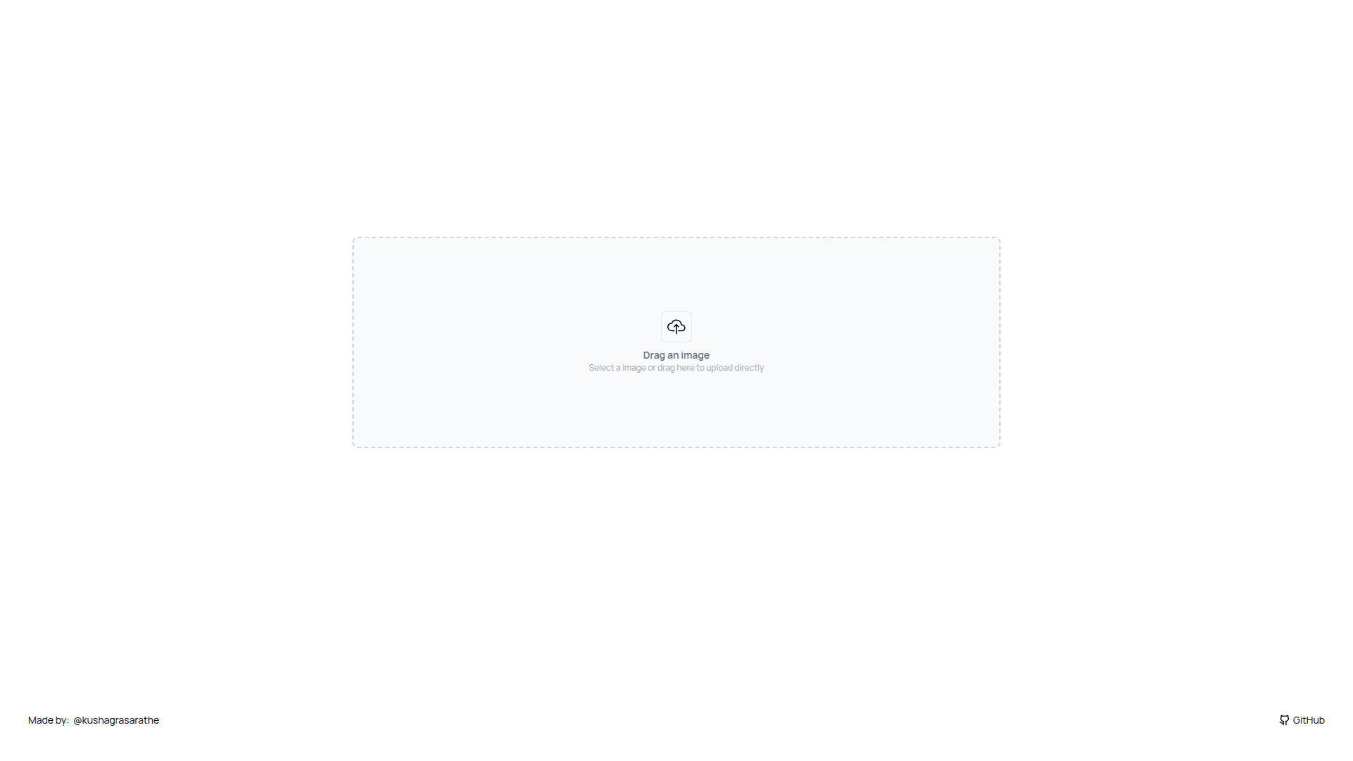
Image Upload Shadcn is a Next.js boilerplate starter that combines Cloudinary-powered image uploads with performance-minded defaults. Following create-next-app conventions, it offers a Vercel-ready deployment path and font optimization out of the box, helping teams prototype and ship production-ready UIs quickly.
Shadcn UI Form Builder speeds up form creation in React by letting you pick inputs, then it auto-generates a Zod schema and a complete, ready-to-use form component with validation and defaults for quick, type-safe integration.
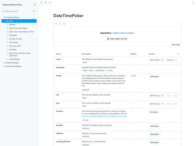
Shadcn Datetime Picker is a robust React component that blends seamlessly with the Shadcn UI framework to deliver polished, timezone-aware date and time selection. It provides date and time pickers, calendar navigation, and ready-to-use TSX files for quick, reliable integration in Next.js and Tailwind-powered apps.
Open-source portfolio starter template for developers to showcase projects, blogs, and expertise. Built with Next.js and Tailwind, it emphasizes speed, accessibility, and easy customization, with clean, component-driven UI inspired by Shadcn patterns.
Convertfast UI provides a CLI-driven boilerplate for rapid landing page creation inspired by shadcn-ui. Build responsive pages with modular, customizable sections and copy-paste ready components, plus dark/light mode and SEO-friendly structured data.
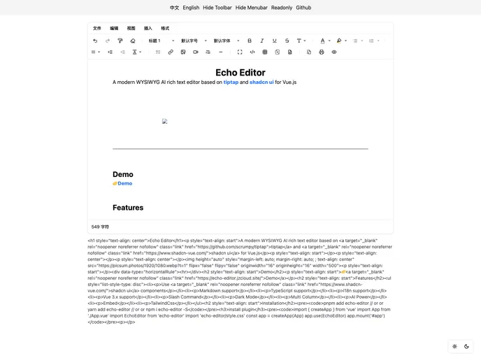
Echo Editor is a tiptap-based WYSIWYG editor built with shadcn-vue components. MIT-licensed and multilingual (en/zhHans), it integrates Tailwind CSS-friendly styling, Markdown and TypeScript support, and a pathway to add custom extensions for your needs—empowering Vue apps with localization-ready, polished rich-text editing.
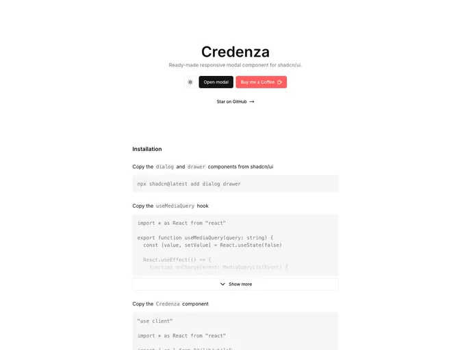
Credenza is a responsive modal component built for the Shadcn UI ecosystem. It delivers sleek, accessible modal experiences with minimal setup, smooth background scaling, and reliable keyboard navigation, ideal for rapid prototyping or production-ready modals in shadcn/ui apps.
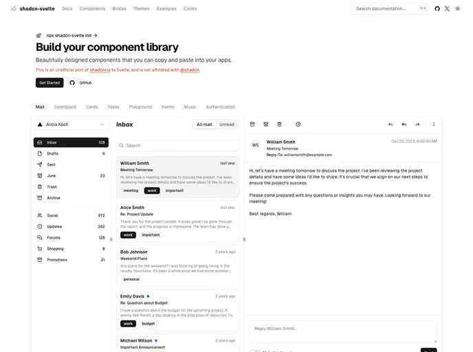
Shadcn Svelte is an unofficial, community-led port of the popular shadcn/ui library tailored for the Svelte ecosystem. It delivers accessible, customizable UI components with a copy-paste workflow, enabling teams to build cohesive interfaces quickly while staying aligned with the trusted design language.
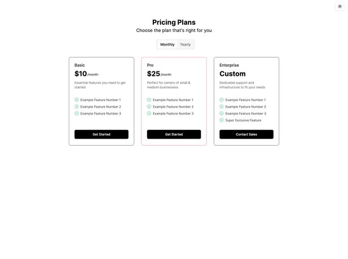
Pricing Page Shadcn is a theme-aware template that automatically adapts to light/dark modes and supports monthly or yearly billing. It highlights yearly savings and lets you spotlight plans with Popular or Exclusive tags, all while integrating smoothly with next-themes for hassle-free theme switching.
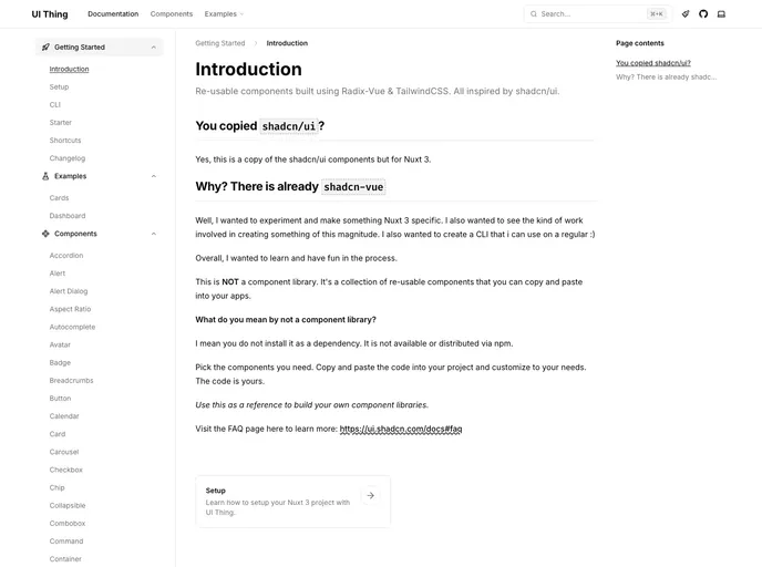
UI Thing delivers Radix-Vue based UI primitives inspired by shadc/ui and shadcn-vue, optimized for Nuxt + Tailwind projects. It provides accessible components, a lightweight CLI for setup and component addition, and clear docs to accelerate UI wiring in Vue ecosystems.
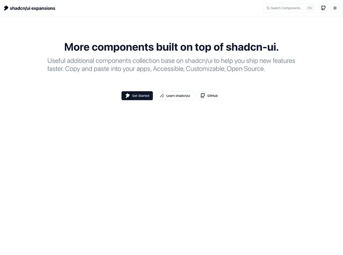
Shadcn UI Expansions extend the shadcn/ui toolkit with ready-to-use components for faster, scalable UI development. Features include advanced multi-select, loading buttons, and infinite scroll—drop-in code you can copy, paste, and tailor to your app. Free and open source for personal and commercial use.
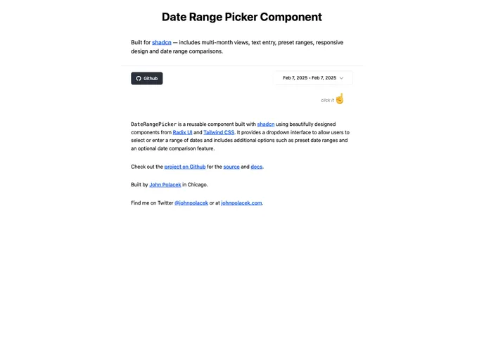
Date Range Picker For Shadcn is a reusable UI component built for Shadcn projects using Radix UI primitives and Tailwind CSS. It delivers a clean dropdown to select or type a date range, supports preset ranges, and offers an optional date comparison view for quick analytics.
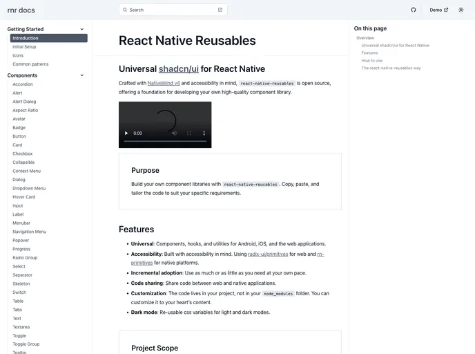
React Native Reusables is an Expo-powered UI library styled with NativeWind, delivering a rich suite of ready-to-use React Native components (Accordion, Alert, Button, Card, Checkbox, and more). It supports copy-paste customization to rapidly assemble a tailored component library for mobile apps, speeding UI parity across projects.
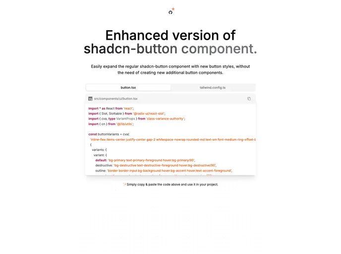
Enhanced Button is a drop-in upgrade for the shadcn button, delivering richer variants and cohesive, theme-ready styles with minimal code. Replace your existing button.tsx and copy a small set of Tailwind config lines to align all projects with a single, maintainable UI button standard.
Next Mobbin Clone is a Next.js 14-based boilerplate that channels Mobbin-inspired UI patterns through shadcn-ui components. It delivers a sleek, motion-friendly starter kit with accessible primitives, helping developers prototype polished interfaces and explore a scalable design system quickly.
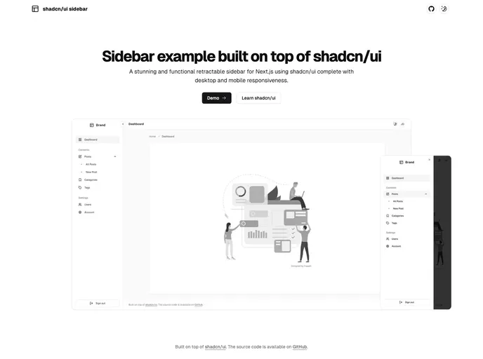
Shadcn UI Sidebar is a polished retractable navigation component for Next.js apps, offering a compact mini variant and a full-width desktop sidebar plus a mobile sheet menu. It’s responsive, accessible, and easy to integrate into admin dashboards or SaaS UIs, enabling organized, collapsible navigation without leaving the current view.
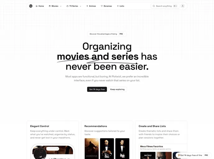
Plotwist is an open-source Next.js boilerplate for easily building and organizing entertainment content—movies, series, and anime. It provides a production-ready base with Tailwind styling, shadcn UI components, and Stripe payments for monetization, ideal for rapid prototyping and community-driven apps.
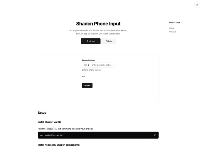
Shadcn Phone Input is a reusable, themeable input component that blends clean, modern aesthetics with practical form controls. It includes a customizable field, built-in country selection, and seamless integration with React, Next.js, Tailwind, and Radix UI. Open source and designed to slot neatly into the Shadcn design system.
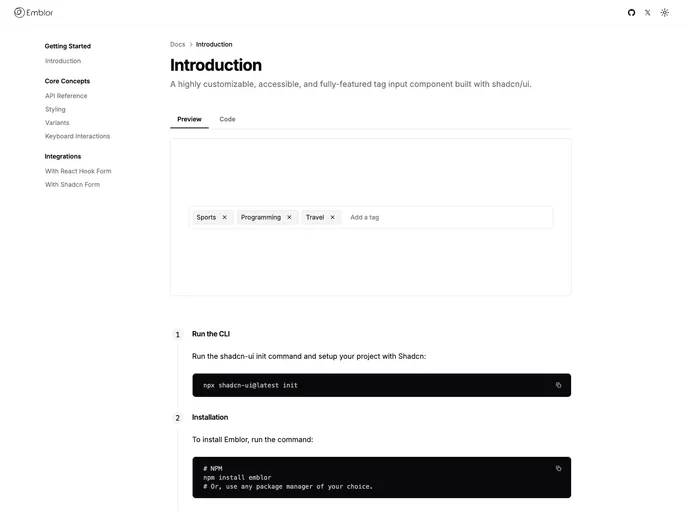
Emblor is a highly customizable, accessible tag-input component built with Shadcn UI. It delivers autocomplete, robust validation, drag-and-drop management, read-only mode, and flexible delimiters, all designed for seamless theming and precise control via Input, Popover, Command, and Dialog primitives. Open-source and free to use.
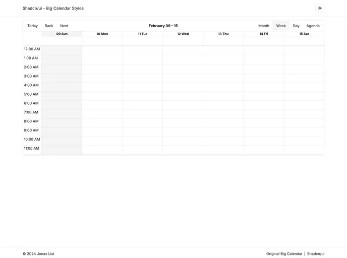
Shadcn UI Big Calendar is a Next.js open-source boilerplate that demonstrates dynamic, theme-aware styling by wiring Shadcn CSS variables into React Big Calendar. The calendar adapts instantly to the active theme, enabling rapid prototyping of themed scheduling dashboards.
The React Confirm Dialog provides a flexible, accessible confirm dialog component for React apps. It offers an easy useConfirm hook, full customization of visuals and behavior, support for custom actions, and seamless Shadcn UI integration. Wrap your app with ConfirmDialogProvider and theme via Tailwind or CSS variables for a cohesive, accessible UX.
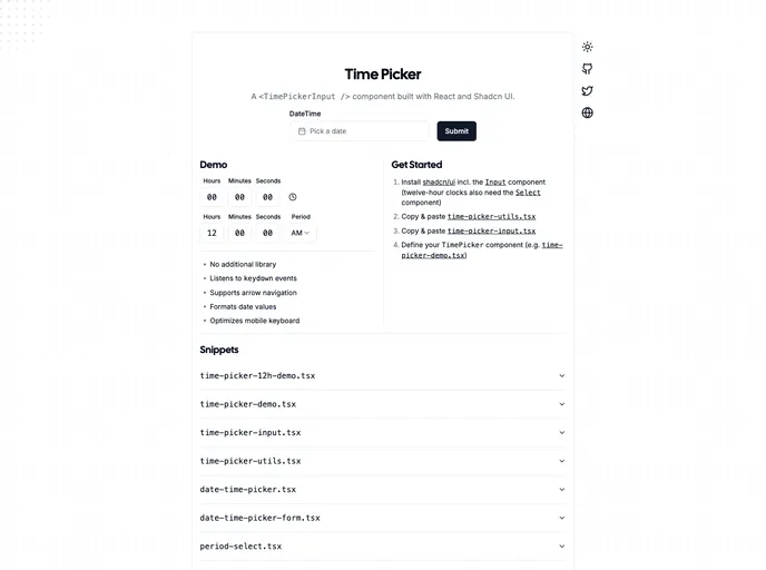
The Shadcn Time Picker is a lightweight, accessible time input component designed for quick, seamless integration into Shadcn UI projects. It presents a clean, responsive interface with easy HTML markup and straightforward JavaScript initialization, making time-based forms fast to implement without sacrificing accessibility or styling consistency.
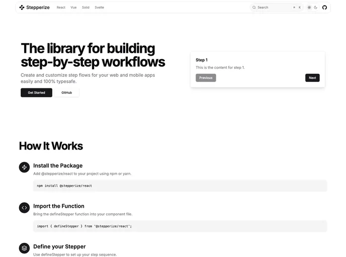
Stepperize is a lightweight, unstyled library for building step-by-step workflows in React apps. It delivers a tiny gzipped footprint under 1kB, a fully type-safe, composable API, and straightforward step definition with defineStepper and useStepper for flexible, reusable flows.
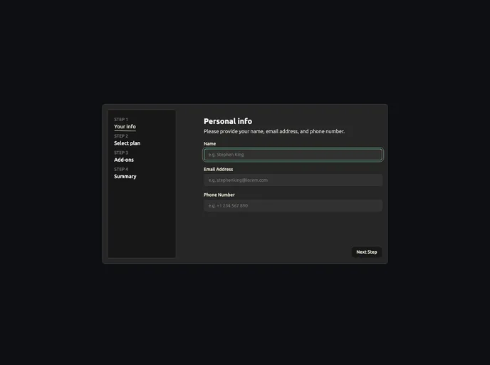
Open-source boilerplate for building robust multi-step forms with Next.js, React, and Tailwind. Includes a flexible wizard, accessible controls, built-in validation hooks, and simple form-state management for rapid prototyping and production-ready experiences.
Onborda is a lightweight Next.js onboarding flow with Framer Motion animations and Tailwind CSS styling. It provides fully customizable tooltips, supports multiple product tours, and ships with ready-to-use Global layout.tsx and Components & page.tsx scaffolding for rapid integration into modern web apps.
Search Address is a React component that uses OpenStreetMap's Nominatim to deliver fast, autocomplete-driven address lookup with grouped, interactive results. It plugs into shadcn-ui and lucide-react, supports multiple providers, debounced input, and dynamic imports for performance—open source for community collaboration.
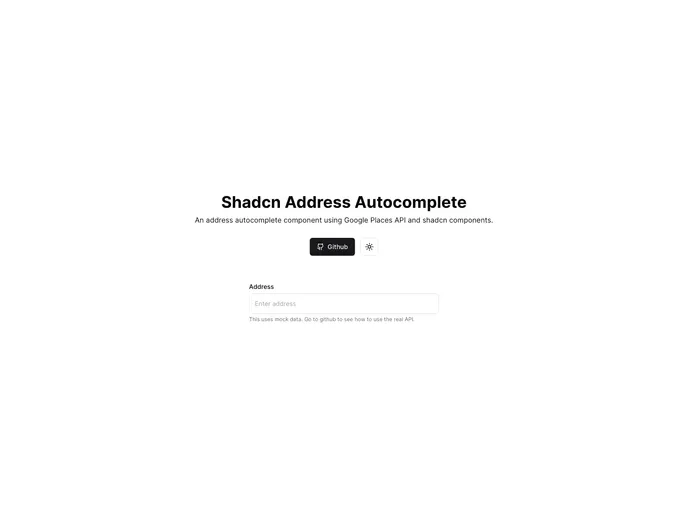
Enhance forms with Google Places-powered address autocomplete, built on Next.js and Tailwind, and styled with shadcn/ui components for a cohesive look. It delivers live suggestions as users type and is open-source for easy customization and integration—ideal for e-commerce, registrations, and any location-heavy app.
Kiranism Shadcn Dashboard Starter is a Next.js + TypeScript boilerplate that blends Tailwind CSS and Shadcn-ui to accelerate building admin dashboards and internal tools. It pairs robust typing with proven libs for auth, forms, state, and data grids so you can ship feature-rich UIs faster and with consistency.
Shadcn Tiptap is a curated set of TipTap extensions and toolbars designed to pair with shadcn/ui components. Built with Next.js and Tailwind CSS, it delivers a cohesive rich-text editing experience ready to drop into React apps. Clone, install with pnpm, and start editing with ready-made UI blocks and an SSR-friendly setup.
A focused, runnable demo that adds column-resize capability to ShadCN UI DataTable. This compact example demonstrates core UX, drag-to-resize events, and API hooks needed to adjust column widths, with a live demo and GitHub link for deeper exploration.
Open-source Crypto Chart Component for React that leverages Pyth's historical crypto data to deliver real-time charting in your app. It requires no API keys, is easy to drop in, responsive, and supports multiple chart types for financial dashboards, trading UIs, and analytics widgets.
The Shadcn Extension provides accessible, customizable UI components that extend the Shadcn library. It enables you to preview every component, read integrated docs, and contribute with a streamlined workflow. Build consistent interfaces faster while staying aligned with your design system and community-driven improvements.
Indie UI is a free, open-source collection of React components designed for rapid web app development. Tailwind CSS-ready and npm-installable, it offers ready-to-use UI blocks you can import and compose into production interfaces with minimal setup. Ideal for prototyping, dashboards, and MVPs.
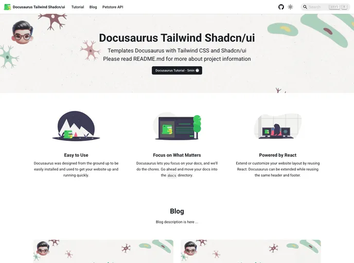
A ready-to-run Docusaurus V3 template that blends TailwindCSS and Shadcn/UI to deliver a fast, modern docs site with accessible components, cohesive design, and local search powered by @easyops-cn/docusaurus-search-local. Ideal for teams seeking speed, branding consistency, and scalable documentation.
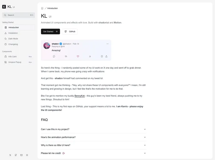
KL UI by Karrix Lee is an open-source collection of animated UI components built with shadcn/ui and Framer Motion. Designed for React and Next.js projects, these reusable elements deliver motion-rich polish that can elevate interfaces, with easy customization and MIT-licensed freedom.
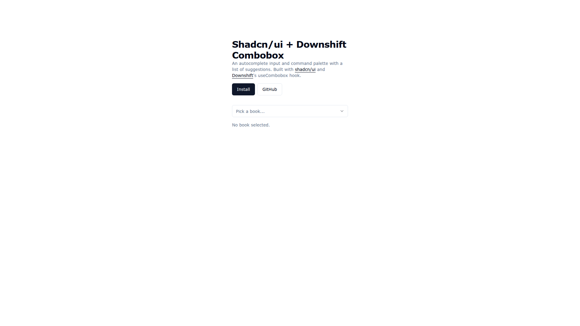
Downshift Shadcn Combobox merges Shadcn UI visuals with Downshift's useCombobox to deliver an accessible autocomplete input and command palette. It enables keyboard-friendly suggestions, cohesive theming, and rapid prototyping, with easy installation via the shadcn CLI and practical demo code for real-world usage.
React Fancy Switch delivers a polished, accessible multi-option toggle for React apps. It supports primitive and object options, smooth highlight transitions, and fully customizable styling for radios and the highlighter, enabling elegant, friction-free option switching in forms, dashboards, and settings UI.
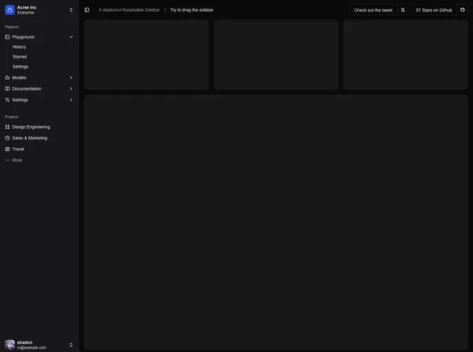
Resizable Sidebar for Next.js apps, built on shadcn/ui. It adds drag-to-resize, collapsible navigation with smooth transitions, theme support (light/dark), keyboard shortcuts, and cookie-backed persistence for a seamless, stateful UI.
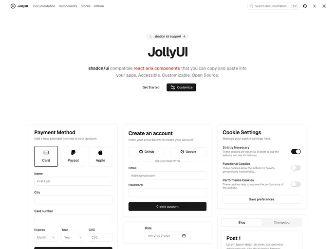
Jolly UI is a fast, accessible collection of React ARIA components designed for quick integration into any app. Built for accessibility, customization, and open-source collaboration, these components let you ship polished, keyboard-friendly UI with minimal boilerplate.
Next Shadcn Admin Dashboard is a modern, open‑source starter template for Next.js 15 and Shadcn UI. It ships with prebuilt admin screens, responsive layouts, and theme presets to accelerate building scalable dashboards. With RBAC, authentication flows, and reusable UI components, you can spin up a polished admin panel quickly while staying aligned with best practices and future‑ready tooling.
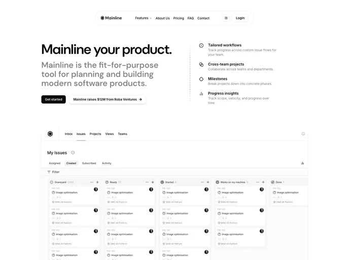
Mainline is a Next.js 15 + shadcn/ui + Tailwind 4 landing-page template designed for minimal, high-performance marketing sites. It pairs a clean aesthetic with fast, SEO-friendly rendering and straightforward component customization for rapid, polished launches.
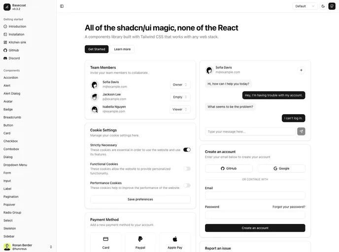
Basecoat is a modern, Tailwind-driven UI component library that works with any tech stack and doesn’t require React. It delivers accessible, themeable components you can drop into apps with minimal setup, helping you ship polished interfaces faster.
Astro Shadcn UI Template is a cohesive starter that blends Astro, Tailwind CSS, and shadcn/ui into a unified UI foundation. It accelerates modern web app development with ready-made components, a shared design system, and fast island-based rendering for responsive, production-ready interfaces.
ReUI is an open-source React UI component library that blends a fresh aesthetic with motion-driven interactivity. Built on React, TypeScript, Tailwind CSS, and Motion, it delivers polished, reusable components that play well with shadcn/ui, boosting developer productivity and UI consistency across apps.
Shadcn Prose is a polished typography package designed for shadcn/ui that serves as a drop-in replacement for @tailwindcss/typography. It standardizes headings, paragraphs, lists, and content blocks with a refined, readable aesthetic, responsive scales, and accessible defaults. Install, wire into globals.css, and elevate your app's text presentation in minutes.
Flutter Shadcn UI is a community-driven Flutter port of the Shadcn UI component set, delivering a cohesive, design-token driven widget library for rapid app UIs. It includes Button, Card, Avatar, Input, Tooltip, Toast, and more, with consistent theming and accessible UX. The port is actively tracked by contributors on Twitter and is free and open-source.
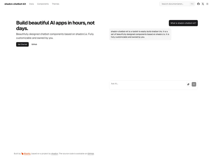
Shadcn Chatbot Kit is a responsive, themeable component suite for building AI chat experiences within the shadcn/ui ecosystem. It accelerates chatbot development with prebuilt UI blocks, modern code, and a CLI-driven setup, while preserving full customization and design consistency.
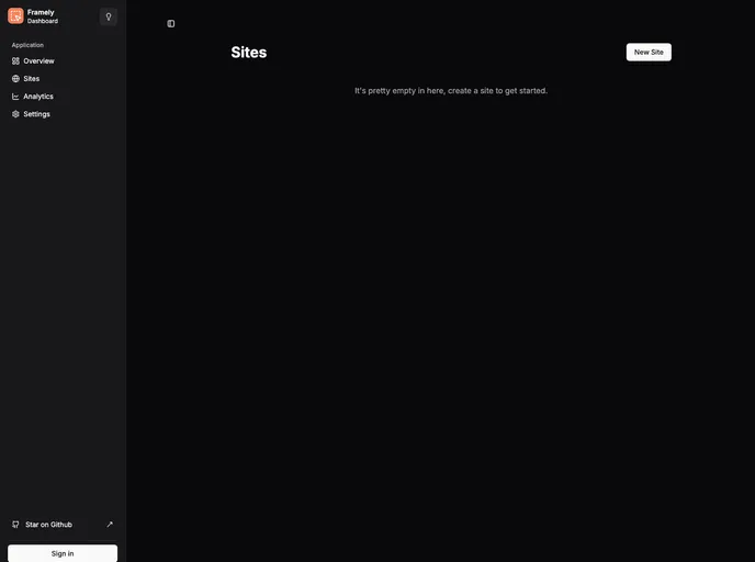
Framely is a Next.js-powered, multi-tenant full-stack platform that simplifies building and managing websites. Its flexible drag-and-drop editor, reusable blocks, and generated CSS previews enable rapid, design-consistent sites without heavy coding. Open to contributions, Framely invites developers to shape its evolving feature set.
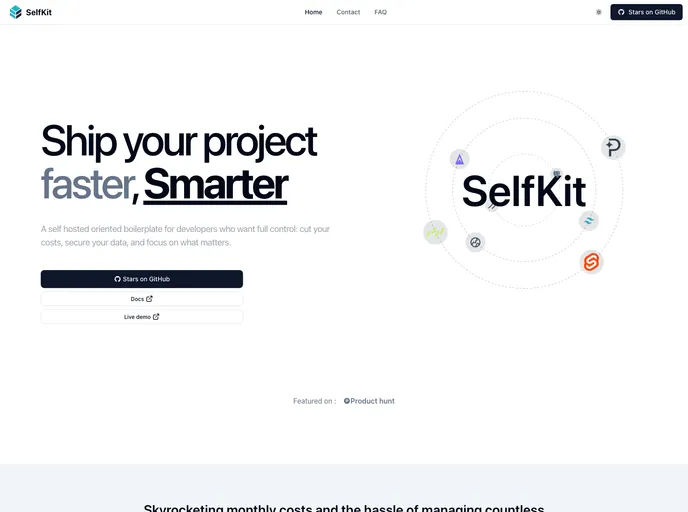
SelfKit is a self-hosted SaaS boilerplate designed for developers who want speed without vendor lock. It emphasizes open-source tooling and Docker-compatible hosting (Coolify or similar), delivering essential SaaS foundations—auth, payments, SEO, blog, analytics—plus a reusable UI kit and internationalization hooks.
Efficient SvelteKit + Supabase boilerplate that jump-starts full-stack apps with built-in auth, realtime data, and a Tailwind-based UI scaffold. It delivers sensible defaults, type-safe data access via drizzle-orm, and serverless-ready deployment for Vercel, making rapid prototyping and production-ready builds easier.
Grida Database Editor is a developer-friendly, all-in-one tool that unifies data management, CMS workflows, and form design. Supabase-backed tables, views, storage, and auth pair with rich text editing, flexible inputs, real-time syncing, and themeable UI to speed up admin UIs and CMS-driven apps.
Extro is an open-source browser extension starter kit that bundles React, TypeScript, and Tailwind CSS into a production-ready boilerplate. It emphasizes type safety, reusable UI components, and a cohesive stack for authentication, storage, content scripts, messaging, and publishing, enabling rapid prototyping and high-quality extension launches.
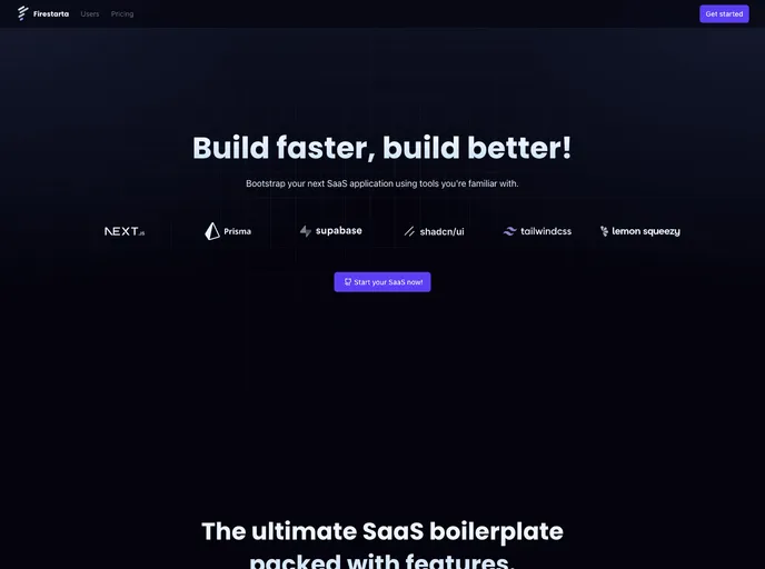
Firestarta is a Next.js SaaS boilerplate that jump-starts authenticated, subscription-based apps. Built with Prisma + Postgres (via Supabase), NextAuth, TypeScript, and Lemon Squeezy, it ships with app routing, user profiles, account management, and a reusable component library to accelerate SaaS delivery.
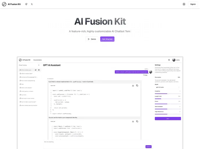
AI Fusion Kit is a TypeScript-first boilerplate that unites React/Next.js, Supabase, OpenAI, Vercel AI SDK, TailwindCSS, and Shadcn UI to deliver a ready-to-run AI-powered web app. It provides scaffolding, backend setup, and deployment-ready config for rapid prototyping and production-grade apps.
Launchmvpfast accelerates MVP software development by delivering ready-to-use SaaS starter kits and modular, customizable UI components. Open-source under the MIT license, it invites community collaboration and rapid iteration. In active development, with upcoming kits and documentation to help you explore, prototype, and ship faster.
Cult Directory Template is a Next.js 13 boilerplate designed to spin up startup directories fast. Built with Tailwind and Shadcn components, it includes an app dir architecture, Supabase backend, admin dashboard, analytics, and ready-made product filters. With dark/light theming and mobile-ready layouts, it streamlines MVPs and data-rich catalogs for rapid deployment.
Next Saas Stripe Starter is a Next.js SaaS boilerplate that accelerates product delivery by uniting Auth.js authentication, Prisma ORM, React Email, and a Tailwind + Shadcn UI toolkit. It’s deployment-ready on Vercel with PlanetScale, delivering a scalable, production-ready SaaS skeleton for rapid experimentation and growth.
Skateshop is an open-source Next.js 14 e-commerce scaffold styled with Tailwind CSS and powered by Drizzle ORM. It delivers essential storefront capabilities—user management, email workflows, content management, and Stripe-based payments—designed as a developer-friendly starting point for rapid customization. Note: development in progress and not recommended for production use.
Kokonut UI is an open-source collection of TailwindCSS-powered UI components designed for design engineers and developers. Built with Motion for React and Next.js, it delivers accessible, ready-to-use components. Clone, install, and accelerate UI development in your React or Next.js apps.
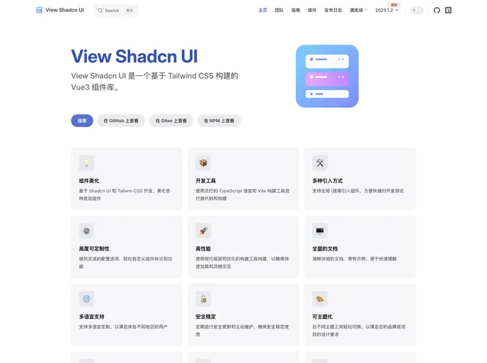
View Shadcn UI is a Vue 3 component library built on Tailwind CSS, delivering a ready-to-use collection of modular UI elements for Vue apps. With simple installation and straightforward imports, you can quickly assemble consistent, scalable interfaces while keeping code clean and maintainable.
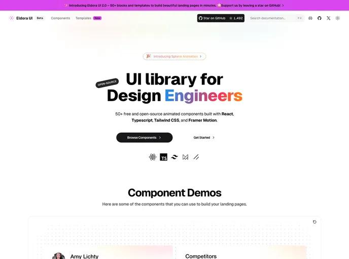
Eldora UI is an open-source React component library with TypeScript, Tailwind CSS, and Framer Motion-driven animations. Fully customizable and modular, these reusable UI elements accelerate modern web development and empower teams to prototype and ship polished interfaces quickly.
Aspect is a polished corporate marketing template built with Next.js 15, shadcn/ui, and Tailwind 4. It delivers a clean, engaging online presence with a robust block-based architecture, SEO-ready setup, and responsive, themeable UI—ideal for corporate sites and fast-growing brands.
Next.js Blog App with multi-user support powered by Supabase. It leverages App Router, Supabase Auth, Database, and Storage to deliver a scalable, production-ready blogging platform with clean frontend/backend separation and ready-to-customize architecture for rapid deployment.
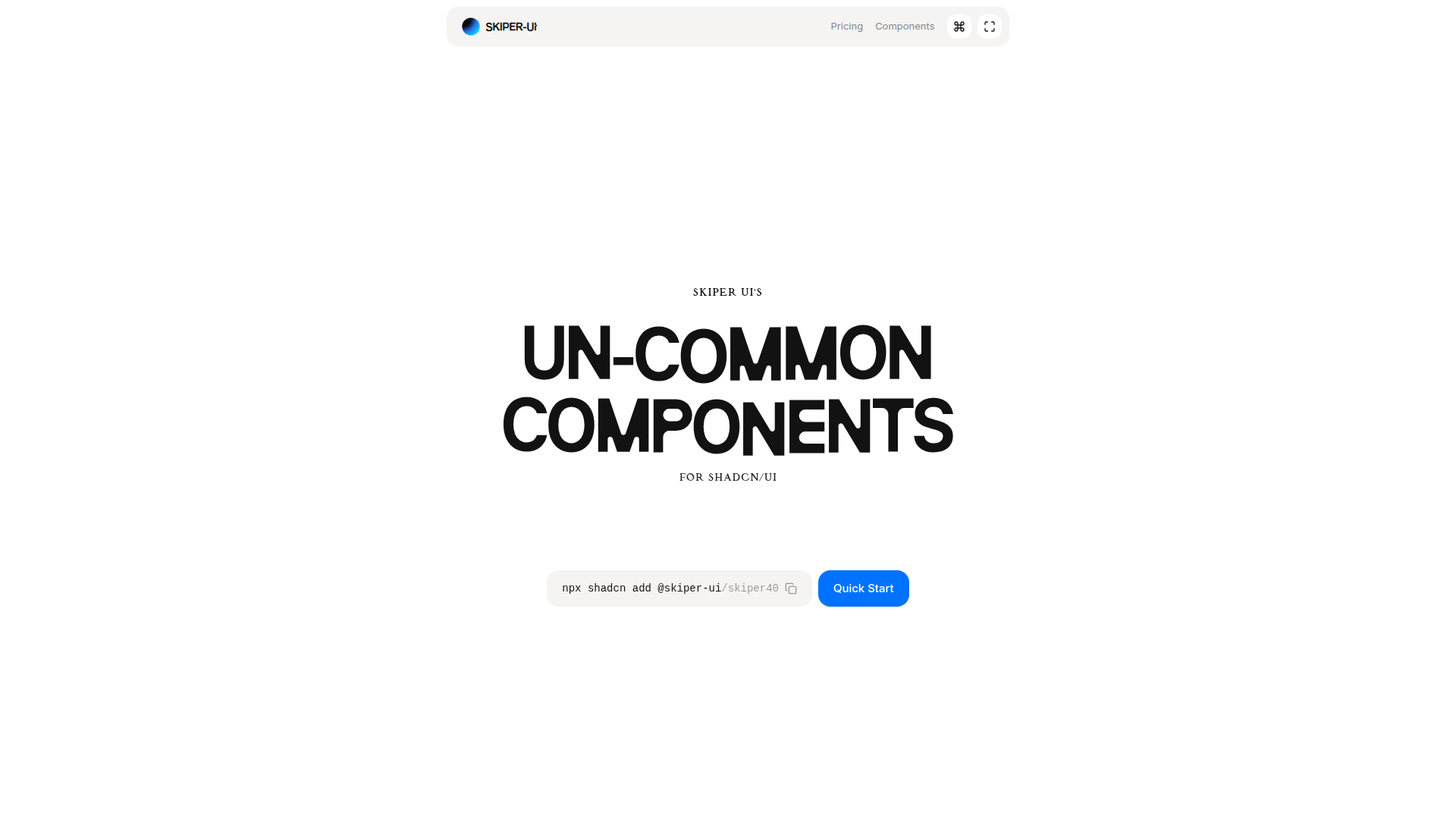
Skiper UI is an open-source component library focused on accessibility, customization, and rapid integration. With copy-and-paste ready components, you can assemble polished interfaces fast while maintaining a cohesive design system across apps.
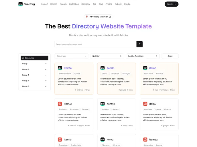
Mdirs is a Next.js directory boilerplate with Sanity Studio CMS, Resend onboarding emails, Stripe payments, and Auth.js authentication with social logins. It ships with Shadcn UI and Tailwind, offering advanced search, SEO, a rich blog, and a responsive UI with dark mode. Fully customizable with lifetime updates.
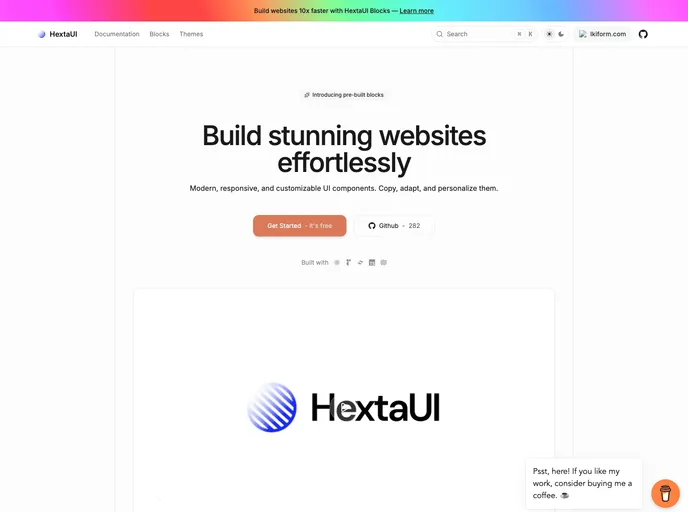
HextaUI is an open-source toolkit of modern, responsive UI components you can copy, adapt, and brand to ship polished web interfaces faster. Designed for developers who value both aesthetics and accessibility, it pairs ready-made blocks with clear docs and thriving community contributions, balancing speed with robust functionality.
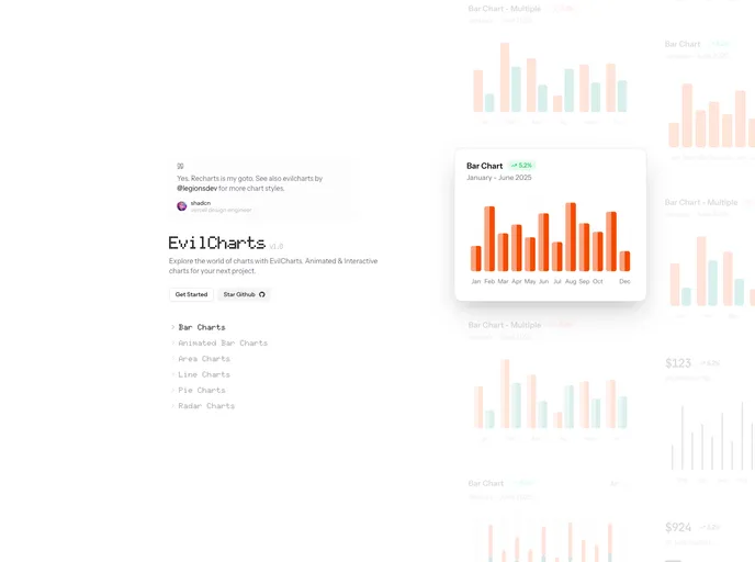
Evilcharts is a modern, visually striking chart UI kit for React and Next.js. Built on shadcn and recharts, it delivers customizable chart components for rapid, interactive data visualizations. Ideal for dashboards and data-driven pages, it blends style with performance and flexible branding options.