Premium blocks, templates & marketing.
43 products found
radix-ng.com
Primitives
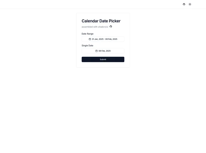
shadcn-calendar-compon...
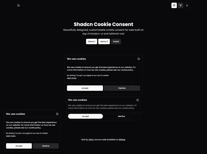
Shadcn Calendar Component
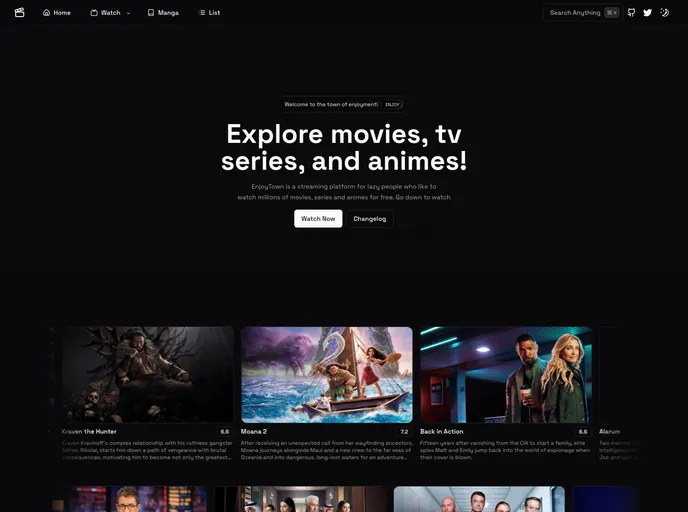
enjoytown.pro
Enjoytown
dialog-stack.haydenble...
Dialog Stack
calendar-shadcn.vercel...
Calendar
originui.com
Origin UI
shadcn-country-dropdow...
Shadcn Country Dropdown
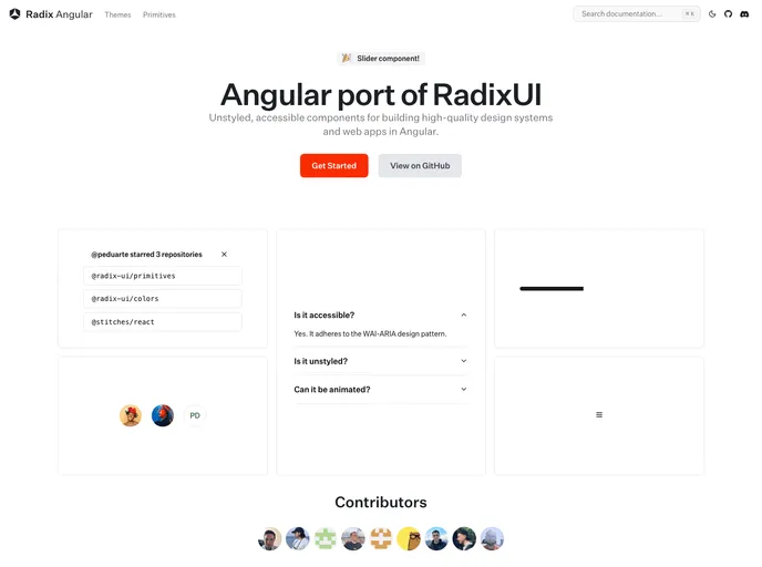
Primitives for Angular (Radix-NG) deliver accessible, low-level UI building blocks inspired by Radix UI. This unofficial port prioritizes accessibility, customization, and a developer-friendly API for incremental adoption in design systems. It ships with a base layer, clear docs, and a Storybook showcase to accelerate reliable UI.
An accessible, drop-in calendar date picker for Next.js apps that blends Shadcn UI styling with Radix primitives. It delivers a keyboard-friendly interface for quick date selection, supports localization and flexible formatting, and plugs into your Next.js project with minimal configuration for a polished, consistent user experience.
Enjoytown is an open-source Next.js + Tailwind boilerplate for a streaming platform. It offers no-signup access to movies, dramas, and anime with English subtitles or dubs, backed by a TMDB catalog. Deployable to Vercel, it features a configurable config/env workflow, and API-ready hooks for rapid media-app prototyping.
Dialog Stack provides a concise, stack-based approach to managing layered modal dialogs in React apps. Track active dialogs, preserve focus order, and deliver accessible, predictable UX across complex flows with minimal boilerplate.
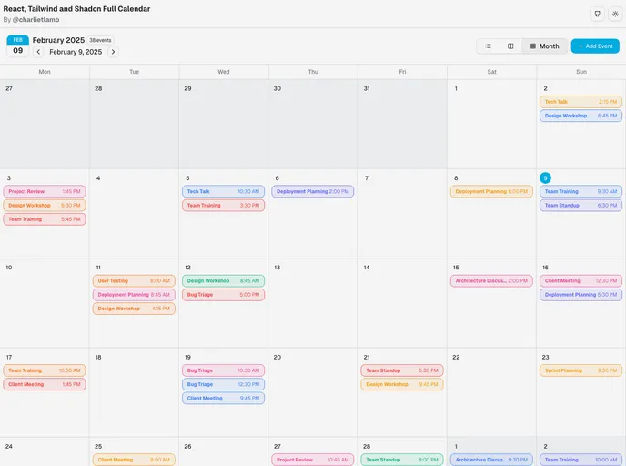
React/ShadCN Calendar: a Tailwind-first, dashboard-focused calendar component. Built with ShadCN patterns and Radix UI accessibility, it supports dark mode, responsive layouts, multiple views, and robust event management. Fully customizable and ready for seamless integration into React apps.
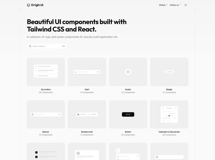
Origin UI is a copy-paste component library for React and Next.js projects, designed to accelerate UI development with a consistent styling system, dark mode, and shadcn-friendly conventions. It streamlines setup by guiding you to copy registry files into your project, wire CSS variables, and adjust Tailwind config for fast, reliable UI integration.
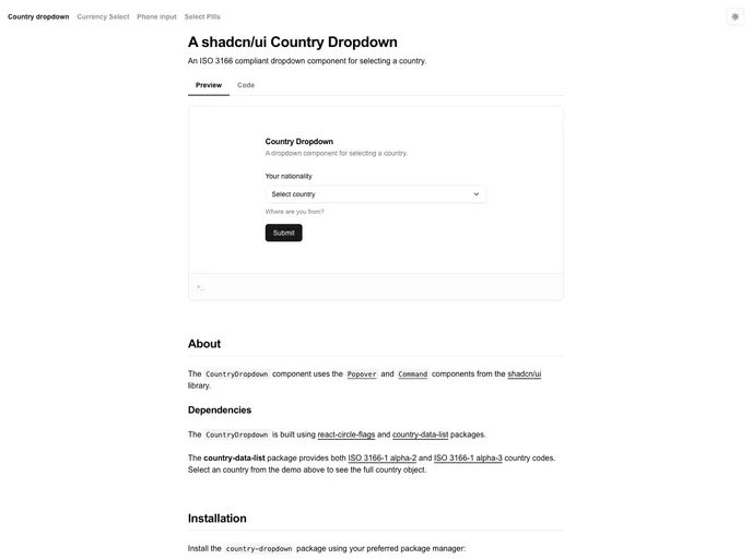
Shadcn Country Dropdown is a Next.js starter boilerplate that demonstrates a clean, accessible country selector built with Shadcn UI patterns. It boots from a minimal dev server, uses next/font to optimize the Geist font for Vercel, and ships with a deployment-ready setup you can edit in app/page.tsx. Ideal for rapid forms, onboarding flows, and prototyping country-aware experiences.
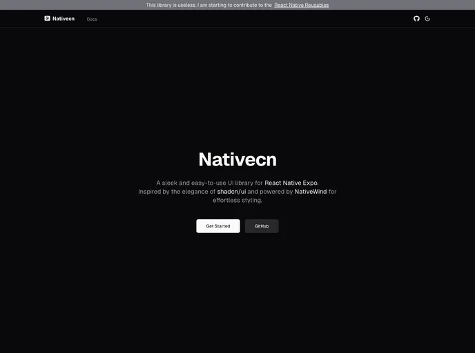
Nativecn is a React Native UI component library inspired by shadcn-ui, crafted for fast, themeable mobile apps. It delivers highly customizable, accessible components with built-in dark mode, CSS variables, and NativeWind compatibility, enabling teams to ship cohesive UIs with minimal setup.
nyxbui.design offers a lightweight, open-source UI kit with thorough docs, contribution guidance, and flexible deployment options. Explore authors, project statistics, star history, and MIT licensing. Deploy quickly on Vercel with Next.js, Tailwind, and Radix UI components.
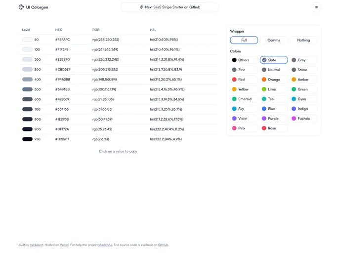
UI Colorgen streamlines color setup for shadcn/ui projects. Browse Tailwind palettes in multiple formats, adjust variables with a Color Picker, and generate root CSS variables plus Tailwind color sections for config files. Ideal for fast, consistent theming across apps.
Carhive is a Next.js-based car rental prototype showcasing App Router-driven layouts, Tailwind styling, and Shadcn/ui components, with an interactive Leaflet map and serverless data via Vercel Postgres. It demonstrates server/client component patterns, auth with Clerk, and a practical rental workflow. Note: project is a work in progress with ongoing updates.
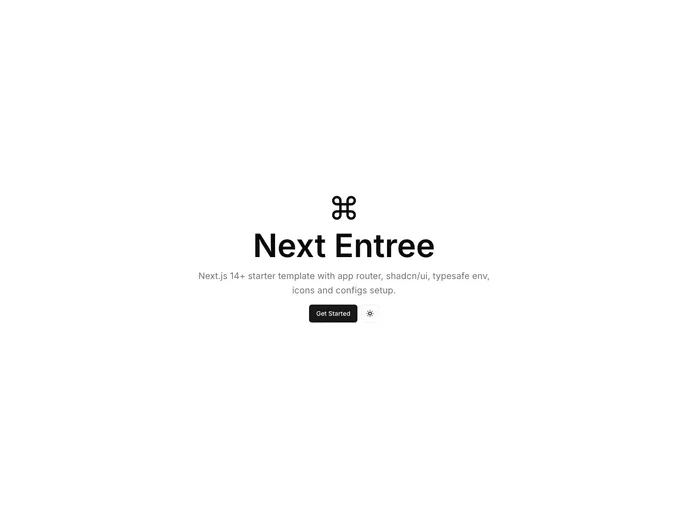
Next Entree is a Next.js 14+ boilerplate with a ready-to-run app structure, app routing, TypeScript, Tailwind, and shadcn/ui integration. It includes SEO-friendly defaults and a typesafe environment to accelerate rapid, scalable development for modern web apps.
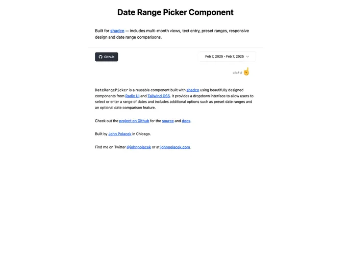
Date Range Picker For Shadcn is a reusable UI component built for Shadcn projects using Radix UI primitives and Tailwind CSS. It delivers a clean dropdown to select or type a date range, supports preset ranges, and offers an optional date comparison view for quick analytics.
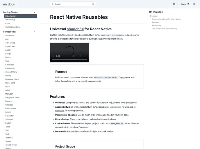
React Native Reusables is an Expo-powered UI library styled with NativeWind, delivering a rich suite of ready-to-use React Native components (Accordion, Alert, Button, Card, Checkbox, and more). It supports copy-paste customization to rapidly assemble a tailored component library for mobile apps, speeding UI parity across projects.
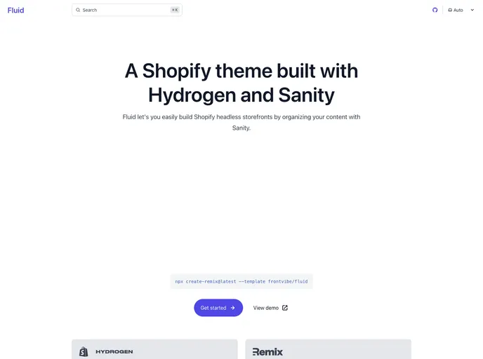
Fluid is a Hydrogen-based theme for Shopify headless storefronts, paired with Sanity CMS for real-time content editing and live previews. Build pages by assembling modular sections, mirroring Liquid-style workflows, while editors see updates instantly through visual editing and live previews.
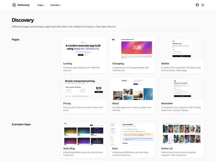
Astro Nomy is an open-source starter for Astro v4 and shadcn/ui that demonstrates a modern app with authentication, subscriptions, API routes, MDX docs, and Content Collections. This experimental project showcases practical patterns for building scalable, well-typed apps while keeping styling minimal and ready for customization.
A Next.js 14 boilerplate monorepo powered by Turborepo. It uses the new router, server components, and multi-app workflows to accelerate development in a single repo. Includes Clerk authentication, Radix UI with Tailwind, TypeScript-first tooling (ESLint/Prettier), and Vercel remote caching for fast builds.
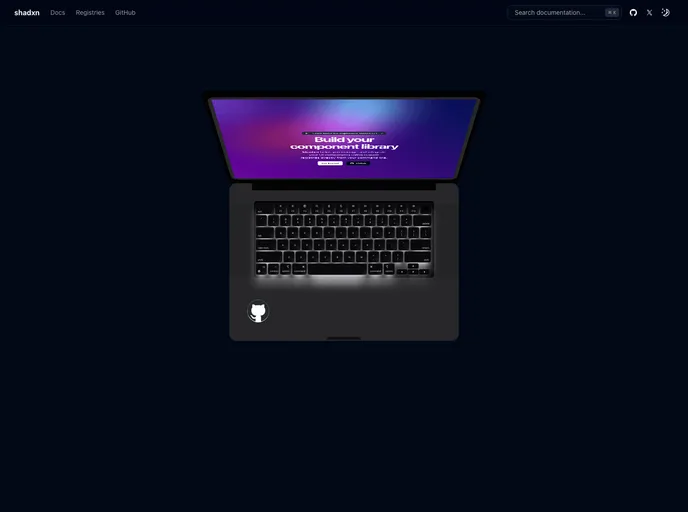
Shadxn is an experimental CLI that accelerates component-driven development by enabling seamless integration of shadcn-style components and dependencies into projects. It adds custom registry support, framework-agnostic compatibility, and streamlined project initialization with sensible defaults.
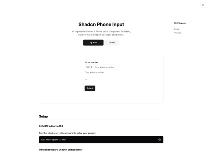
Shadcn Phone Input is a reusable, themeable input component that blends clean, modern aesthetics with practical form controls. It includes a customizable field, built-in country selection, and seamless integration with React, Next.js, Tailwind, and Radix UI. Open source and designed to slot neatly into the Shadcn design system.
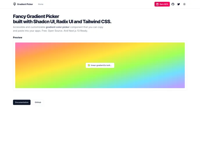
Gradient Picker is a lightweight tool to discover, tweak, and export gradients and color themes for UI design. Built with Shadcn UI, Radix UI, and Tailwind CSS, it delivers real-time gradient previews, solid colors, and background-image blends. Free and open source, with live examples and clean code/docs to accelerate theming in Shadcn projects.
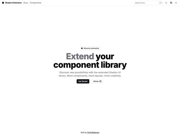
The Shadcn Extension provides accessible, customizable UI components that extend the Shadcn library. It enables you to preview every component, read integrated docs, and contribute with a streamlined workflow. Build consistent interfaces faster while staying aligned with your design system and community-driven improvements.
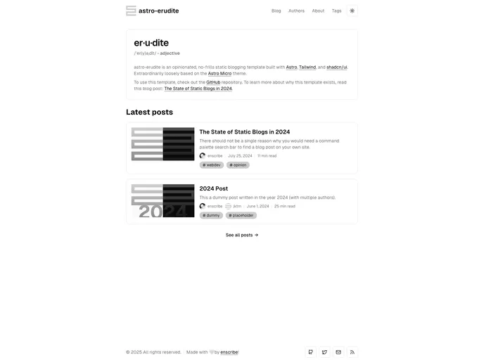
Astro Erudite is a fast, minimal static blogging template built with Astro, Tailwind, and shadcn/ui. Inspired by the Astro Micro theme, it prioritizes speed, readability, and developer-friendly customization—from MDX posts and enhanced code blocks to SEO-friendly output and painless deployment.
An Astro-powered personal site starter designed for speed, simplicity, and a polished portfolio. This lightweight template highlights modern design while keeping development fast and approachable, ideal for quickly showcasing work with minimal setup.
Next Portfolio is a clean, modern Next.js starter to showcase your work with minimal distraction. Built with React, Next.js, and Tailwind CSS, it delivers fast performance, easy customization, and deployment-ready setup—ideal for developers, designers, and freelancers launching portfolios.
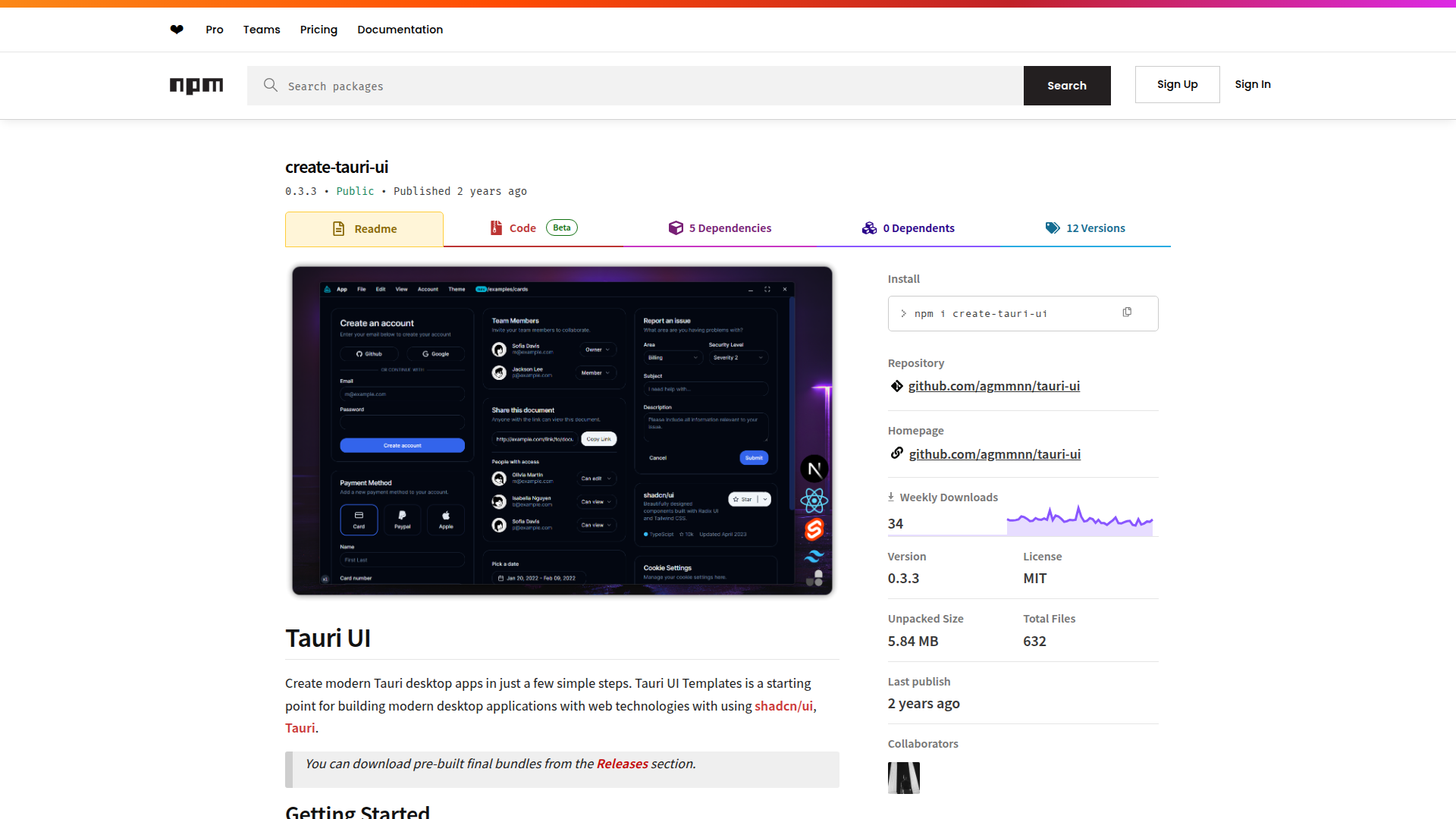
Tauri UI is a modern desktop app starter template built with Tauri 2, Next.js 13, Tailwind, and shadcn/ui components. It delivers a lightweight, secure runtime, a cohesive React workflow, and ready-to-theme UI pieces. Includes dark/light theming, a draggable titlebar, and TypeScript tooling to accelerate prototyping and production-ready apps.
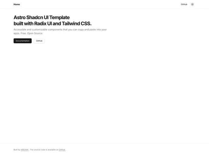
Astro Shadcn UI Template is a cohesive starter that blends Astro, Tailwind CSS, and shadcn/ui into a unified UI foundation. It accelerates modern web app development with ready-made components, a shared design system, and fast island-based rendering for responsive, production-ready interfaces.
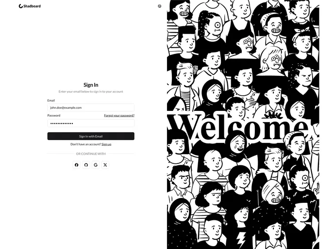
Shadboard is an open-source admin dashboard boilerplate built with Next.js 15 and Shadcn/UI. It provides a scalable, accessible starter for modern web apps, featuring authentication, I18n, a customizable UI, and responsive layouts. Free to the community, it's ideal for learning, rapid prototyping, and building production-ready admin panels.
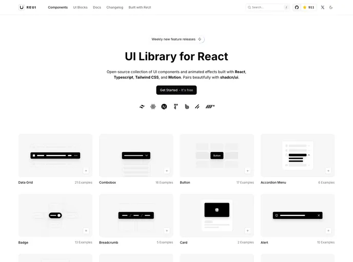
ReUI is an open-source React UI component library that blends a fresh aesthetic with motion-driven interactivity. Built on React, TypeScript, Tailwind CSS, and Motion, it delivers polished, reusable components that play well with shadcn/ui, boosting developer productivity and UI consistency across apps.
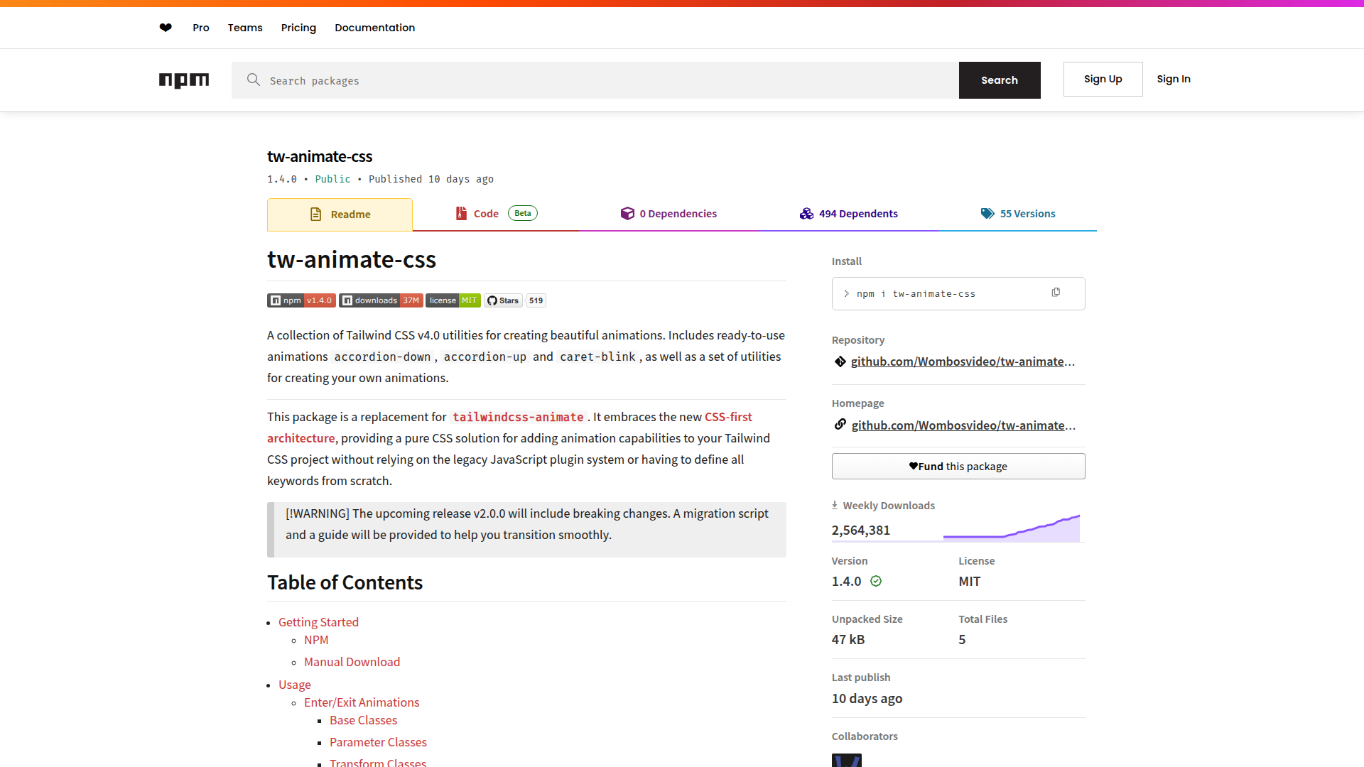
Tw Animate CSS delivers pure CSS animation utilities for Tailwind CSS v4.0. It includes ready-to-use presets like accordion-down, accordion-up, and caret-blink, all CSS-first to avoid legacy JavaScript. Install via npm or manual download, then tune duration, delay, and easing to fit your UI with zero runtime dependencies.
A Next.js-based personal blog with Markdown authoring, syntax highlighting, and SEO-friendly design. It delivers a responsive UI, built-in comments, and a streamlined dev setup using pnpm, TypeScript, Tailwind CSS, Radix UI, Prisma, and Supabase for fast, readable writing.
GTD Task Management App is a Next.js 13–based theme delivering a clean GTD-style workspace for tasks, projects, contexts, and goals. Built with Radix UI Primitives, Tailwind CSS (with class sorting/merging/linting), Lucide icons, and React Query, plus Prisma + Postgres for persistence, it offers dark mode and a turnkey setup to clone, install, and run locally.
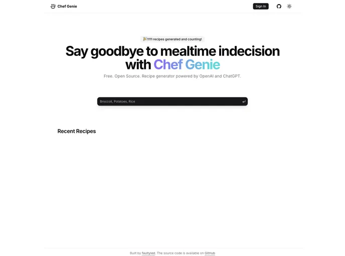
Chef Gpt is a developer-friendly boilerplate for AI-powered recipe apps built with Next.js and Shadcn UI. It scaffolds OpenAI/ChatGPT integration, UI primitives, authentication, and data handling, plus deployment-ready patterns. Still in active development and not recommended for production use.
Frontend Nav is a Next.js 13 boilerplate for building modular, navigable frontends. It combines Radix UI with Tailwind, dark mode, NextAuth authentication, Prisma ORM, and a PlanetScale MySQL backend. It features a one-click page capture to generate shareable cards and static docs pages, delivering a practical, learning-oriented starter for modern app patterns (API routes, ORM, and more).
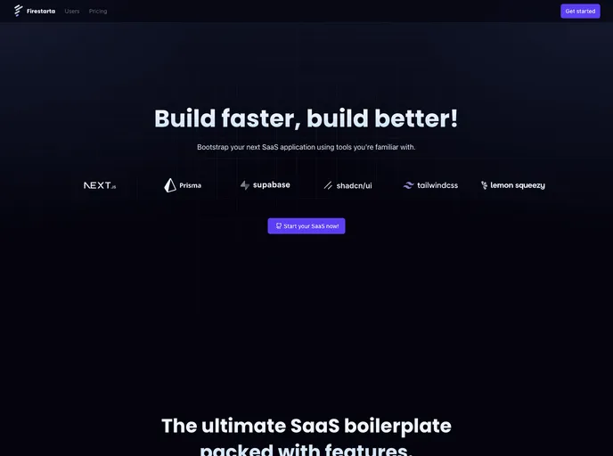
Firestarta is a Next.js SaaS boilerplate that jump-starts authenticated, subscription-based apps. Built with Prisma + Postgres (via Supabase), NextAuth, TypeScript, and Lemon Squeezy, it ships with app routing, user profiles, account management, and a reusable component library to accelerate SaaS delivery.
A ready-to-run Next.js 14 e-commerce boilerplate with admin panel, TypeScript, Prisma, Tailwind, and shadcn/ui. It combines React Server Components, MDX-powered blogs, Cloudinary uploads, cookie-based auth, SEO/i18n support, and production-ready patterns to bootstrap online stores fast.
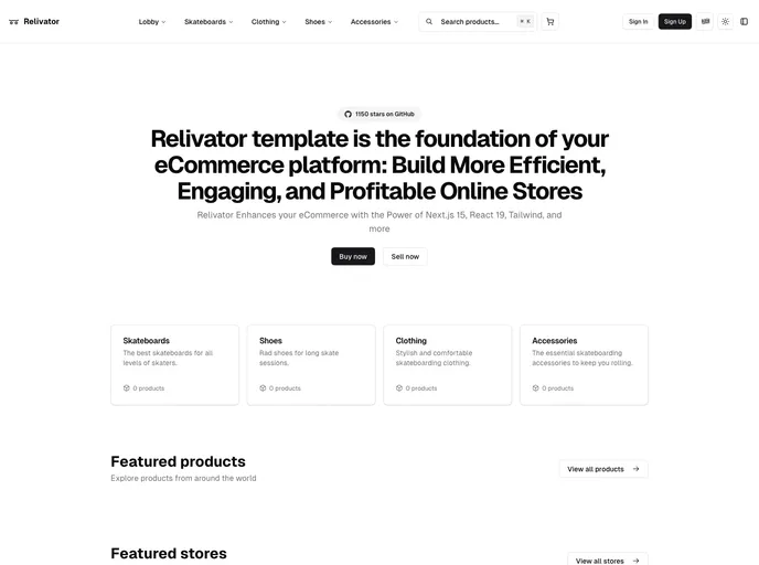
Relivator Next.js Template is a production-ready Next.js 14 starter that streamlines project setup with multi-auth, integrated tooling, and effortless deployment. Ideal for rapid prototyping, reliable production apps, and scalable SaaS ventures.
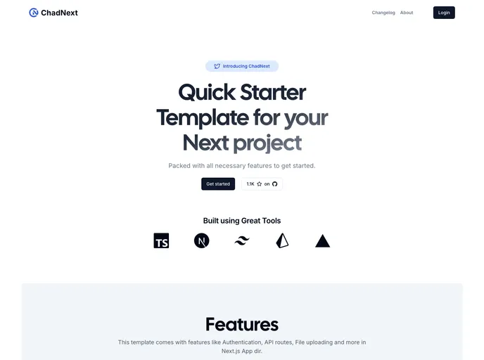
ChadNext is a fast, opinionated Next.js starter that bundles essential features for rapid prototyping: polished Tailwind-based UI components, straightforward authentication, streamlined database access, and seamless deployment to Vercel. It helps you test ideas quickly while delivering solid performance and a great developer experience.
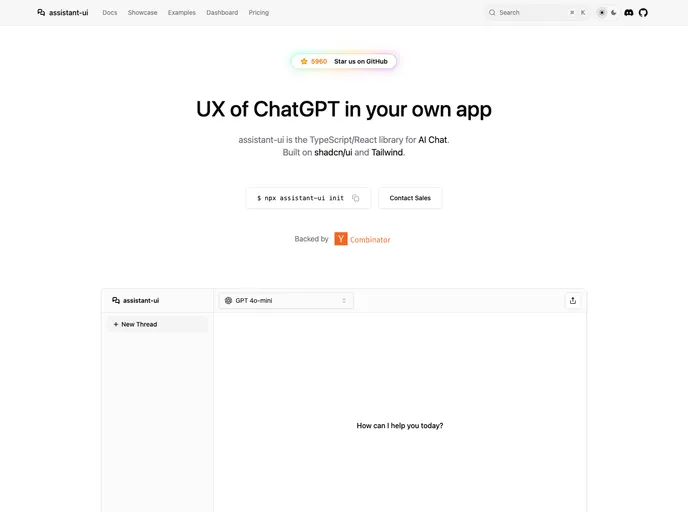
Assistant UI is an open-source TypeScript/React library for rapid, production-ready AI chat UIs. It delivers composable primitives, streaming, auto-scroll, accessibility, and theme customization, enabling developers to craft polished chat experiences that integrate with multiple AI models and backend services. Built for real-time interactions and excellent DX, it lets teams ship reliable AI chat apps faster while handling UI complexity.
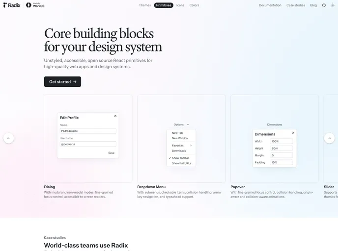
Radix Primitives delivers accessible, low-level UI building blocks for React that you can trust as the foundation of a design system or to augment existing apps. With a11y-first primitives and modular composition, you can build robust, keyboard-friendly interactions incrementally.
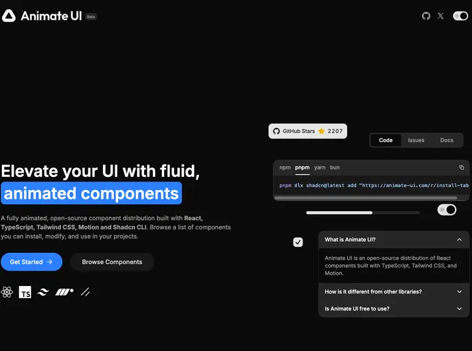
Animate UI is a beta toolkit of customizable UI components designed to accelerate interface prototyping. It offers modular primitives, clear docs, and ongoing updates. As an open-source project under the MIT license, it invites community contributions to shape the final product while you experiment with early features.
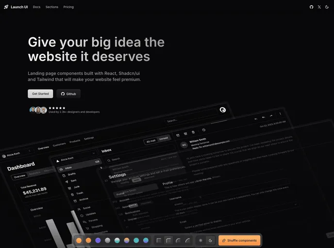
Launch UI is a production-ready Next.js website components template built with Shadcn/ui and Tailwind CSS. It ships ready-to-use, responsive components and layouts to accelerate modern site builds while emphasizing accessibility, performance, and SEO out of the box.
Cook is a modern, bento-box styled portfolio boilerplate for developers, designers, and creatives. Built with Next.js, Tailwind, shadcn/ui, and magic-ui, it targets top Lighthouse scores, accessibility, and effortless deployment to Vercel, with GitHub API integration, Pocketbase backend, and Umami analytics.
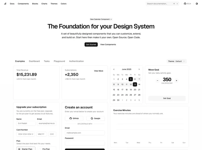
shadcn/ui is a React component library built on Radix UI and Tailwind CSS, designed for a copy-paste workflow. It ships as self-contained components you can browse in a central registry, paste into your project, and customize with no external dependencies. A CLI manages components across apps, delivering fast, accessible UIs out of the box.