Premium blocks, templates & marketing.
76 products found
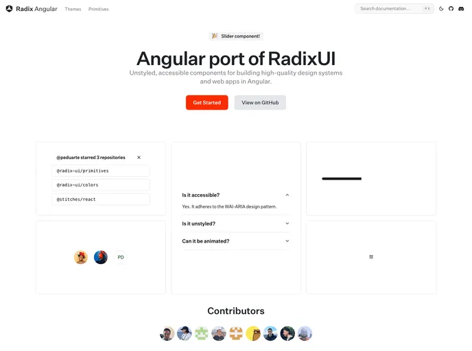
radix-ng.com
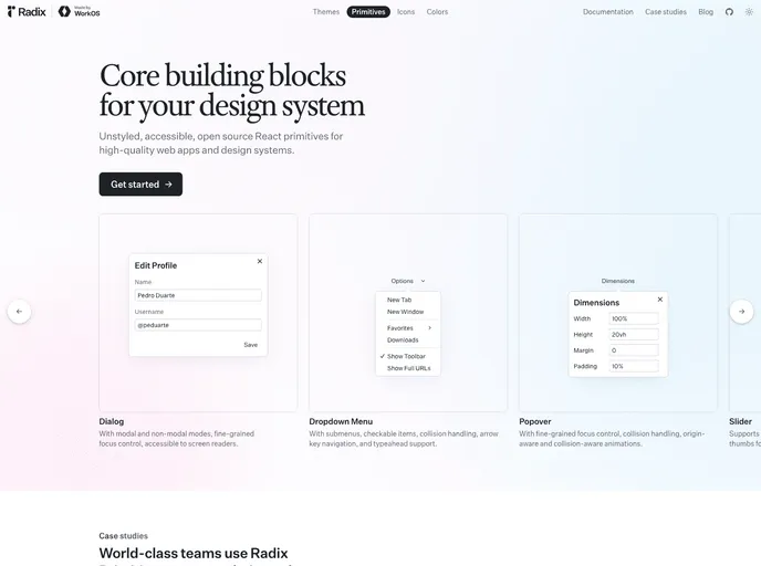
Primitives
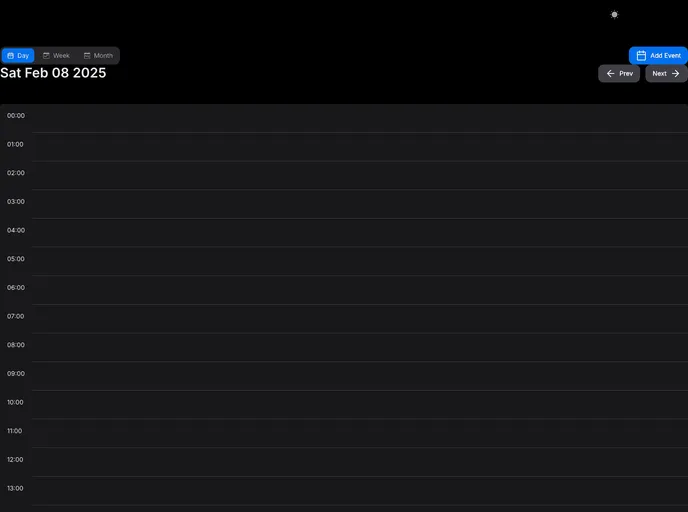
mina-scheduler.vercel.app
Mina Scheduler
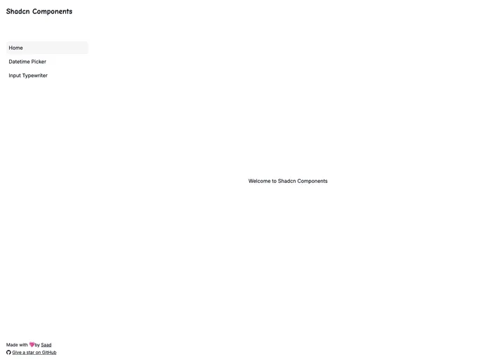
shadcn-datetime-picker...
Shadcn Datetime Picker
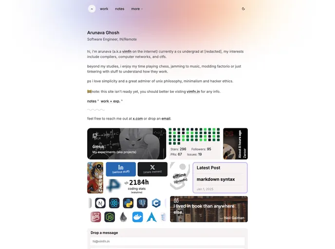
beta.vimfn.in
Www
nextzy.vercel.app
Next Minimal Store
prismui.tech
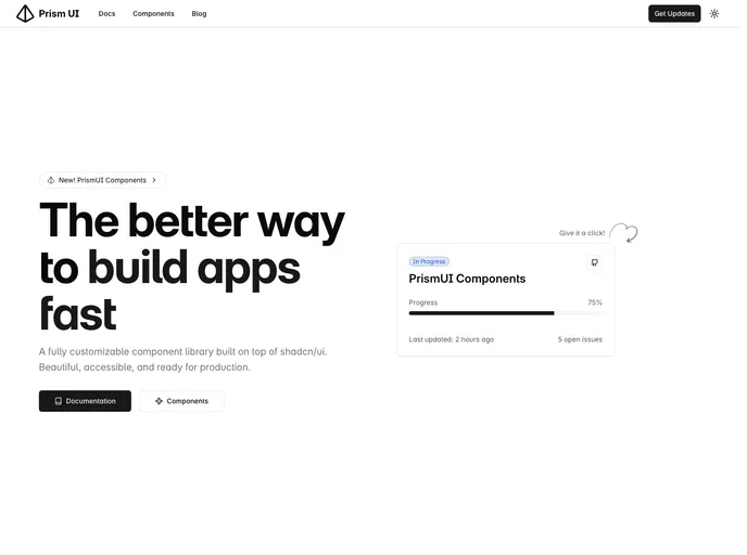
Prism UI
fullcalendar-shadcn-ex...
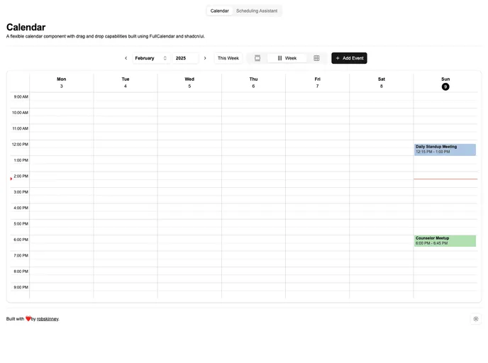
Shadcn UI Fullcalendar Example
Primitives for Angular (Radix-NG) deliver accessible, low-level UI building blocks inspired by Radix UI. This unofficial port prioritizes accessibility, customization, and a developer-friendly API for incremental adoption in design systems. It ships with a base layer, clear docs, and a Storybook showcase to accelerate reliable UI.
Mina Scheduler is a lightweight, plug‑and‑play scheduling UI kit built for the Shadcn/Tailwind ecosystem. It delivers calendar views, event management components, and drag‑and‑drop rescheduling to rapidly add scheduling features to admin dashboards and SaaS apps. Fully client‑side, customizable, and open source.
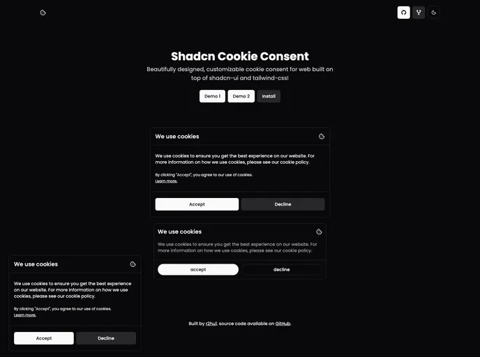
Shadcn Datetime Picker is a compact, reusable UI component for selecting dates and times in Shadcn-based apps. It includes a dedicated time picker and is designed to work smoothly inside popovers. Version 2 fixes layout stability and simplifies integration with a script tag, CSS import in head, and straightforward JS initialization.
Www is a lightweight frontend boilerplate built for React/Next.js with Tailwind, prioritizing minimalist design, fast performance, and responsive layouts. It enables quick onboarding: clone the repo, install dependencies, and start the dev server to prototype production-ready interfaces fast.
Next Minimal Store is a lightweight, open-source storefront boilerplate built with Next.js, Tailwind, and Shadcn UI. It delivers a lean set of reusable storefront components and routing boilerplate to accelerate prototyping and production-ready storefronts.
Prism UI is a Tailwind-friendly React component library that extends shadcn/ui with accessible, TypeScript-first components and pre-built page sections. It accelerates building polished, brandable web apps with composable patterns and deep customization.
Shadcn UI Fullcalendar Example is a Next.js boilerplate that demonstrates integrating FullCalendar with Shadcn UI components. Bootstrapped with create-next-app, it includes a development server, next/font-based Geist font optimization, learning resources, and Vercel-ready deployment. A practical starter for fast prototyping and learning modern UI tooling.
Shopco is an open-source boilerplate that turns Figma e-commerce designs into production-ready, responsive storefronts. Built with Next.js 14, TypeScript, Tailwind CSS, Redux, Framer Motion, and ShadCN UI, it prioritizes SEO, performance, and accessibility to help teams ship maintainable, scalable shopfronts fast.
Next.js 15 Starter Shadcn delivers a production-ready boilerplate built with Next.js 15, React 19, TypeScript 5, Tailwind CSS 3, and Shadcn UI. It accelerates setup with robust tooling and VS Code-focused workflows for rapid UI prototyping.
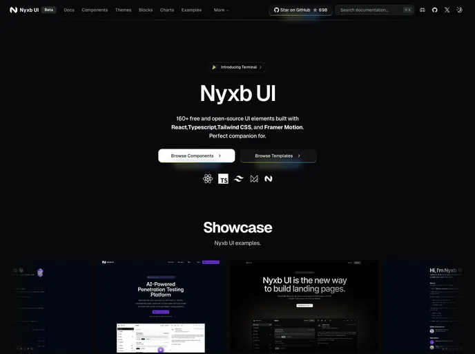
nyxbui.design offers a lightweight, open-source UI kit with thorough docs, contribution guidance, and flexible deployment options. Explore authors, project statistics, star history, and MIT licensing. Deploy quickly on Vercel with Next.js, Tailwind, and Radix UI components.
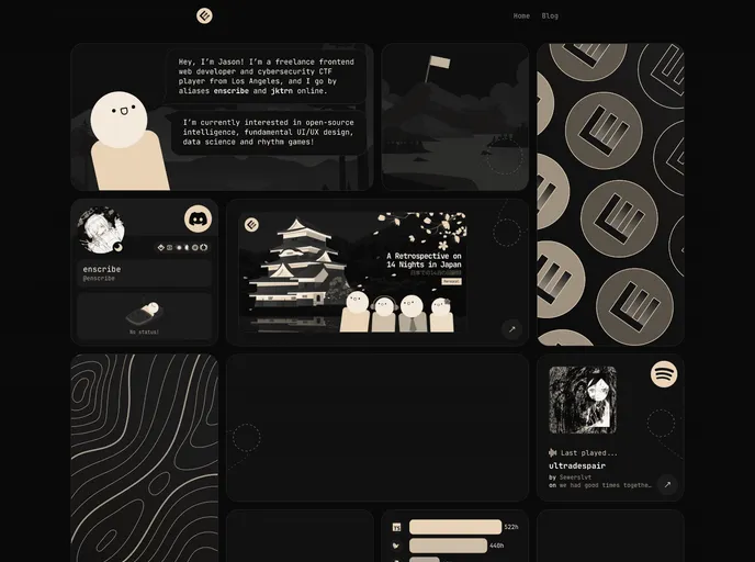
Enscribe.dev is a Next.js + Tailwind CSS blog boilerplate for personal information security. This open-source starter acts as a learning hub, practical reference, and inspiration for security-focused projects, featuring a TypeScript-first codebase and streamlined Vercel deployment for fast, interactive experiences.
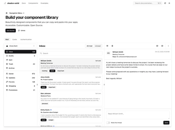
Shadcn Solid is an unofficial, community-led SolidJS port of shadcn/ui. It provides accessible, customizable Solid components you can drop into apps to rapidly assemble a shared component library. Free, open source, and designed for teams seeking a consistent design system with minimal setup.
A curated Shadcn UI kit for React apps that accelerates UI development with ready-to-use, composable blocks. It includes camera-enabled components (capture-photo), AI chat elements, autocomplete, automatic form creation, and other reusable patterns to help teams prototype faster while preserving a cohesive, accessible design system.
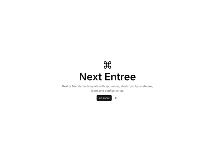
Next Entree is a Next.js 14+ boilerplate with a ready-to-run app structure, app routing, TypeScript, Tailwind, and shadcn/ui integration. It includes SEO-friendly defaults and a typesafe environment to accelerate rapid, scalable development for modern web apps.
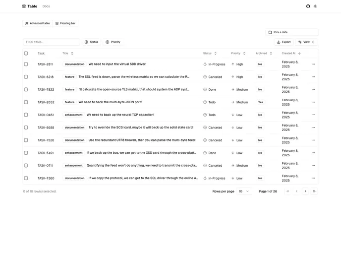
Next.js-based Shadcn Table component styled with Tailwind and powered by TanStack React Table. It provides server-side pagination, sorting, and filtering, plus debounced search and dynamic facet filters. The project is in active development and not yet production-ready.
Nativecn UI is a React Native component library inspired by shadcn-ui, delivering a cohesive, customizable set of mobile UI elements designed to speed app development. It provides themeable components, consistent design primitives, and a straightforward integration path for rapid prototyping and collaboration.
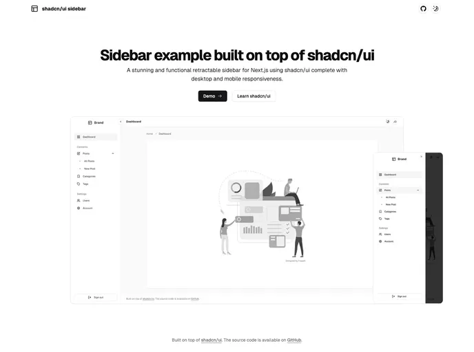
Shadcn UI Sidebar is a polished retractable navigation component for Next.js apps, offering a compact mini variant and a full-width desktop sidebar plus a mobile sheet menu. It’s responsive, accessible, and easy to integrate into admin dashboards or SaaS UIs, enabling organized, collapsible navigation without leaving the current view.
Next.js 15 Starter delivers a clean, scalable scaffold for rapid project launches. Built on Next.js 15, TailwindCSS, and Shadcn UI, with Google Analytics and Vercel hosting, it provides localization-ready support, sensible defaults, and a smooth clone-to-deploy workflow for fast iteration.
Shadxn is an experimental CLI that accelerates component-driven development by enabling seamless integration of shadcn-style components and dependencies into projects. It adds custom registry support, framework-agnostic compatibility, and streamlined project initialization with sensible defaults.
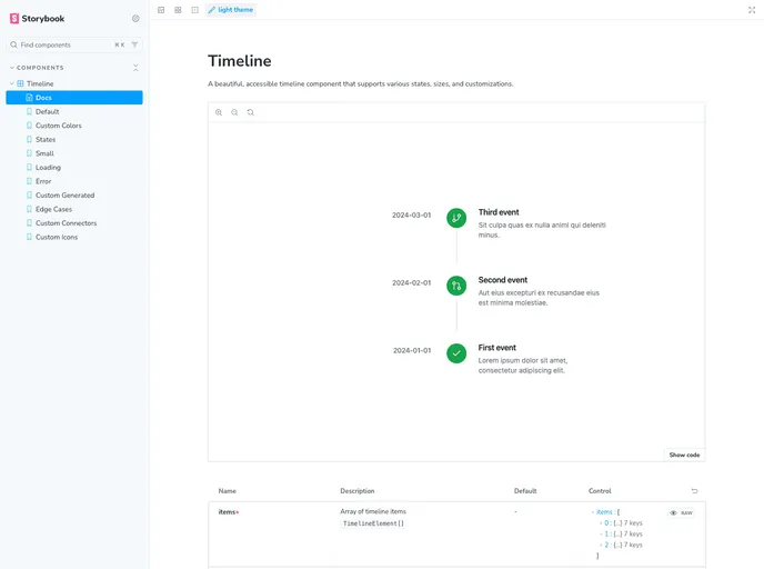
Shadcn Timeline is a lightweight, reusable timeline component crafted for Shadcn-based UI and Next.js apps. It enables clean, data-driven visualization of events in chronological order, with easy integration, accessible markup, and Tailwind-friendly styling for rapid adoption in modern React projects.
Open-source Vault UI kit for building secure, scalable file-management interfaces. File Vault provides ready-to-use components for file lists, folders, uploads, previews, search, and RBAC-friendly interactions—designed to plug into Shadcn-driven applications with clean APIs and accessible design.
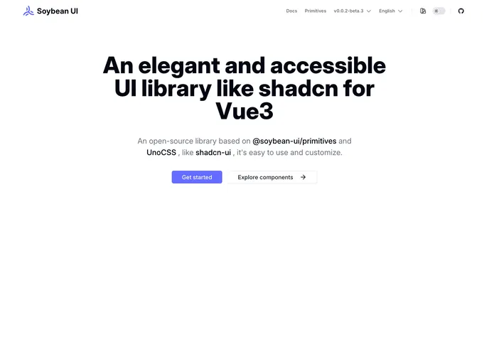
SoybeanUI is a clean, accessible UI library for Vue3, built on @soybean-ui/primitives and UnoCSS. It delivers elegant, production-ready components with easy theming and seamless integration. Lightweight yet powerful, it helps teams ship beautiful, responsive interfaces quickly while prioritizing accessibility and developer ergonomics.
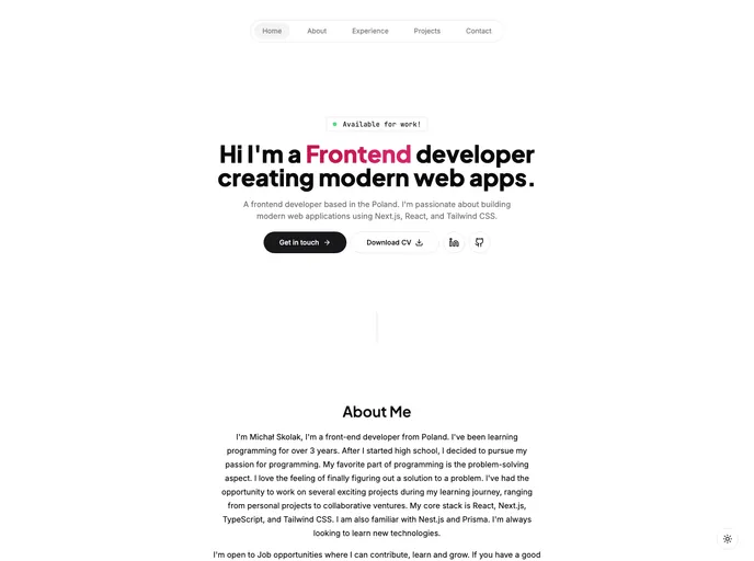
A polished personal portfolio template built with Next.js, Tailwind CSS, and Framer Motion. It delivers a responsive, fast, and type-safe site to showcase projects, achievements, and skills, with smooth motion and accessible forms—easy to customize for developers.
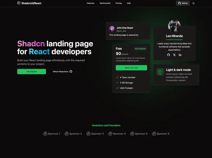
A ready-to-use React landing page template powered by TypeScript and Tailwind CSS, delivering all essential sections for a turnkey marketing site. Lightweight, responsive, accessible, and easy to customize for fast product launches.
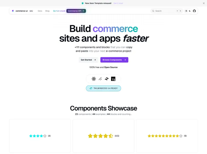
Commerce UI is a React + Next.js based UI theme and component kit for e-commerce. Built with Tailwind CSS and shadcn/ui, it delivers ready-to-use blocks and fully functional pages you can copy-paste into projects. Speed storefront development with a cohesive, responsive shopping experience.
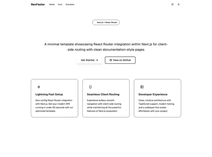
NexFaster fuses the power of Next.js with React Router–style client-side routing into a lean, modern app framework. It speeds navigation, ships a Tailwind UI, and supports TypeScript, dark mode, and protected routes. Ideal for rapid prototyping and scalable multi-page apps, while keeping development fast, approachable, and visually polished.
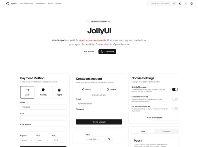
Jolly UI is a fast, accessible collection of React ARIA components designed for quick integration into any app. Built for accessibility, customization, and open-source collaboration, these components let you ship polished, keyboard-friendly UI with minimal boilerplate.
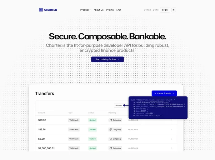
Charter is a fintech-style Next.js template built with shadcn/ui and Tailwind CSS. It provides a polished marketing site foundation for startups seeking speed and a modern online presence. With prebuilt fintech components and a responsive UI, Charter enables rapid MVPs while keeping customization simple and robust.
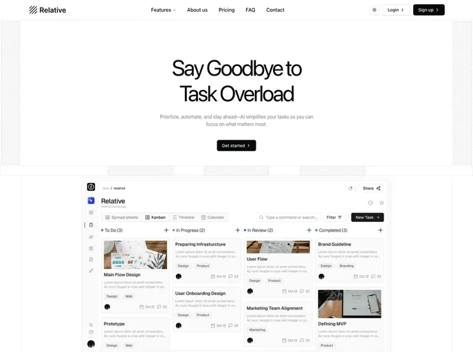
Relative is a Next.js landing-page template built with shadcn/ui and Tailwind, crafted to speed up marketing-site launches. It delivers a responsive, component-driven foundation with SEO-friendly structure and polished UI, ideal for personal portfolios or product campaigns. Customize quickly while keeping a cohesive, high-end look.
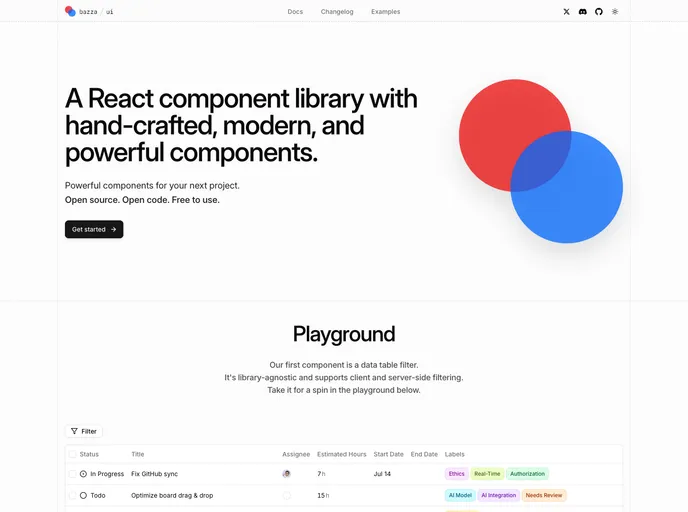
Bazza UI is an open-source UI framework that streamlines web app development with flexible, composable components and solid documentation. Built for React and Next.js workflows, it helps teams ship polished interfaces faster. MIT-licensed and community-driven, it invites collaboration and contributions.
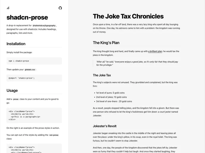
Shadcn Prose is a polished typography package designed for shadcn/ui that serves as a drop-in replacement for @tailwindcss/typography. It standardizes headings, paragraphs, lists, and content blocks with a refined, readable aesthetic, responsive scales, and accessible defaults. Install, wire into globals.css, and elevate your app's text presentation in minutes.
VITE-SHADCN Admin is a Vite-powered admin UI kit for Shadcn stacks, blending React and Zustand to enable fast, scalable dashboards. It includes dynamic permission-based routing, internationalization, a themeable UI, and a robust component library with ready-made admin patterns. Perfect for admin panels, dashboards, and lightweight enterprise apps.
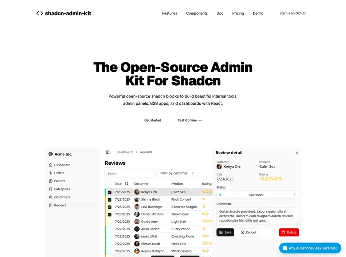
Shadcn Admin Kit accelerates building robust admin apps atop shadcn/ui. It bundles pre-built CRUD, data tables, forms, dashboards, and auth screens, letting you focus on domain logic. With TypeScript, React Router, and Tailwind CSS, it delivers a modern, responsive admin foundation for rapid, scalable backend UIs.
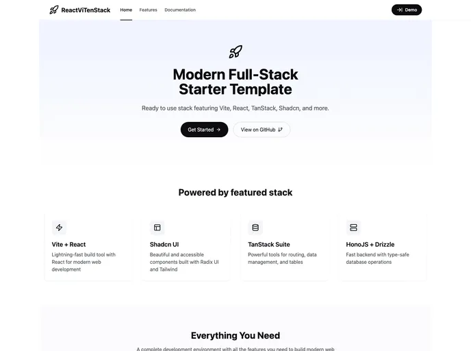
ReactViTenStack is a modern full-stack React starter template built with Vite, Tanstack Suite, Shadcn UI, HonoJs, and Drizzle ORM. It delivers a fast, scalable foundation with an organized project layout, pragmatic defaults, and an efficient dev-to-deploy workflow for production-ready apps.
GTD Task Management App is a Next.js 13–based theme delivering a clean GTD-style workspace for tasks, projects, contexts, and goals. Built with Radix UI Primitives, Tailwind CSS (with class sorting/merging/linting), Lucide icons, and React Query, plus Prisma + Postgres for persistence, it offers dark mode and a turnkey setup to clone, install, and run locally.
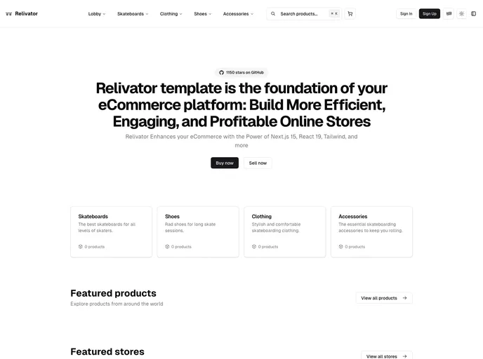
Relivator Next.js Template is a production-ready Next.js 14 starter that streamlines project setup with multi-auth, integrated tooling, and effortless deployment. Ideal for rapid prototyping, reliable production apps, and scalable SaaS ventures.
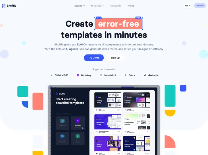
Shuffle UI Kit Bundle is a versatile collection of ready-made UI components designed for fast integration with Tailwind, Bootstrap, and Shadcn/UI. It accelerates design workflows, delivers polished, responsive elements, and helps teams ship cohesive, professional interfaces across projects with confidence.
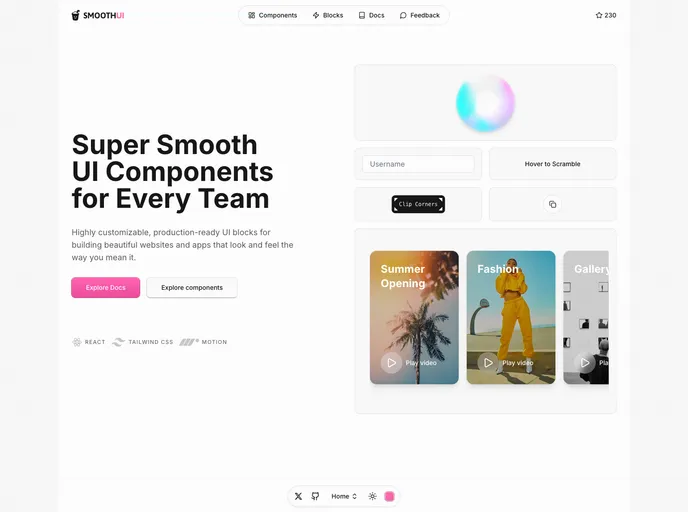
SmoothUI is a vibrant React component library built with Tailwind CSS and Motion, delivering accessible, responsive UI elements with delightful animations. With strong TypeScript support and easy integration, it helps teams craft polished interfaces quickly while keeping code scalable and branding consistent.
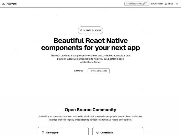
Native UI is a mobile-first React Native component suite focused on accessibility and rapid integration. Drop-in components can be pasted into RN projects with minimal setup, delivering polished, customizable UI for iOS and Android while prioritizing keyboard navigation and screen reader support.
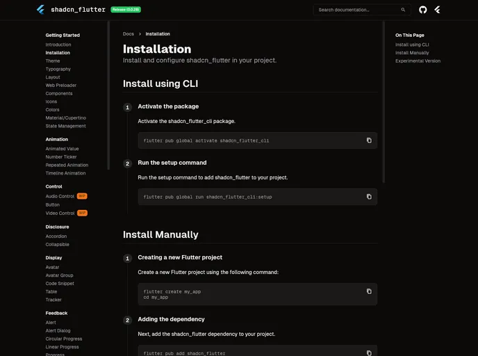
Shadcn Flutter ports the shadcn UI design system to Flutter, delivering a curated set of widgets, animations, forms, and layout utilities optimized for building polished Flutter web apps. With a CLI-friendly setup and theming support, it enables rapid UI composition with cohesive design tokens across projects.
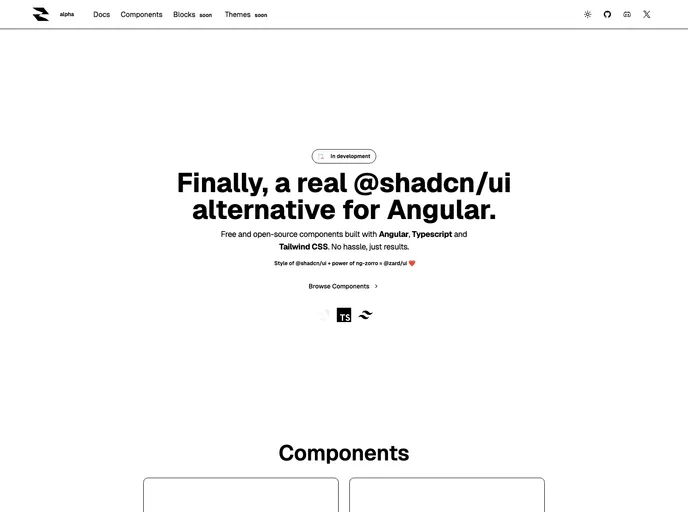
Zard UI is an open-source Angular component library inspired by Shadcn/ui and ng-zorro. It delivers Tailwind-styled components, a polished API, and MIT licensing for flexible customization. With thorough docs and ongoing community contributions, it’s ideal for rapid, cohesive UI in professional or personal projects.
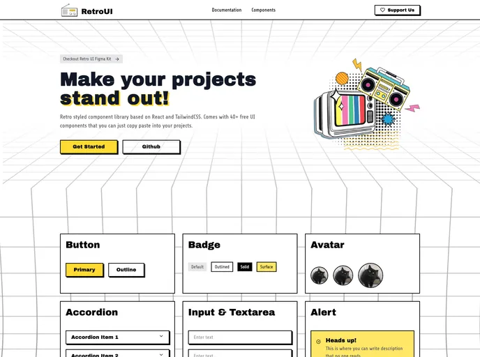
RetroUI is a retro-inspired Tailwind CSS component library for modern web apps. It blends classic UI aesthetics with a utility-first workflow and solid documentation, enabling rapid prototyping and production-ready interfaces with minimal setup.
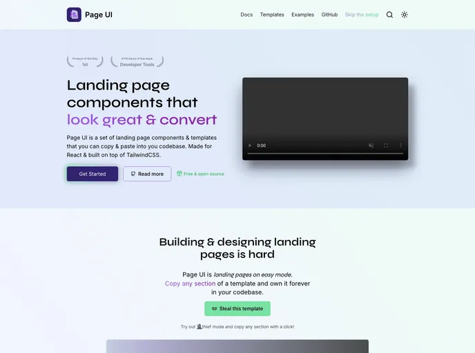
Page UI is a turnkey library of landing-page templates, components, and examples for React and Next.js. Open-source and Tailwind CSS–friendly, it provides a fast, customizable starter experience with a CLI scaffold and ready-to-implement pages—an approachable alternative to Shadcn UI for web projects.
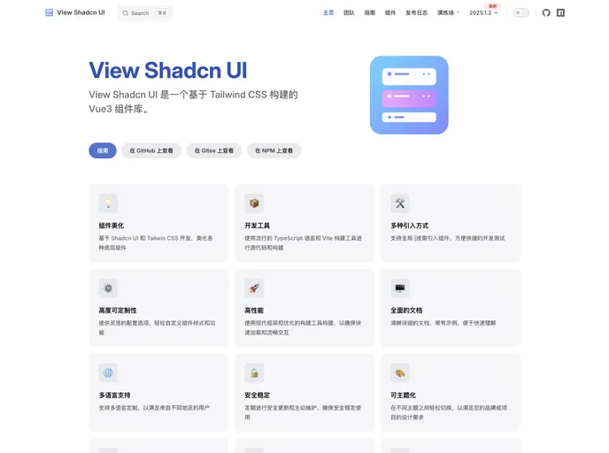
View Shadcn UI is a Vue 3 component library built on Tailwind CSS, delivering a ready-to-use collection of modular UI elements for Vue apps. With simple installation and straightforward imports, you can quickly assemble consistent, scalable interfaces while keeping code clean and maintainable.
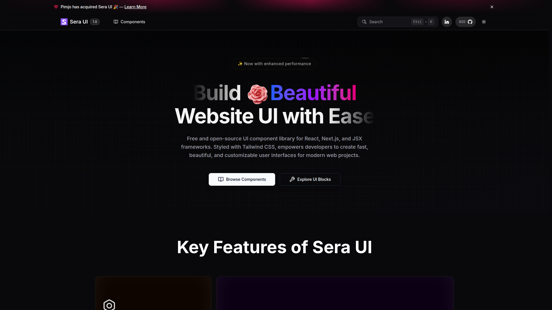
Sera UI is an accessible, high‑performance React/Next.js component library focused on reusable UI, easy customization, and modern aesthetics. Built from real developer needs, it delivers a growing set of components with smooth animations, an open‑source license, and quick setup to help teams ship polished interfaces with less boilerplate.
UI Layouts is an open-source component library that streamlines website development with ready-to-use, creatively designed UI blocks. It focuses on essential, reusable components suitable for landing pages, dashboards, and marketing sites, while fitting Tailwind CSS and Framer Motion workflows. Ongoing contributions keep the library fresh for developers and designers alike.
Intent UI packs accessible, React-ready UI components by pairing React Aria foundations with prebuilt, Tailwind-friendly blocks. It emphasizes keyboard and screen-reader friendliness, rapid drop-in integration, and simple customization, empowering devs to ship accessible interfaces faster.
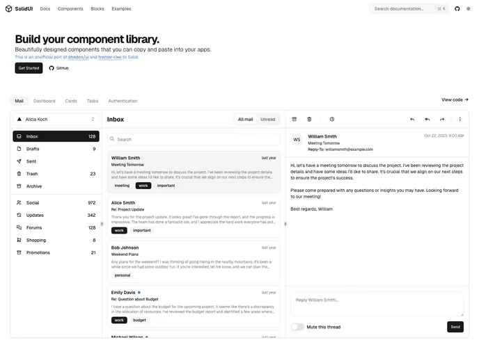
Unofficial port of shadcn/ui and tremor-raw to Solid, Solid UI delivers accessible, customizable components you can copy, paste, and drop into your Solid apps. Free and open source, it helps you bootstrap or build your own Solid-based component library with active community support.
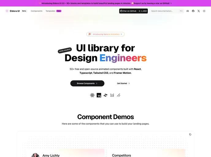
Eldora UI is an open-source React component library with TypeScript, Tailwind CSS, and Framer Motion-driven animations. Fully customizable and modular, these reusable UI elements accelerate modern web development and empower teams to prototype and ship polished interfaces quickly.
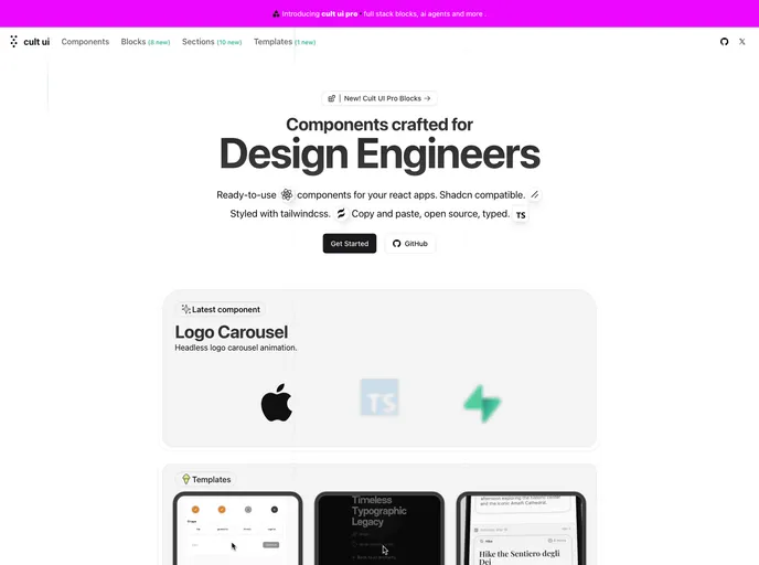
Cult UI is a curated, open-source collection of unique Shadcn-compatible components styled with Tailwind CSS. Built for design engineers and rapid prototyping, it plugs into your existing Shadcn projects with minimal setup, delivering polished, modern interfaces while preserving a cohesive design language. With MIT licensing, Cult UI enables teams to explore ideas faster and ship professional UI quickly.
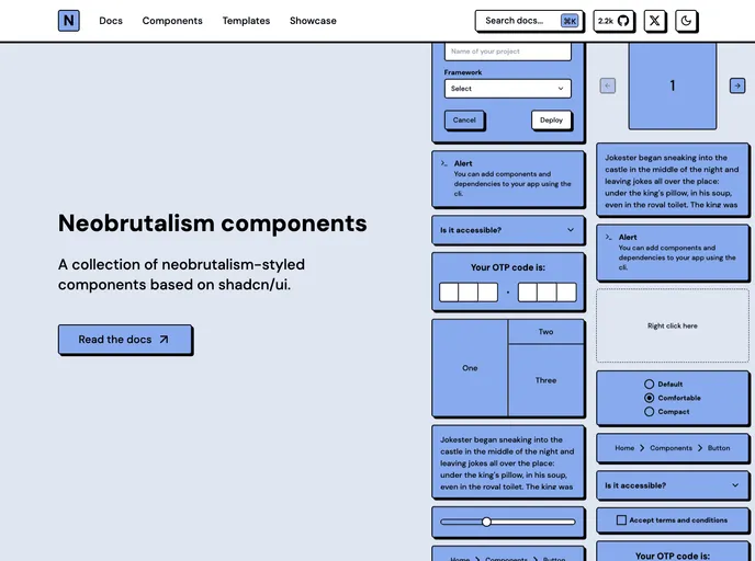
Neobrutalism Components is a type-safe React library styled with Tailwind that demonstrates the Neobrutalism UI language. MIT-licensed and easy to drop into existing projects, it helps you learn this design style while delivering reliable, reusable UI building blocks.
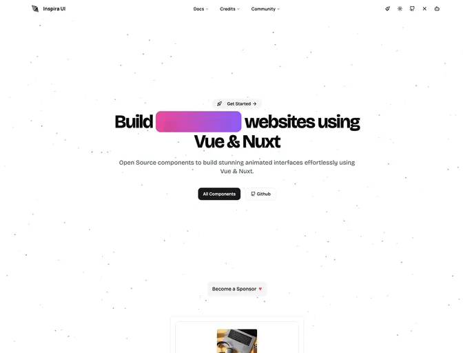
Inspira UI is a Vue and Nuxt-ready component library that blends the aesthetics of Aceternity UI and Magic UI into a cohesive, highly configurable kit. Open source and easily customizable, it helps teams ship polished, responsive interfaces quickly while maintaining design-system consistency across Vue/Nuxt apps. Install via npm or yarn and tailor components to project needs.
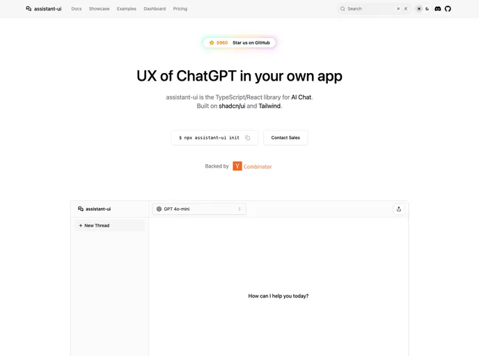
Assistant UI is an open-source TypeScript/React library for rapid, production-ready AI chat UIs. It delivers composable primitives, streaming, auto-scroll, accessibility, and theme customization, enabling developers to craft polished chat experiences that integrate with multiple AI models and backend services. Built for real-time interactions and excellent DX, it lets teams ship reliable AI chat apps faster while handling UI complexity.
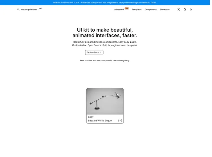
Motion Primitives delivers a ready-made library of motion components built with Framer Motion and Tailwind CSS. It’s designed for rapid, polished interactions in React apps, with a cohesive motion design system. The project is in beta with frequent updates and an MIT license, enabling fast iteration and open collaboration.
Shadcn Vue is a community-driven port of shadcn/ui for Vue, delivering accessible, highly customizable UI components you can drop into Vue apps. Independent but blessed by the original project, it provides a modern, free, open-source component set to accelerate UI development in Vue teams.
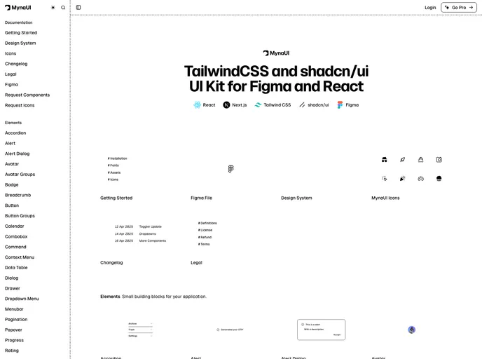
Myna UI is a TailwindCSS and shadcn/ui-based UI kit for React and Figma that helps teams rapidly prototype, theme, and ship modern interfaces. It provides a responsive, component-driven foundation with clear documentation, speeding design-to-dev handoffs and ensuring design-system consistency across projects.
Pro Motion Primitives provides handcrafted motion components and templates to empower developers to add fluid, interactive animations to modern web apps. Built for React and Tailwind ecosystems, it enables fast, performance-friendly UI motion that enhances engagement while keeping accessibility and maintainability in focus.
New Cult is a Pro-grade fullstack Next.js template built on React, TypeScript, Tailwind CSS, and Motion. It pairs a polished UI with a scalable component library and an easy setup that accelerates building responsive, production-ready web apps. Ideal for teams and solo developers seeking strong visuals, performance, and flexible customization in a single, maintainable starter kit.
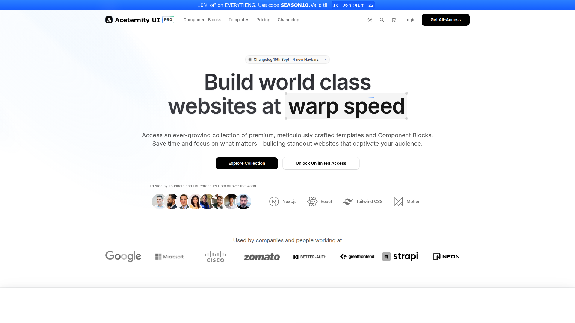
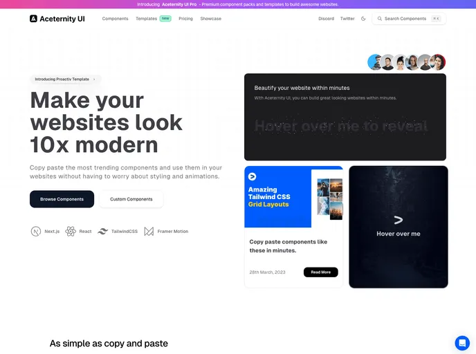
Aceternity UI Pro is a developer-first UI toolkit for rapid Next.js + Tailwind projects, delivering ready-made templates, a robust UI kit, a rich block library, boilerplates, a Theme Generator, and AI-assisted prototyping. It accelerates design-to-code workflows within the Shadcn ecosystem, helping teams ship polished interfaces faster.
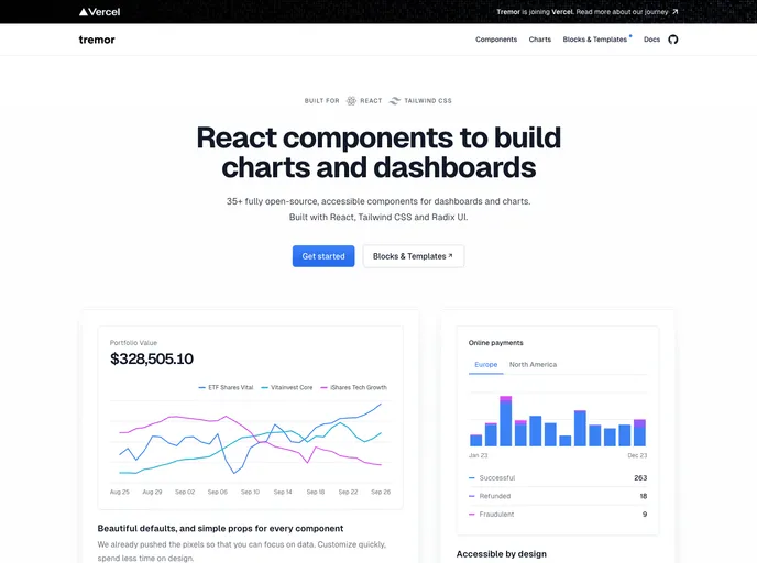
An open-source dashboard UI toolkit for data scientists and developers to rapidly assemble modular, design-forward analytics interfaces. Tremor provides ready-to-use components, Tailwind CSS-based styling (Tailwind setup required), and Next.js 13.4+ compatibility to help teams ship polished dashboards with less boilerplate.
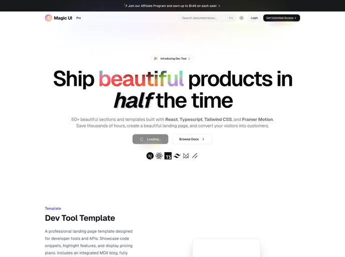
Magic UI Pro accelerates UI creation with a rich React/TS/Tailwind toolkit. Explore 50+ sections and templates, animated with Framer Motion, and ready for responsive, accessible interfaces. Perfect for developers who want fast, polished UI foundations and smooth, scalable customization.
Radix Primitives delivers accessible, low-level UI building blocks for React that you can trust as the foundation of a design system or to augment existing apps. With a11y-first primitives and modular composition, you can build robust, keyboard-friendly interactions incrementally.
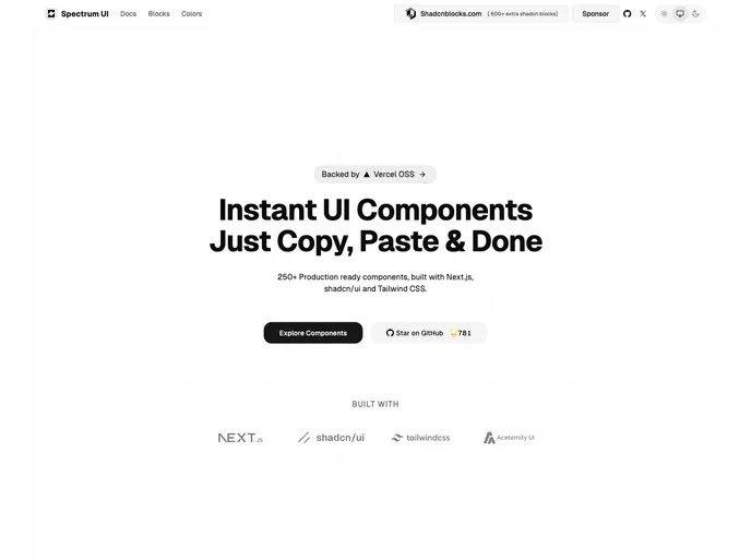
Spectrum UI is an open-source component library where developers contribute bug fixes, new features, and improvements. This guide outlines a clear, Git-driven workflow: fork, branch, implement, test, and submit pull requests. Join the community and help evolve Spectrum UI with collaborative contributions.
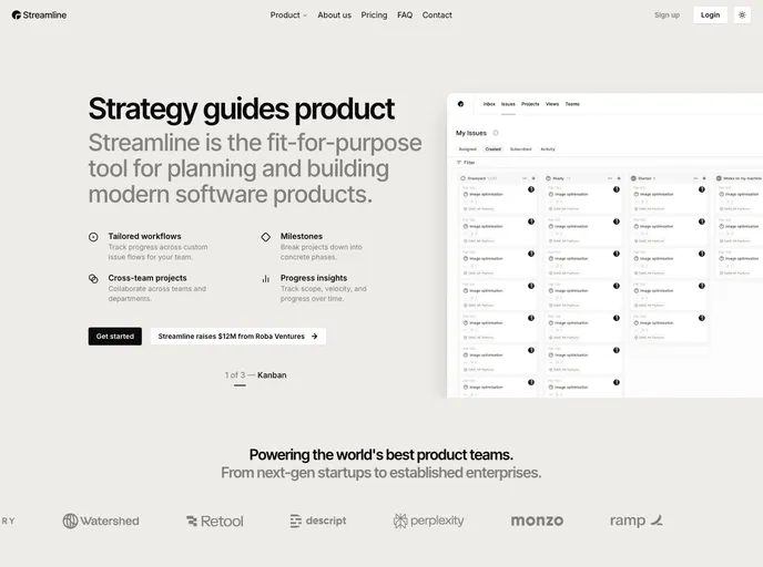
Streamline is a polished landing-page template built with Next.js 15, shadcn/ui, and Tailwind 4. It delivers a clean, minimalist aesthetic on a responsive, performance-focused foundation, with extensive customization options. Ideal for startups and portfolios seeking a modern, professional online presence with rapid prototyping.
Aceternity UI is a React + Tailwind component library that speeds UI construction with ready-made, copy-paste components. It emphasizes consistent design, rapid prototyping, and approachable documentation, helping teams ship polished interfaces quickly.
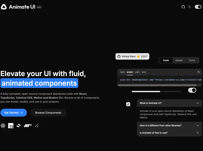
Animate UI is a beta toolkit of customizable UI components designed to accelerate interface prototyping. It offers modular primitives, clear docs, and ongoing updates. As an open-source project under the MIT license, it invites community contributions to shape the final product while you experiment with early features.
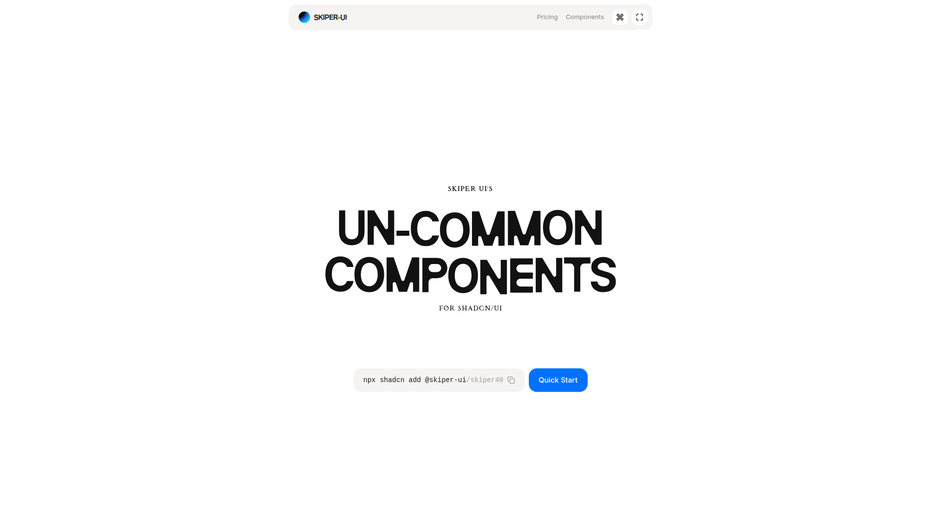
Skiper UI is an open-source component library focused on accessibility, customization, and rapid integration. With copy-and-paste ready components, you can assemble polished interfaces fast while maintaining a cohesive design system across apps.
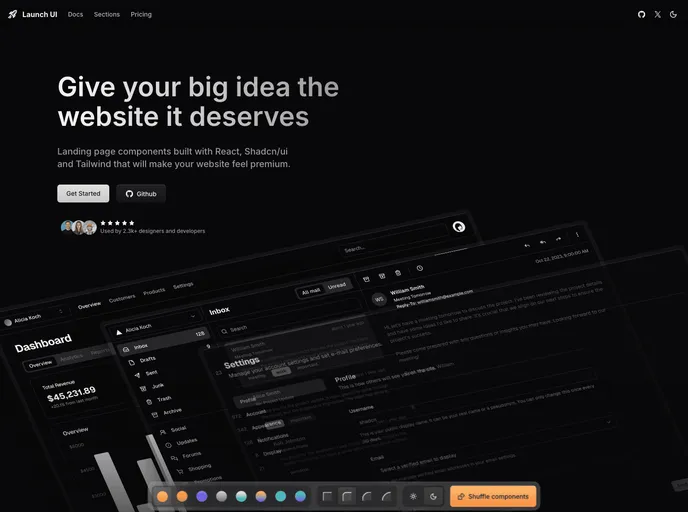
Launch UI is a production-ready Next.js website components template built with Shadcn/ui and Tailwind CSS. It ships ready-to-use, responsive components and layouts to accelerate modern site builds while emphasizing accessibility, performance, and SEO out of the box.
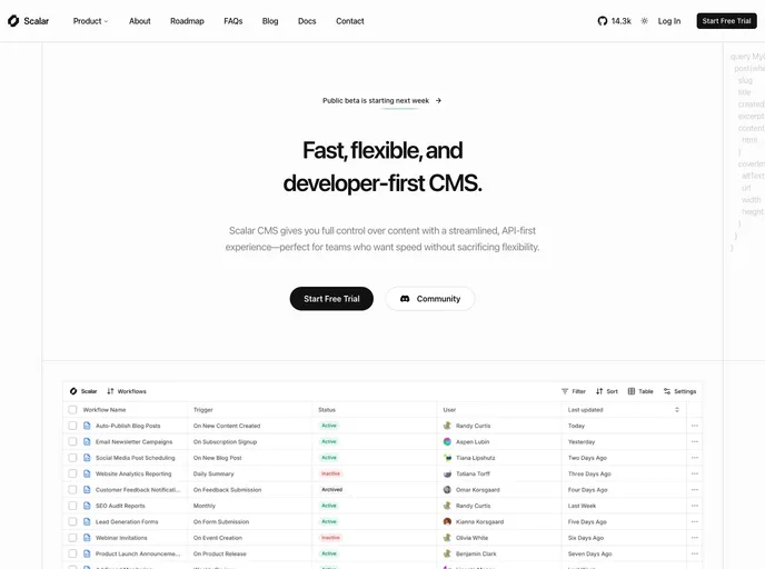
Scalar is a modern SaaS & startup template built with Next.js 15, shadcn/ui, and Tailwind 4. It delivers a modular, block-based foundation with a tech-forward design to launch professional SaaS sites quickly, featuring ready components, pages, and MDX/JSON content support.
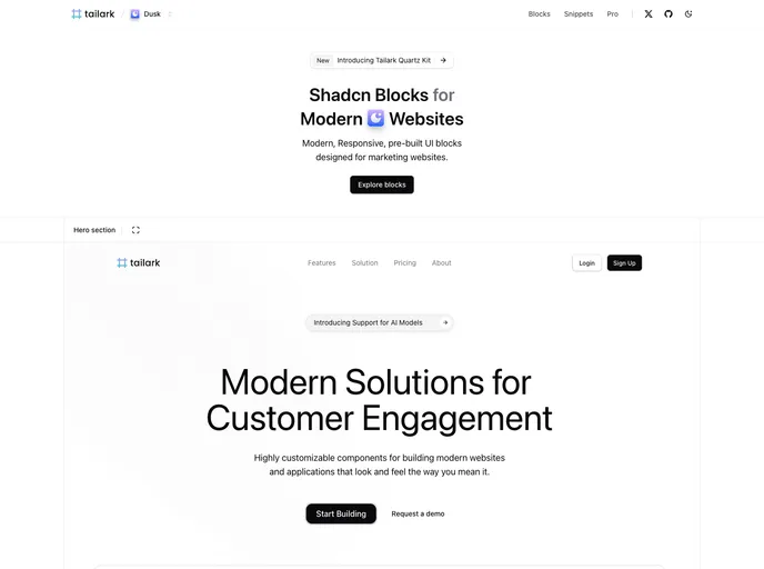
Tailark Blocks delivers a responsive library of pre-built UI blocks for marketing sites, based on shadcn-UI and TailwindCSS. It accelerates page assembly with ready-to-use components and a lightweight footprint—just run the dev server and preview in moments. Open-source and highly customizable.
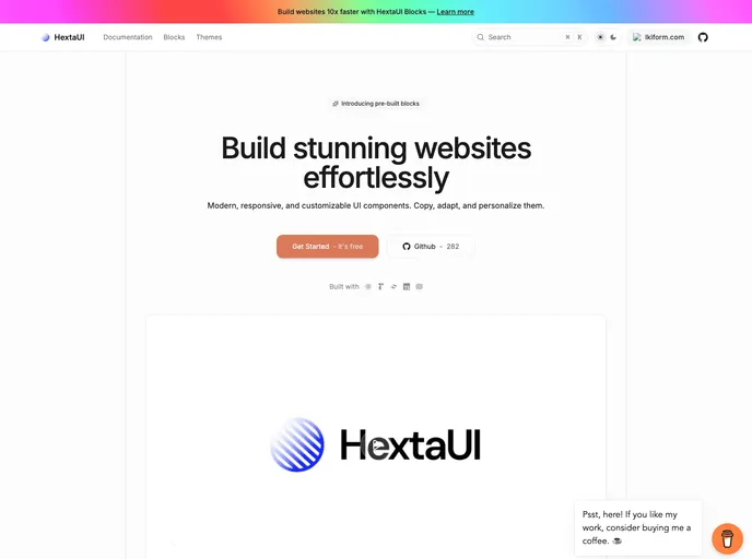
HextaUI is an open-source toolkit of modern, responsive UI components you can copy, adapt, and brand to ship polished web interfaces faster. Designed for developers who value both aesthetics and accessibility, it pairs ready-made blocks with clear docs and thriving community contributions, balancing speed with robust functionality.
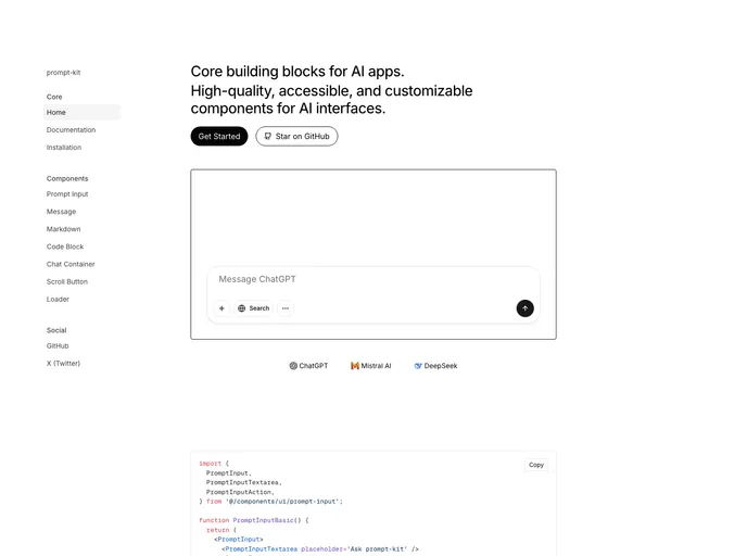
Prompt Kit is a free, open-source collection of high-quality, customizable UI components built for AI apps. It accelerates building chat experiences, AI agents, autonomous assistants, and related interfaces, delivering polished, consistent UIs that scale with your AI projects.
Cook is a modern, bento-box styled portfolio boilerplate for developers, designers, and creatives. Built with Next.js, Tailwind, shadcn/ui, and magic-ui, it targets top Lighthouse scores, accessibility, and effortless deployment to Vercel, with GitHub API integration, Pocketbase backend, and Umami analytics.
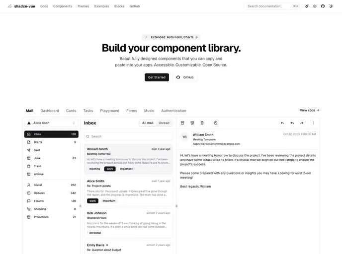
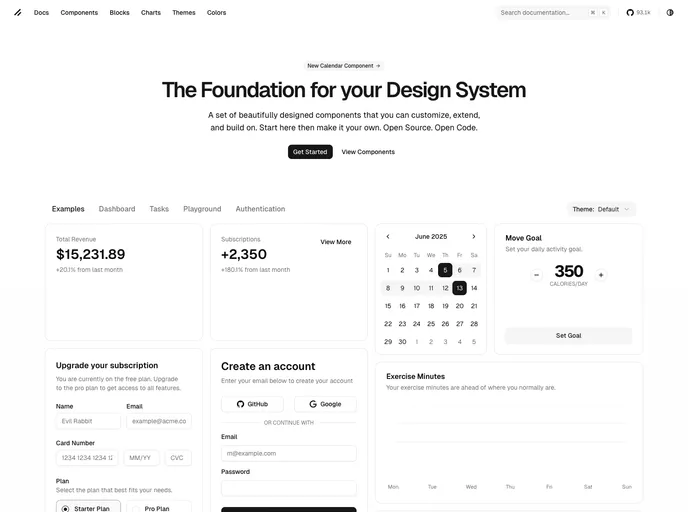
shadcn/ui is a React component library built on Radix UI and Tailwind CSS, designed for a copy-paste workflow. It ships as self-contained components you can browse in a central registry, paste into your project, and customize with no external dependencies. A CLI manages components across apps, delivering fast, accessible UIs out of the box.
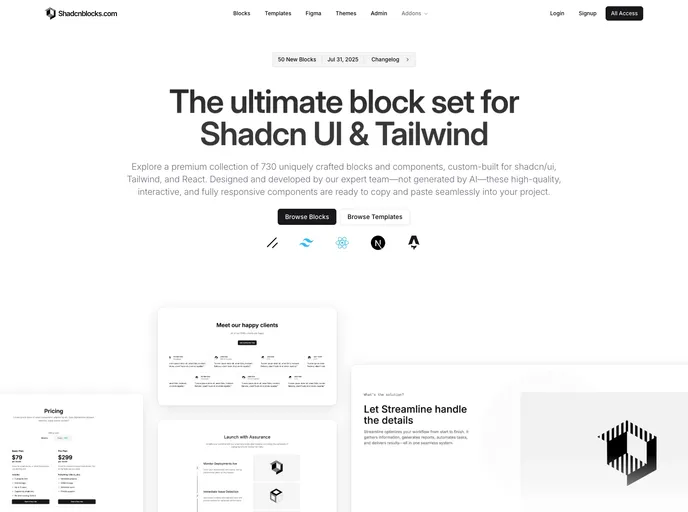
Shadcnblocks extends Shadcn UI with a premium library of ready-to-use blocks and components for Tailwind CSS, built on top of shadcn/ui. This collection enables rapid, consistent UI assembly—from hero sections and features to galleries and dashboards—accelerating prototyping and production UI.
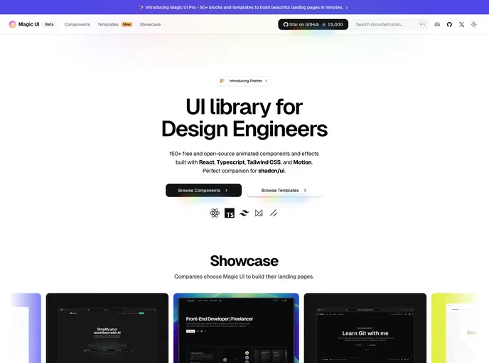
Magic UI offers a sleek, modern design system you can drop into any project. With a clean visual language, responsive behavior, and straightforward customization, it helps you ship polished interfaces faster. MIT-licensed and open source, it’s ideal for prototyping, marketing sites, and SaaS dashboards alike.