Premium blocks, templates & marketing.
68 products found
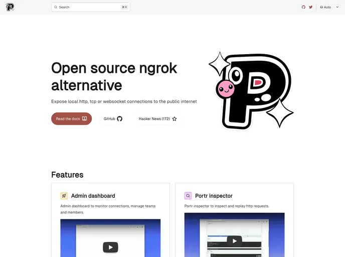
portr.dev
Portr
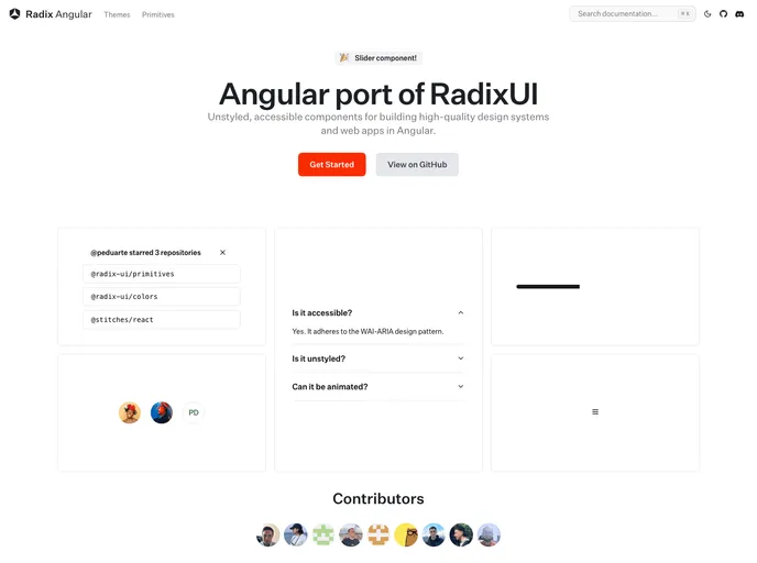
radix-ng.com
Primitives
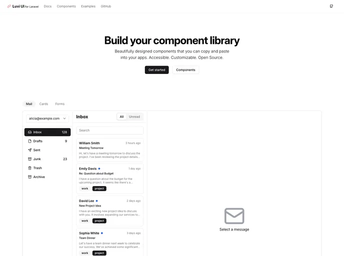
laravel-luvi.com
Laravel Luvi
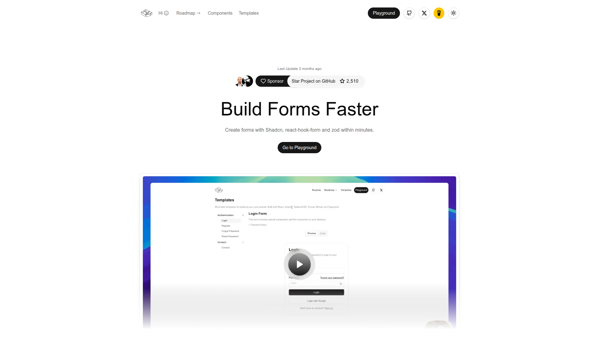
shadcn-form.com
Form Builder
dialog-stack.haydenble...
Dialog Stack
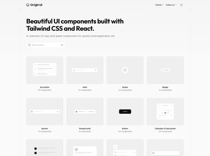
originui.com
Origin UI
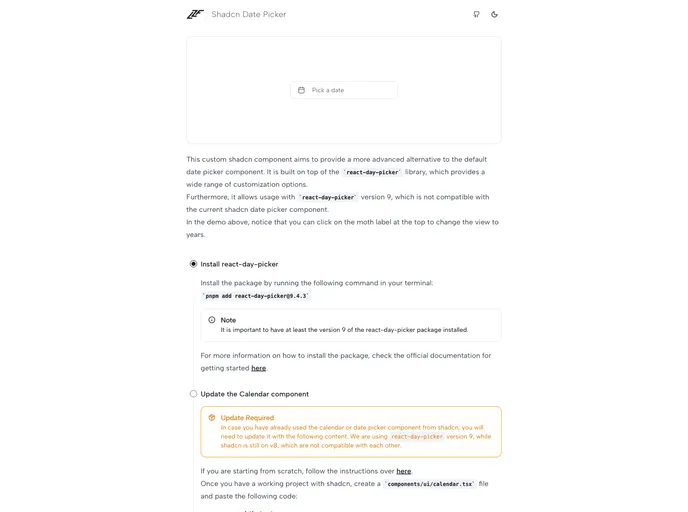
date-picker.luca-felix...
Shadcn Date Picker
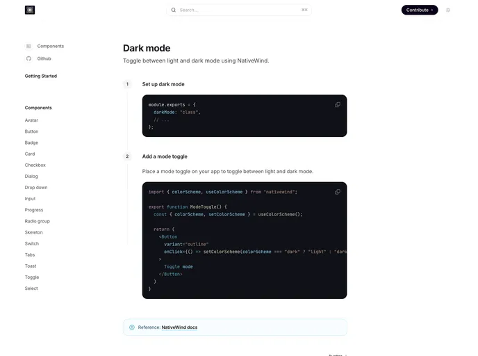
Portr provides a compact set of Svelte-friendly templates, starter boilerplates, and a theming toolkit to accelerate UI prototyping. With ready-made components and layout blocks, it helps teams bootstrap consistent, accessible interfaces quickly, while staying flexible for customization.
Primitives for Angular (Radix-NG) deliver accessible, low-level UI building blocks inspired by Radix UI. This unofficial port prioritizes accessibility, customization, and a developer-friendly API for incremental adoption in design systems. It ships with a base layer, clear docs, and a Storybook showcase to accelerate reliable UI.
Luvi UI for Laravel is an open-source UI kit delivering polished Blade components and layout primitives to accelerate modern Laravel interfaces. Install with Composer, customize visuals under the MIT license, and enjoy a consistent, production-ready design system across your Laravel projects.
Form Builder is a developer-centric tool to rapidly compose, customize, and validate web forms in React and Next.js apps. With Zod-powered validation and a clean drag-and-drop interface, it speeds form creation, ensures consistent UX, and supports server-side rendering for scalable, production-ready forms.
Dialog Stack provides a concise, stack-based approach to managing layered modal dialogs in React apps. Track active dialogs, preserve focus order, and deliver accessible, predictable UX across complex flows with minimal boilerplate.
Origin UI is a copy-paste component library for React and Next.js projects, designed to accelerate UI development with a consistent styling system, dark mode, and shadcn-friendly conventions. It streamlines setup by guiding you to copy registry files into your project, wire CSS variables, and adjust Tailwind config for fast, reliable UI integration.
A flexible React date picker built atop react-day-picker, designed to integrate with Shadcn themes. It offers rich customization, view switching, and accessible, keyboard-friendly date selection for modern web apps.
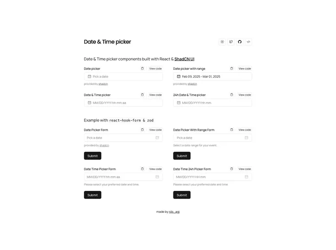
Shadcn Date Time Picker delivers cohesive, adaptable date and time inputs built with ShadCN patterns for rapid integration into React/Next.js apps. Accessible, Tailwind-friendly components enable precise scheduling and streamlined form UX with consistent theming.
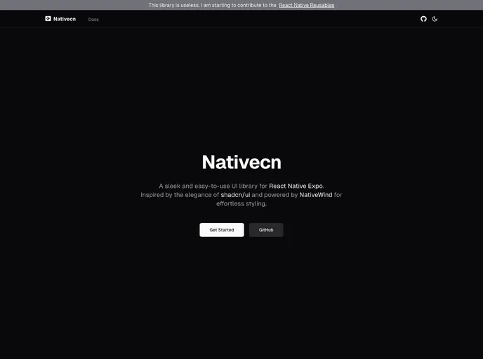
Nativecn is a React Native UI component library inspired by shadcn-ui, crafted for fast, themeable mobile apps. It delivers highly customizable, accessible components with built-in dark mode, CSS variables, and NativeWind compatibility, enabling teams to ship cohesive UIs with minimal setup.
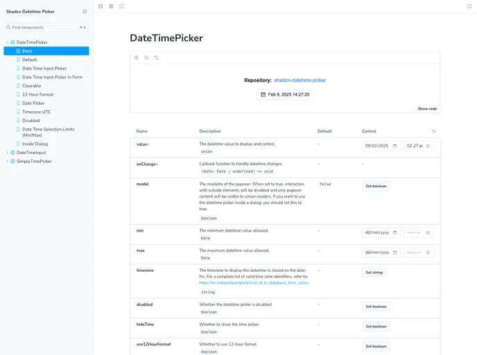
Shadcn Datetime Picker is a robust React component that blends seamlessly with the Shadcn UI framework to deliver polished, timezone-aware date and time selection. It provides date and time pickers, calendar navigation, and ready-to-use TSX files for quick, reliable integration in Next.js and Tailwind-powered apps.
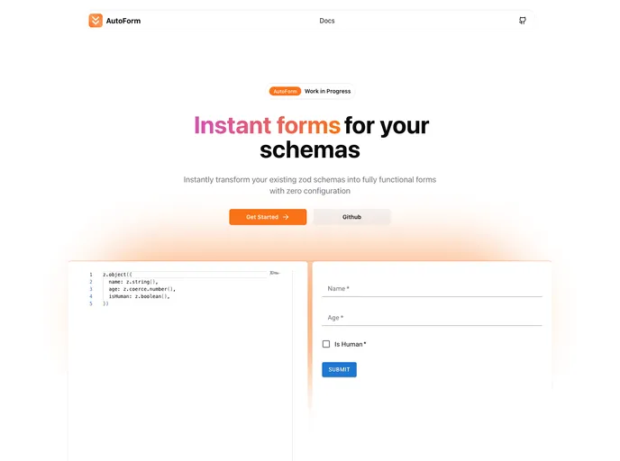
Autoform is an open-source form scaffolding tool for React apps. It speeds UI creation by auto-generating schemas from JSON or TypeScript, rendering accessible, themeable inputs with Shadcn-inspired primitives for consistent, rapid data collection.
nyxbui.design offers a lightweight, open-source UI kit with thorough docs, contribution guidance, and flexible deployment options. Explore authors, project statistics, star history, and MIT licensing. Deploy quickly on Vercel with Next.js, Tailwind, and Radix UI components.
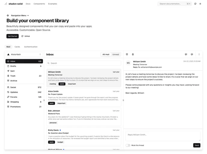
Shadcn Solid is an unofficial, community-led SolidJS port of shadcn/ui. It provides accessible, customizable Solid components you can drop into apps to rapidly assemble a shared component library. Free, open source, and designed for teams seeking a consistent design system with minimal setup.
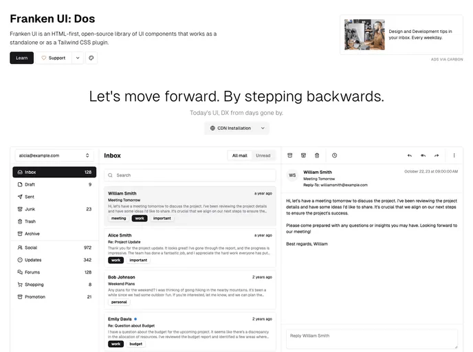
Franken UI is an open-source, HTML-first UI component library that can run as a standalone toolkit or as a Tailwind CSS plugin. Compatible with UIkit 3 and inspired by shadcn/ui, it helps teams ship cohesive interfaces faster while keeping design decisions portable across projects.
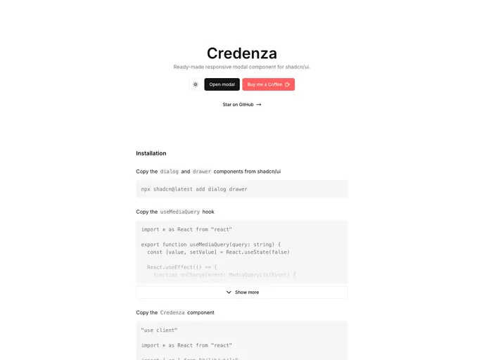
Credenza is a responsive modal component built for the Shadcn UI ecosystem. It delivers sleek, accessible modal experiences with minimal setup, smooth background scaling, and reliable keyboard navigation, ideal for rapid prototyping or production-ready modals in shadcn/ui apps.
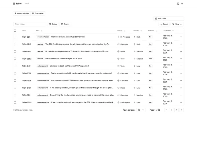
Next.js-based Shadcn Table component styled with Tailwind and powered by TanStack React Table. It provides server-side pagination, sorting, and filtering, plus debounced search and dynamic facet filters. The project is in active development and not yet production-ready.
Shadcn Svelte is an unofficial, community-led port of the popular shadcn/ui library tailored for the Svelte ecosystem. It delivers accessible, customizable UI components with a copy-paste workflow, enabling teams to build cohesive interfaces quickly while staying aligned with the trusted design language.
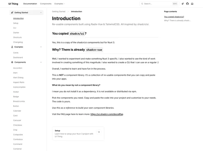
UI Thing delivers Radix-Vue based UI primitives inspired by shadc/ui and shadcn-vue, optimized for Nuxt + Tailwind projects. It provides accessible components, a lightweight CLI for setup and component addition, and clear docs to accelerate UI wiring in Vue ecosystems.
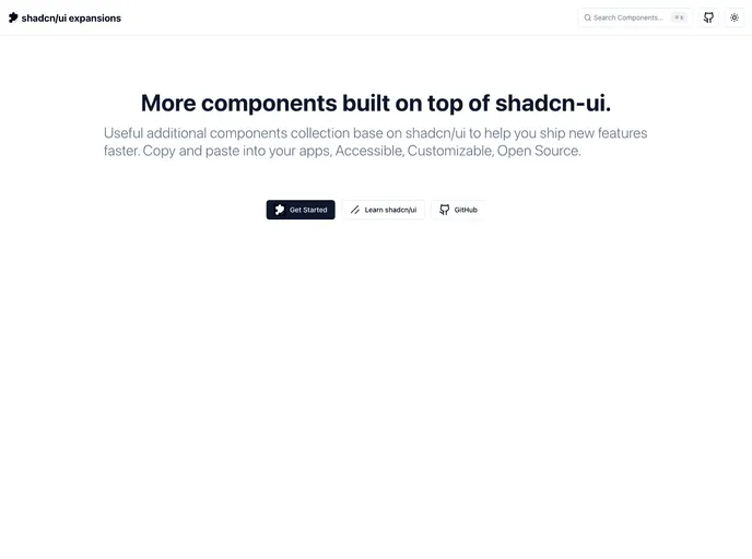
Shadcn UI Expansions extend the shadcn/ui toolkit with ready-to-use components for faster, scalable UI development. Features include advanced multi-select, loading buttons, and infinite scroll—drop-in code you can copy, paste, and tailor to your app. Free and open source for personal and commercial use.
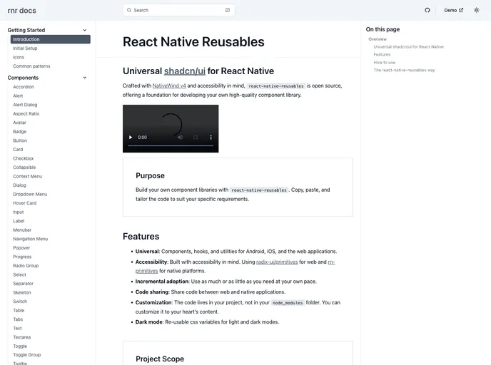
React Native Reusables is an Expo-powered UI library styled with NativeWind, delivering a rich suite of ready-to-use React Native components (Accordion, Alert, Button, Card, Checkbox, and more). It supports copy-paste customization to rapidly assemble a tailored component library for mobile apps, speeding UI parity across projects.
Nativecn UI is a React Native component library inspired by shadcn-ui, delivering a cohesive, customizable set of mobile UI elements designed to speed app development. It provides themeable components, consistent design primitives, and a straightforward integration path for rapid prototyping and collaboration.
Notpad is a free, open-source boilerplate for rapid UI prototyping of note-taking apps. It delivers modular components, Tailwind-ready styling, and Vite-powered scaffolding to speed up development. Designed for quick theming and lightweight editor UIs, Notpad makes it easy to bootstrap polished note interfaces with minimal setup.
The React Confirm Dialog provides a flexible, accessible confirm dialog component for React apps. It offers an easy useConfirm hook, full customization of visuals and behavior, support for custom actions, and seamless Shadcn UI integration. Wrap your app with ConfirmDialogProvider and theme via Tailwind or CSS variables for a cohesive, accessible UX.
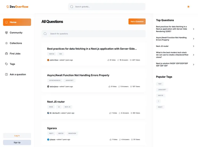
Nextjs14 Devoverflow is a Next.js 14 boilerplate starter kit designed for fast, scalable web apps. It ships Tailwind-ready styling, Shadcn UI components, and production-ready templates to jumpstart marketing pages, dashboards, and SaaS apps. Ideal for rapid prototyping and clean, consistent theming across projects.
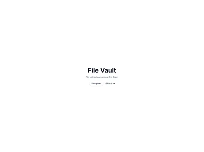
Open-source Vault UI kit for building secure, scalable file-management interfaces. File Vault provides ready-to-use components for file lists, folders, uploads, previews, search, and RBAC-friendly interactions—designed to plug into Shadcn-driven applications with clean APIs and accessible design.
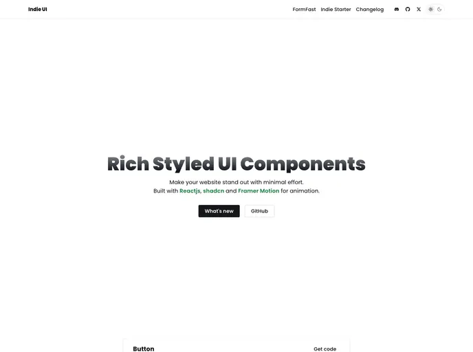
Indie UI is a free, open-source collection of React components designed for rapid web app development. Tailwind CSS-ready and npm-installable, it offers ready-to-use UI blocks you can import and compose into production interfaces with minimal setup. Ideal for prototyping, dashboards, and MVPs.
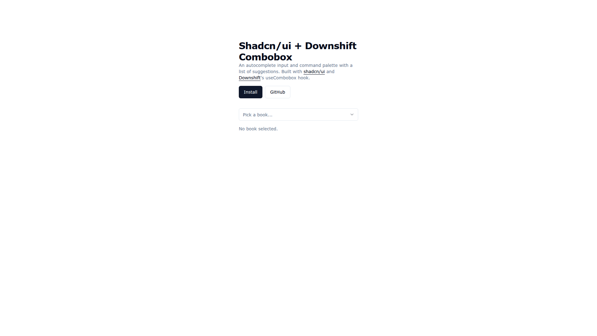
Downshift Shadcn Combobox merges Shadcn UI visuals with Downshift's useCombobox to deliver an accessible autocomplete input and command palette. It enables keyboard-friendly suggestions, cohesive theming, and rapid prototyping, with easy installation via the shadcn CLI and practical demo code for real-world usage.
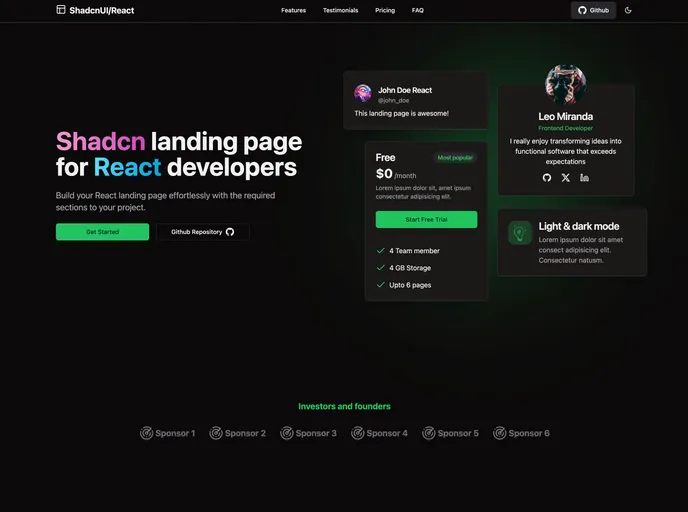
A ready-to-use React landing page template powered by TypeScript and Tailwind CSS, delivering all essential sections for a turnkey marketing site. Lightweight, responsive, accessible, and easy to customize for fast product launches.
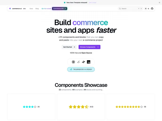
Commerce UI is a React + Next.js based UI theme and component kit for e-commerce. Built with Tailwind CSS and shadcn/ui, it delivers ready-to-use blocks and fully functional pages you can copy-paste into projects. Speed storefront development with a cohesive, responsive shopping experience.
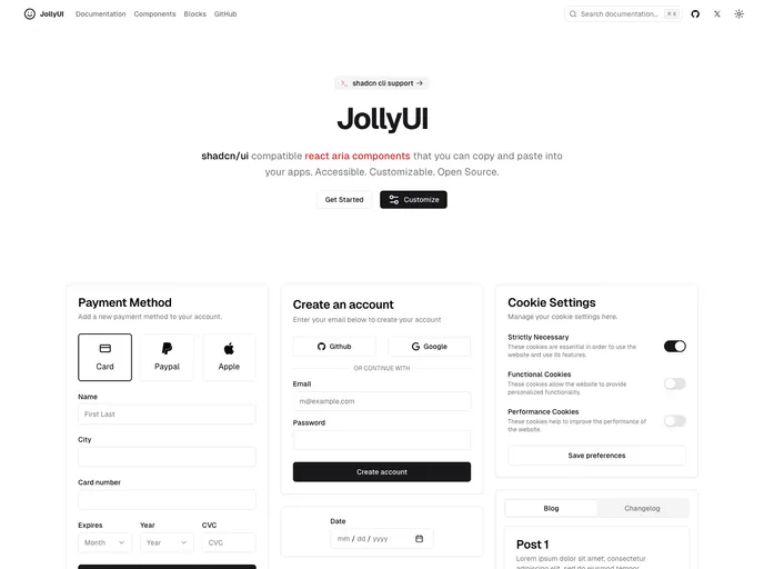
Jolly UI is a fast, accessible collection of React ARIA components designed for quick integration into any app. Built for accessibility, customization, and open-source collaboration, these components let you ship polished, keyboard-friendly UI with minimal boilerplate.
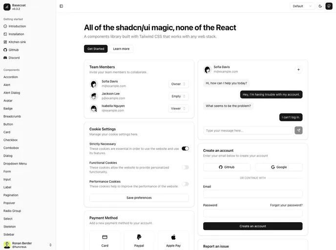
Basecoat is a modern, Tailwind-driven UI component library that works with any tech stack and doesn’t require React. It delivers accessible, themeable components you can drop into apps with minimal setup, helping you ship polished interfaces faster.
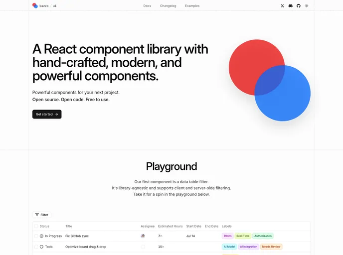
Bazza UI is an open-source UI framework that streamlines web app development with flexible, composable components and solid documentation. Built for React and Next.js workflows, it helps teams ship polished interfaces faster. MIT-licensed and community-driven, it invites collaboration and contributions.
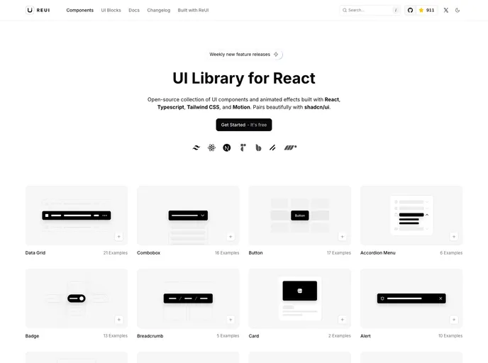
ReUI is an open-source React UI component library that blends a fresh aesthetic with motion-driven interactivity. Built on React, TypeScript, Tailwind CSS, and Motion, it delivers polished, reusable components that play well with shadcn/ui, boosting developer productivity and UI consistency across apps.
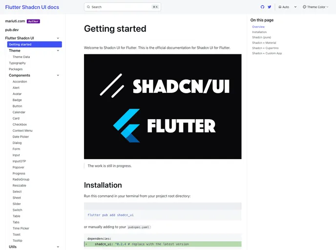
Flutter Shadcn UI is a community-driven Flutter port of the Shadcn UI component set, delivering a cohesive, design-token driven widget library for rapid app UIs. It includes Button, Card, Avatar, Input, Tooltip, Toast, and more, with consistent theming and accessible UX. The port is actively tracked by contributors on Twitter and is free and open-source.
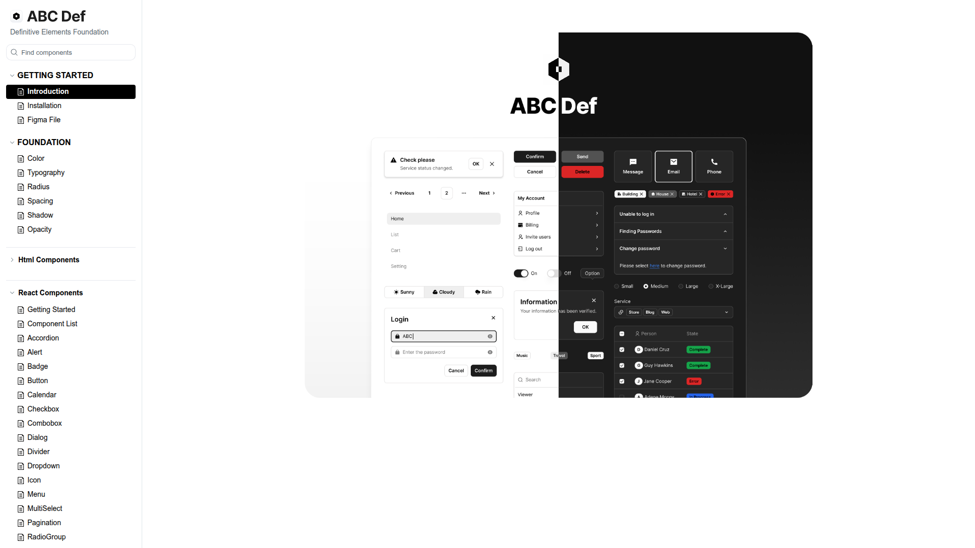
ABC Def (ABC Studio's Definitive Elements Foundation) is a headless design system that streamlines web component development with a three-tier token scheme and Headless UI primitives. It enforces consistency while enabling flexible customization, backed by a Turborepo-based monorepo, Tailwind CSS, and React. Organized into focused packages with thorough docs, it accelerates building responsive, accessible UIs and scalable themes for teams.
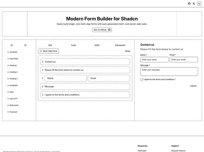
FormCn is a modern, Shadcn-based form builder that makes single- and multi-step forms effortless. It delivers instant previews, production-ready code generation, and seamless validation with Zod and React Hook Form—all in an open-source package designed for developers.
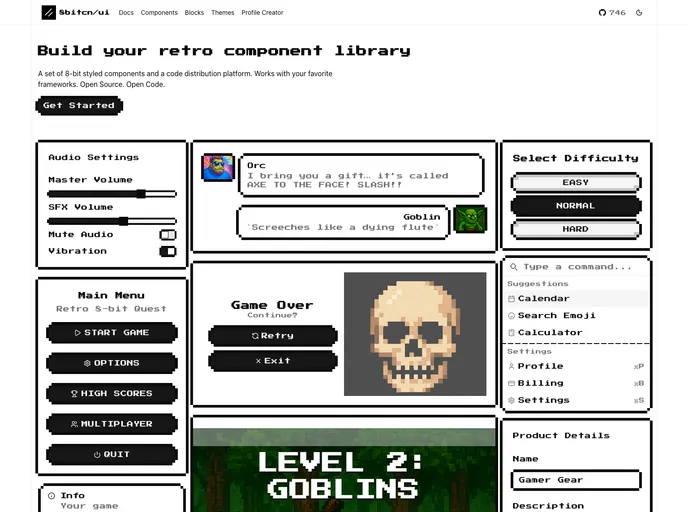
8bitcn UI is a retro-inspired component library that blends nostalgic visuals with modern accessibility. MIT-licensed and open source, it’s easy to drop into projects, customize, and contribute. Ideal for rapid prototyping, cohesive theming, and inclusive interfaces across web apps.
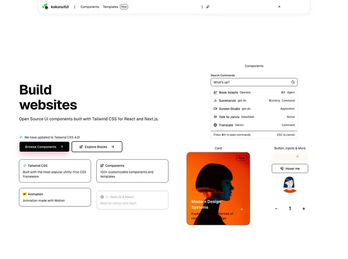
Kokonut UI is an open-source collection of TailwindCSS-powered UI components designed for design engineers and developers. Built with Motion for React and Next.js, it delivers accessible, ready-to-use components. Clone, install, and accelerate UI development in your React or Next.js apps.
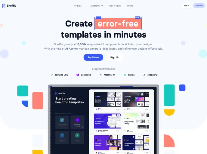
Shuffle UI Kit Bundle is a versatile collection of ready-made UI components designed for fast integration with Tailwind, Bootstrap, and Shadcn/UI. It accelerates design workflows, delivers polished, responsive elements, and helps teams ship cohesive, professional interfaces across projects with confidence.
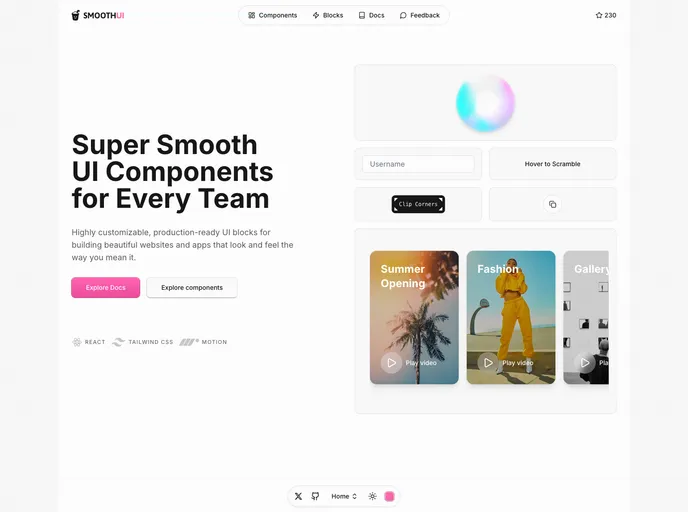
SmoothUI is a vibrant React component library built with Tailwind CSS and Motion, delivering accessible, responsive UI elements with delightful animations. With strong TypeScript support and easy integration, it helps teams craft polished interfaces quickly while keeping code scalable and branding consistent.
Native UI is a mobile-first React Native component suite focused on accessibility and rapid integration. Drop-in components can be pasted into RN projects with minimal setup, delivering polished, customizable UI for iOS and Android while prioritizing keyboard navigation and screen reader support.
Zard UI is an open-source Angular component library inspired by Shadcn/ui and ng-zorro. It delivers Tailwind-styled components, a polished API, and MIT licensing for flexible customization. With thorough docs and ongoing community contributions, it’s ideal for rapid, cohesive UI in professional or personal projects.
View Shadcn UI is a Vue 3 component library built on Tailwind CSS, delivering a ready-to-use collection of modular UI elements for Vue apps. With simple installation and straightforward imports, you can quickly assemble consistent, scalable interfaces while keeping code clean and maintainable.
Sera UI is an accessible, high‑performance React/Next.js component library focused on reusable UI, easy customization, and modern aesthetics. Built from real developer needs, it delivers a growing set of components with smooth animations, an open‑source license, and quick setup to help teams ship polished interfaces with less boilerplate.
UI Layouts is an open-source component library that streamlines website development with ready-to-use, creatively designed UI blocks. It focuses on essential, reusable components suitable for landing pages, dashboards, and marketing sites, while fitting Tailwind CSS and Framer Motion workflows. Ongoing contributions keep the library fresh for developers and designers alike.
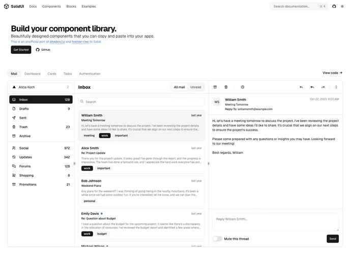
Unofficial port of shadcn/ui and tremor-raw to Solid, Solid UI delivers accessible, customizable components you can copy, paste, and drop into your Solid apps. Free and open source, it helps you bootstrap or build your own Solid-based component library with active community support.
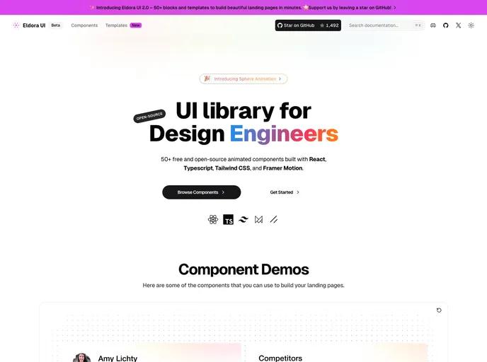
Eldora UI is an open-source React component library with TypeScript, Tailwind CSS, and Framer Motion-driven animations. Fully customizable and modular, these reusable UI elements accelerate modern web development and empower teams to prototype and ship polished interfaces quickly.
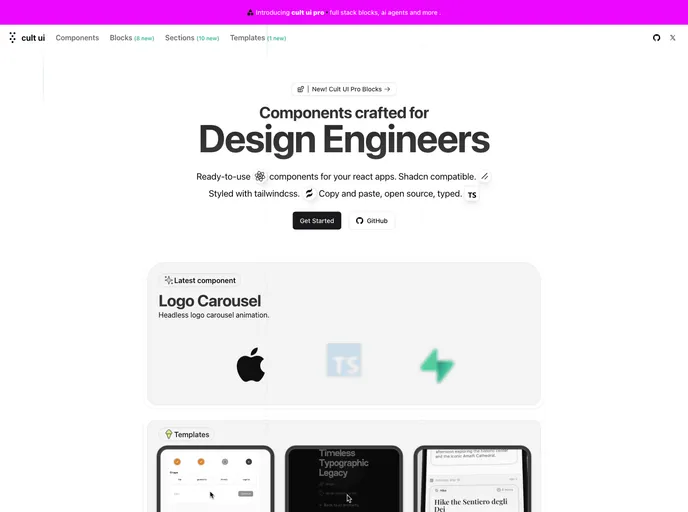
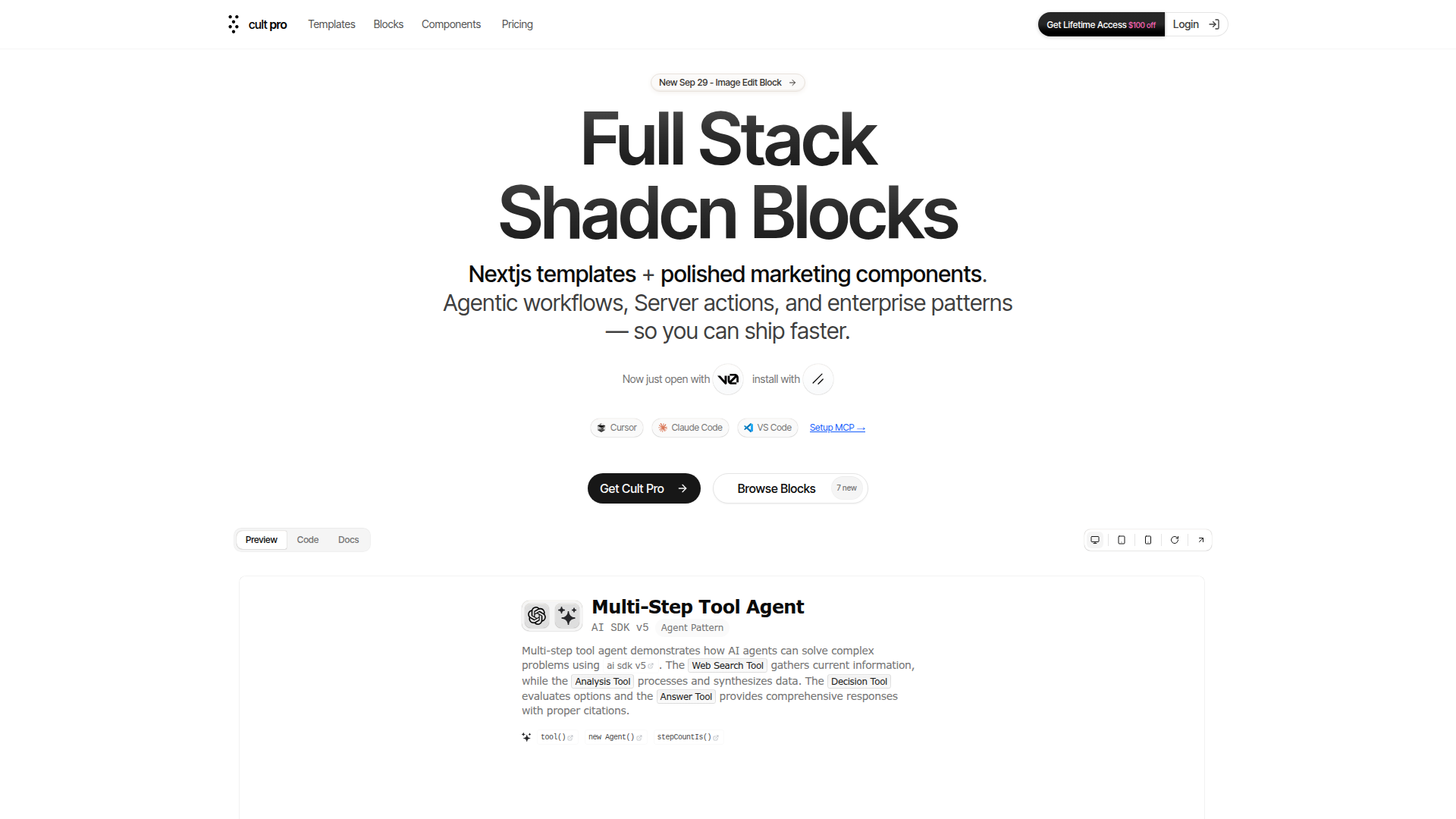
Cult UI is a curated, open-source collection of unique Shadcn-compatible components styled with Tailwind CSS. Built for design engineers and rapid prototyping, it plugs into your existing Shadcn projects with minimal setup, delivering polished, modern interfaces while preserving a cohesive design language. With MIT licensing, Cult UI enables teams to explore ideas faster and ship professional UI quickly.
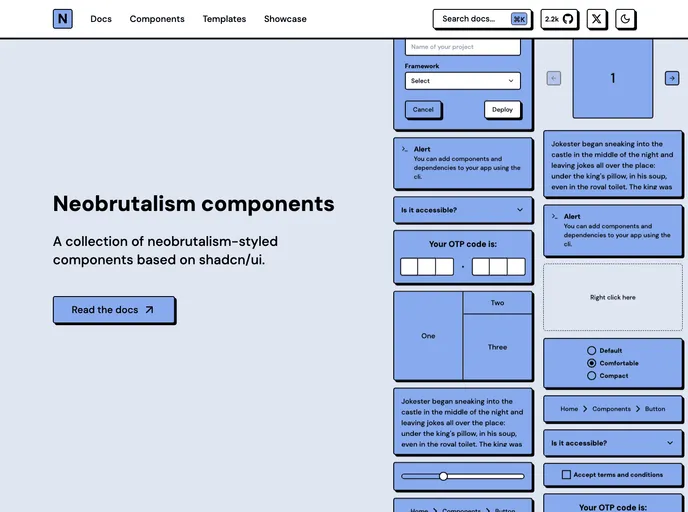
Neobrutalism Components is a type-safe React library styled with Tailwind that demonstrates the Neobrutalism UI language. MIT-licensed and easy to drop into existing projects, it helps you learn this design style while delivering reliable, reusable UI building blocks.
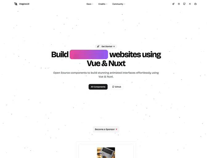
Inspira UI is a Vue and Nuxt-ready component library that blends the aesthetics of Aceternity UI and Magic UI into a cohesive, highly configurable kit. Open source and easily customizable, it helps teams ship polished, responsive interfaces quickly while maintaining design-system consistency across Vue/Nuxt apps. Install via npm or yarn and tailor components to project needs.
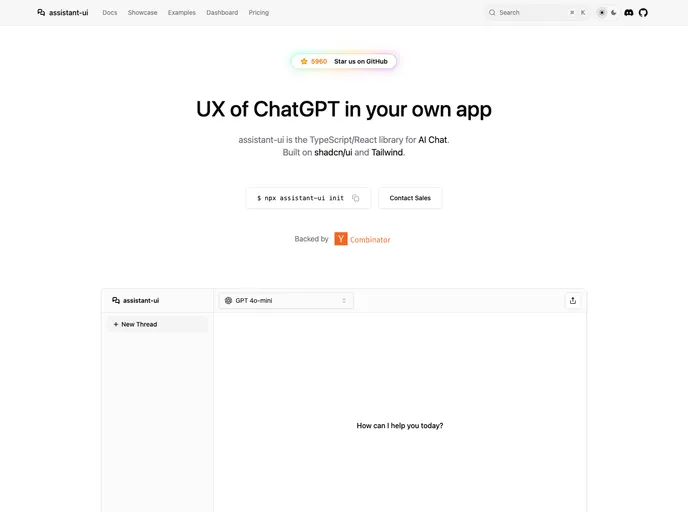
Assistant UI is an open-source TypeScript/React library for rapid, production-ready AI chat UIs. It delivers composable primitives, streaming, auto-scroll, accessibility, and theme customization, enabling developers to craft polished chat experiences that integrate with multiple AI models and backend services. Built for real-time interactions and excellent DX, it lets teams ship reliable AI chat apps faster while handling UI complexity.
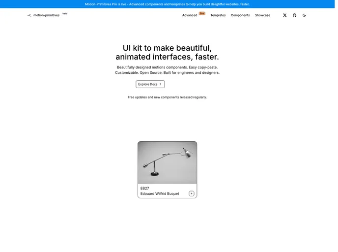
Motion Primitives delivers a ready-made library of motion components built with Framer Motion and Tailwind CSS. It’s designed for rapid, polished interactions in React apps, with a cohesive motion design system. The project is in beta with frequent updates and an MIT license, enabling fast iteration and open collaboration.
Shadcn Vue is a community-driven port of shadcn/ui for Vue, delivering accessible, highly customizable UI components you can drop into Vue apps. Independent but blessed by the original project, it provides a modern, free, open-source component set to accelerate UI development in Vue teams.
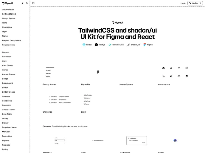
Myna UI is a TailwindCSS and shadcn/ui-based UI kit for React and Figma that helps teams rapidly prototype, theme, and ship modern interfaces. It provides a responsive, component-driven foundation with clear documentation, speeding design-to-dev handoffs and ensuring design-system consistency across projects.
New Cult is a Pro-grade fullstack Next.js template built on React, TypeScript, Tailwind CSS, and Motion. It pairs a polished UI with a scalable component library and an easy setup that accelerates building responsive, production-ready web apps. Ideal for teams and solo developers seeking strong visuals, performance, and flexible customization in a single, maintainable starter kit.
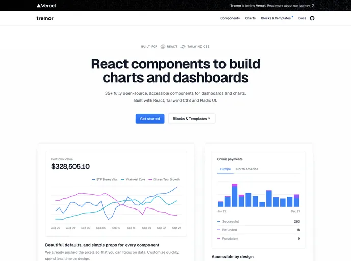
An open-source dashboard UI toolkit for data scientists and developers to rapidly assemble modular, design-forward analytics interfaces. Tremor provides ready-to-use components, Tailwind CSS-based styling (Tailwind setup required), and Next.js 13.4+ compatibility to help teams ship polished dashboards with less boilerplate.
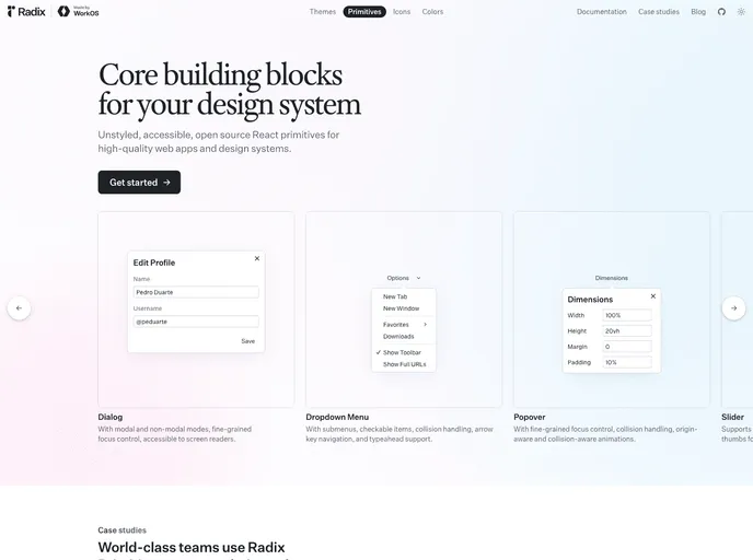
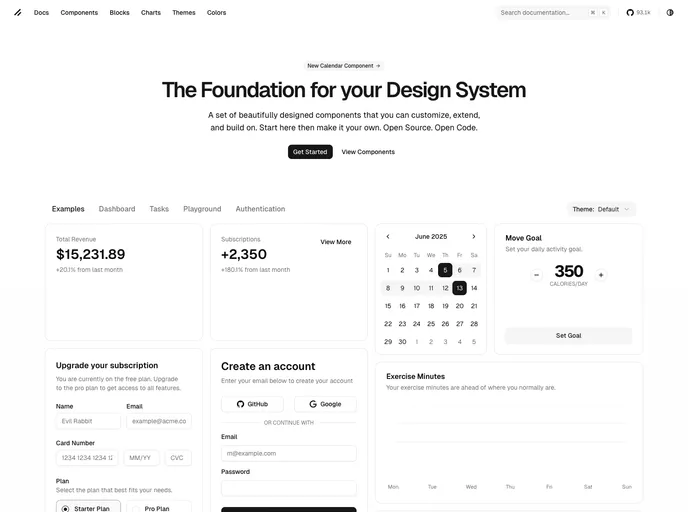
Radix Primitives delivers accessible, low-level UI building blocks for React that you can trust as the foundation of a design system or to augment existing apps. With a11y-first primitives and modular composition, you can build robust, keyboard-friendly interactions incrementally.
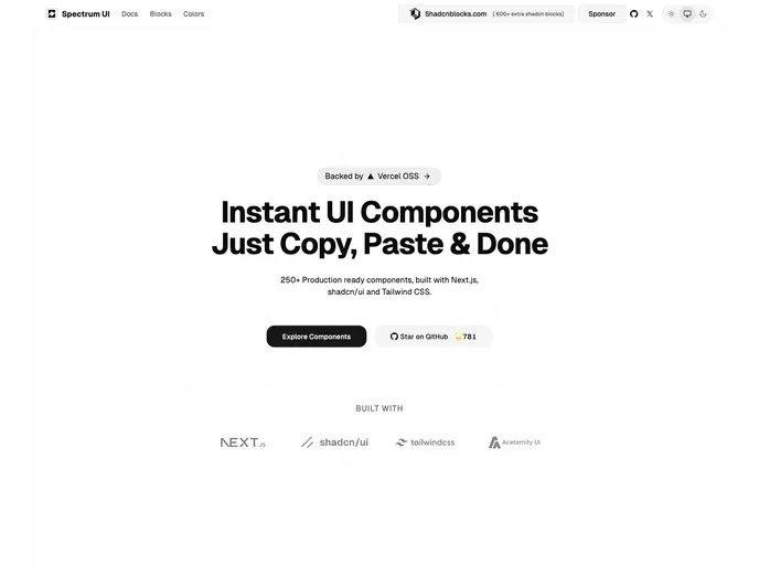
Spectrum UI is an open-source component library where developers contribute bug fixes, new features, and improvements. This guide outlines a clear, Git-driven workflow: fork, branch, implement, test, and submit pull requests. Join the community and help evolve Spectrum UI with collaborative contributions.
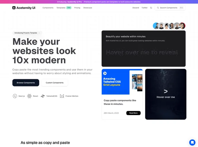
Aceternity UI is a React + Tailwind component library that speeds UI construction with ready-made, copy-paste components. It emphasizes consistent design, rapid prototyping, and approachable documentation, helping teams ship polished interfaces quickly.
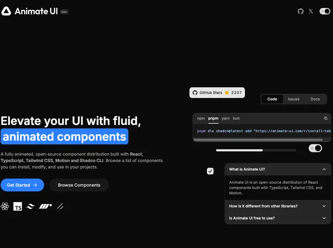
Animate UI is a beta toolkit of customizable UI components designed to accelerate interface prototyping. It offers modular primitives, clear docs, and ongoing updates. As an open-source project under the MIT license, it invites community contributions to shape the final product while you experiment with early features.
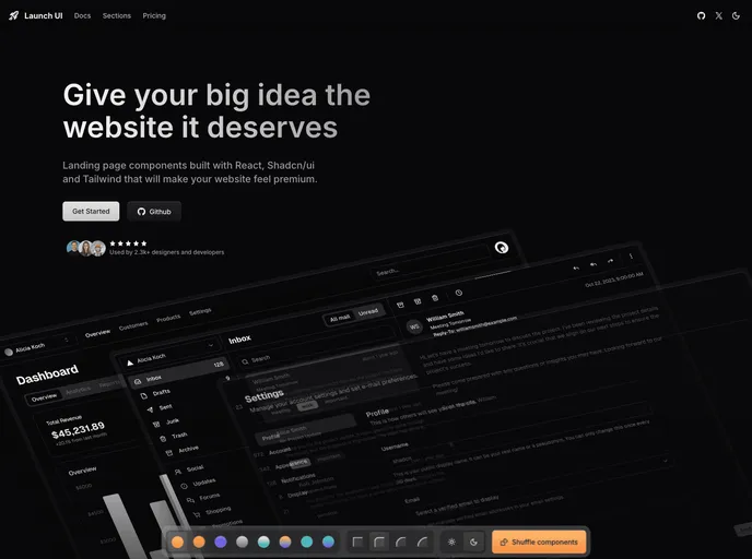
Launch UI is a production-ready Next.js website components template built with Shadcn/ui and Tailwind CSS. It ships ready-to-use, responsive components and layouts to accelerate modern site builds while emphasizing accessibility, performance, and SEO out of the box.
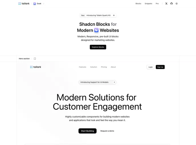
Tailark Blocks delivers a responsive library of pre-built UI blocks for marketing sites, based on shadcn-UI and TailwindCSS. It accelerates page assembly with ready-to-use components and a lightweight footprint—just run the dev server and preview in moments. Open-source and highly customizable.
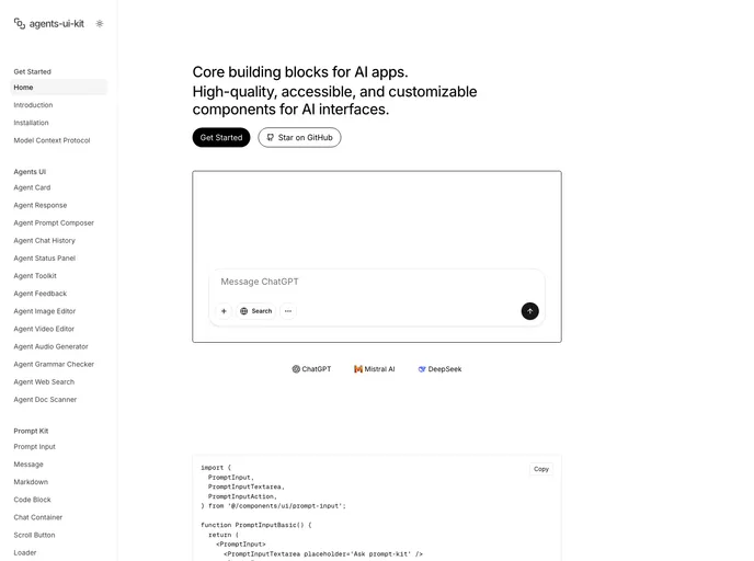
Agents Kit is a modular UI toolkit for building AI agent interfaces, extending prompt-kit foundations to enable autonomous assistants and multi-agent UIs. It emphasizes aesthetic quality and high customization, delivering ready-to-use agent cards, specialized components, and smooth real-time interactions for sophisticated AI apps.
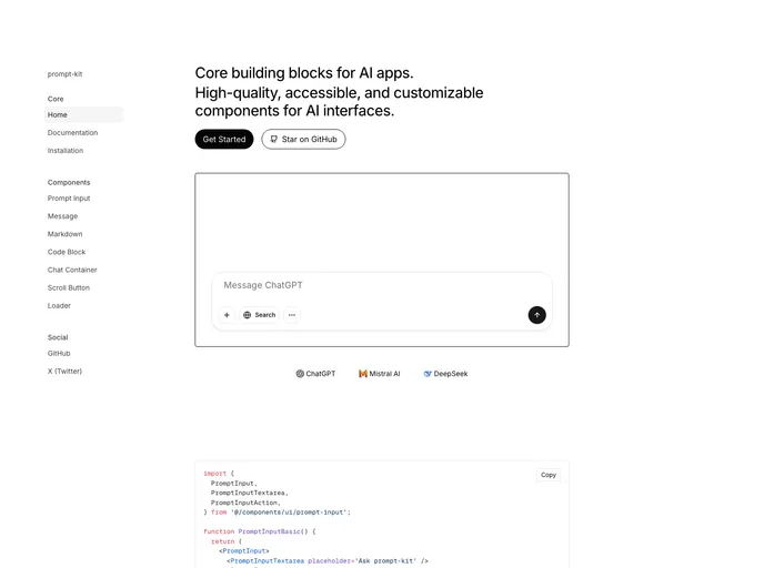
Prompt Kit is a free, open-source collection of high-quality, customizable UI components built for AI apps. It accelerates building chat experiences, AI agents, autonomous assistants, and related interfaces, delivering polished, consistent UIs that scale with your AI projects.
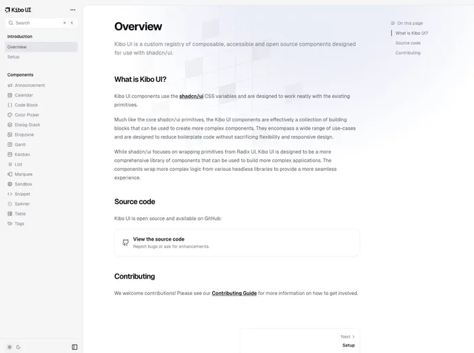
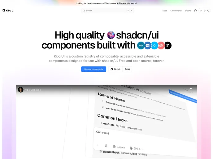
Kibo UI is a curated registry of composable, accessible, open-source UI building blocks designed to pair with shadcn/ui. Leveraging shadcn/ui CSS variables, these components slot into existing primitives to speed UI assembly, reduce boilerplate, and support responsive, theme-friendly interfaces.
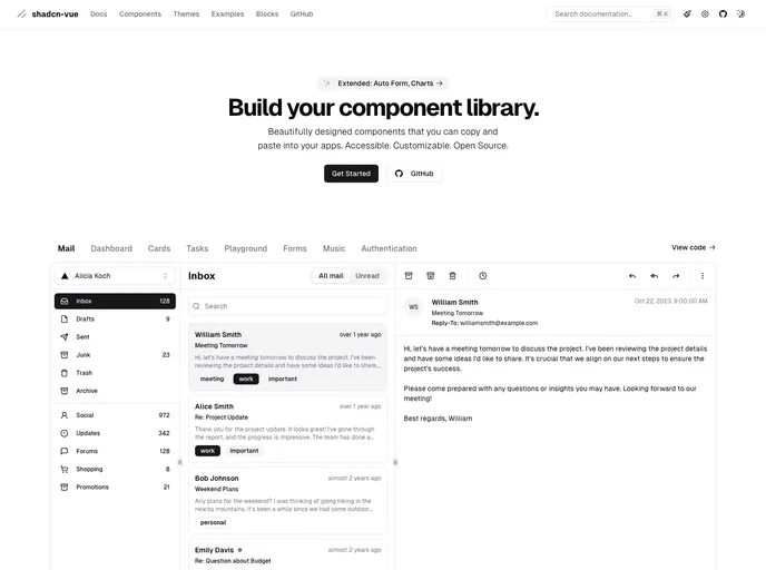
shadcn/ui is a React component library built on Radix UI and Tailwind CSS, designed for a copy-paste workflow. It ships as self-contained components you can browse in a central registry, paste into your project, and customize with no external dependencies. A CLI manages components across apps, delivering fast, accessible UIs out of the box.
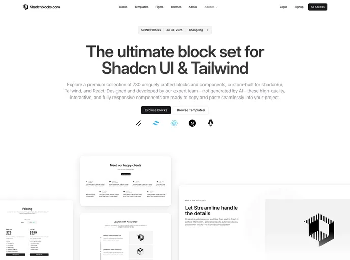
Shadcnblocks extends Shadcn UI with a premium library of ready-to-use blocks and components for Tailwind CSS, built on top of shadcn/ui. This collection enables rapid, consistent UI assembly—from hero sections and features to galleries and dashboards—accelerating prototyping and production UI.
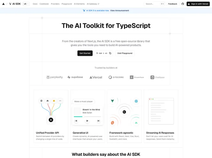
AI Elements is an open-source TypeScript toolkit for accelerating AI-powered web apps. Designed to slot into Next.js projects, it offers pre-built AI UI components and a flexible, extensible architecture so developers can ship intelligent experiences—from responsive chat UIs to AI-enabled workflows—faster with fewer boilerplate efforts.